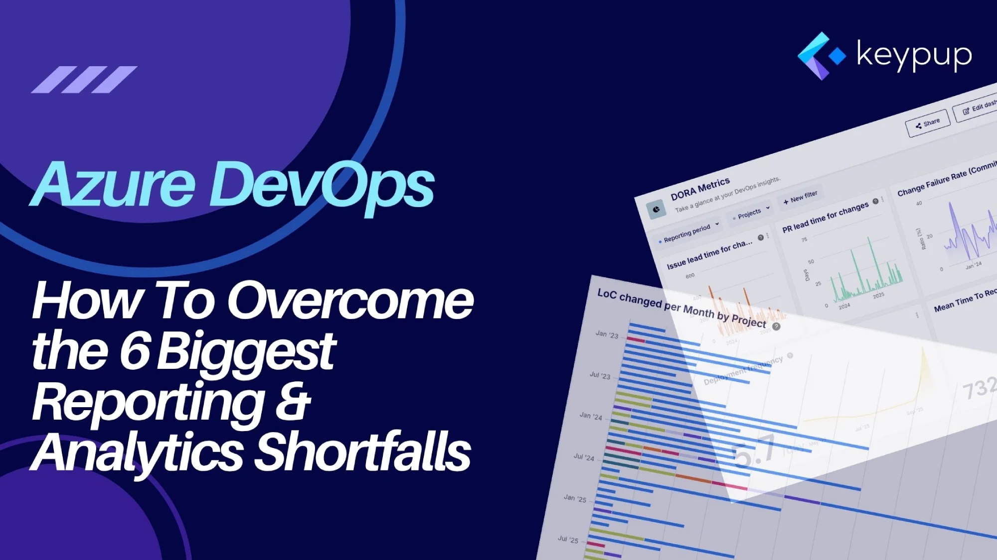
Software development teams rely on Azure DevOps forits robust planning and CI/CD capabilities. Yet, many teams hit a wall when itcomes to reporting and analytics. While the platform provides tools to trackwork, users frequently voice frustrations about turning that data intoactionable insights. The struggle is real: native dashboards feel basic, advanced options are complex, and getting a unified view across projects is a persistent headache.
These aren't just minor inconveniences; they are obstacles that prevent teams from effectively tracking progress, identifying bottlenecks, and optimizing their development workflow. The most significant pain points can be boiled down to six key areas.
This article will detail each of these six shortfalls and demonstrate how to solve them using a specialized engineering intelligence platform like Keypup. We will also provide practical examples using Keypup's AI Agent to show how you can generate the insights you need in seconds.
1. The Shortfall: Limited Native Customization and Basic Visuals
A common complaint is that the built-in Azure DevOps dashboards are too simplistic. Users find the widgets and customization options insufficient for deep analysis, lacking advanced charts and the ability to create complex, calculated metrics. This often forces teams to export data or use external tools, creating a disjointed experience.
The Keypup Solution: Advanced, No-Code Customization
Keypup solves this by offering a powerful, yet intuitive, platform for creating sophisticated visualizations without writing code. It provides a rich library of chart types—from KPIs and cycle time charts to heatmaps and stacked column charts—that can be fully customized.
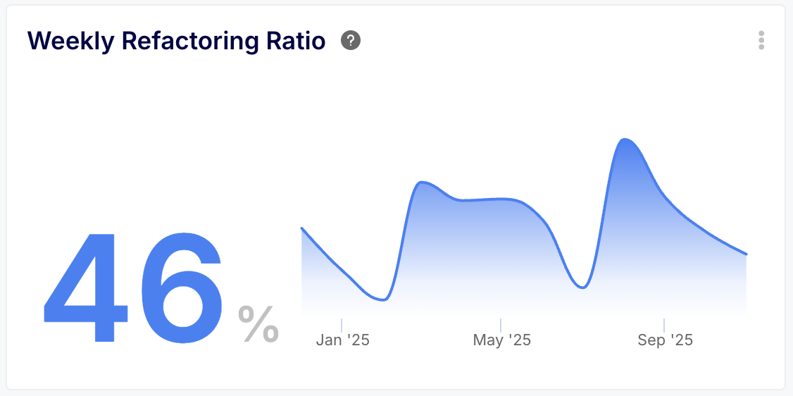
More importantly, Keypup's custom formula engine allows you to define the exact metrics you need. You can perform calculations across different fields and functions to create KPIs that are perfectly tailored to your team's processes. For example, you can calculate a "Refactoring Ratio" by dividing lines of code deleted by lines added, a metric that is impossible to create with a standard Azure DevOps widget.
Put it into Practice with Keypup's AI Agent
Instead of wrestling with widget configurations, you can ask for a complex, calculated insight in plain English.
Prompt: Create a KPI with a sparkline trend showing our weekly refactoring ratio over the last 3 months.The ratio is the sum of lines deleted divided by the sum of lines added.
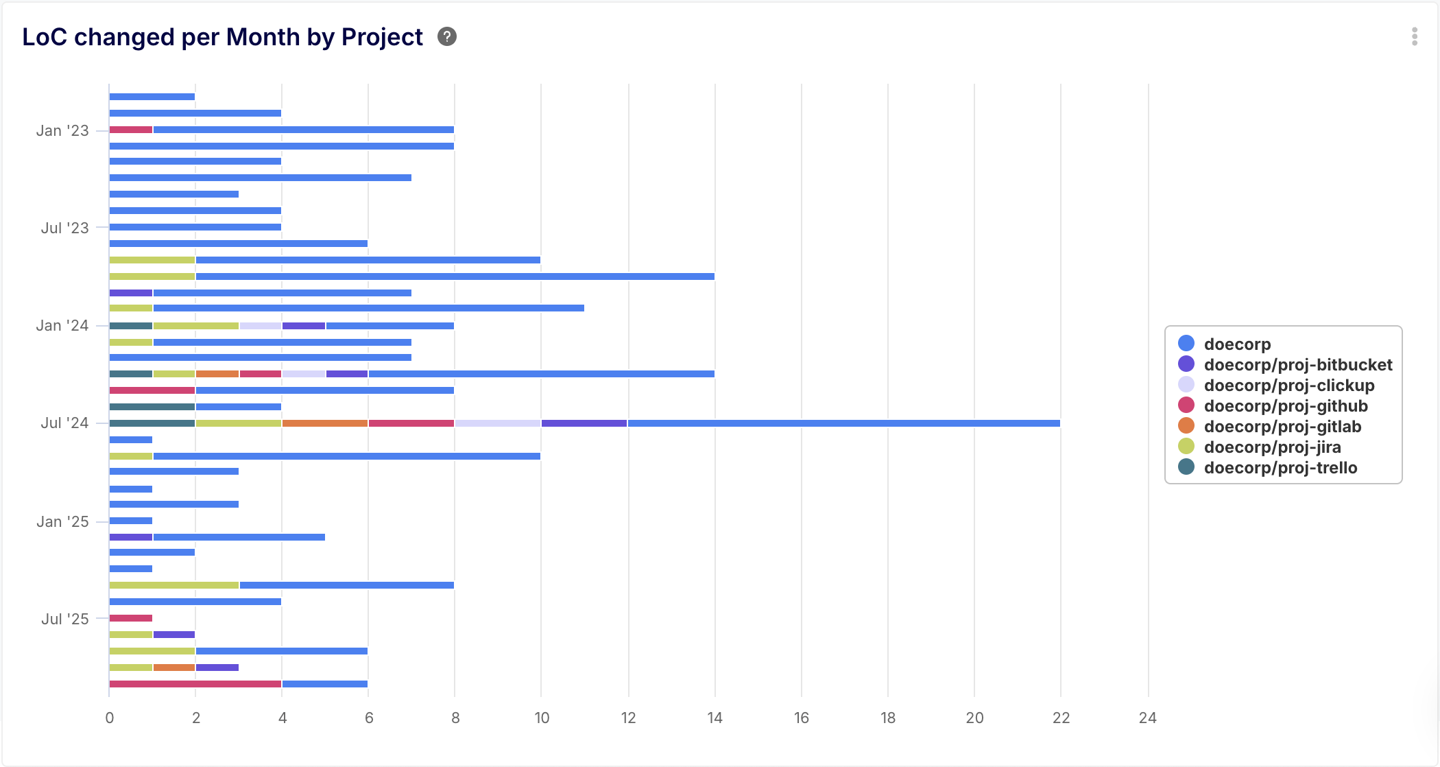
2. The Shortfall: Lack of Cross-Project Visibility
Azure DevOps dashboards are inherently siloed, tied to a single project. This is a major roadblock for organizations that need a consolidated view across a portfolio of projects. Getting a holistic understanding of progress for a feature that spans multiple team projects is cumbersome and often requires manual data wrangling.
The Keypup Solution: Unified, Cross-Project Analytics
Keypup was built to break down data silos. It automatically aggregates data from all your connected Azure DevOps projects into a single, unified database. This allows you to build dashboards and reports that provide a true bird's-eye view of your entire engineering organization.
Furthermore, Keypup can integrate with other tools like GitHub, GitLab, andJira, allowing you to create dashboards that span your entire toolchain, not just Azure DevOps.
Put it into Practice with Keypup's AI Agent
Ask for insights that span multiple projects effortlessly.
Prompt: Show me a bar chart of the lines of code changed per month per project.
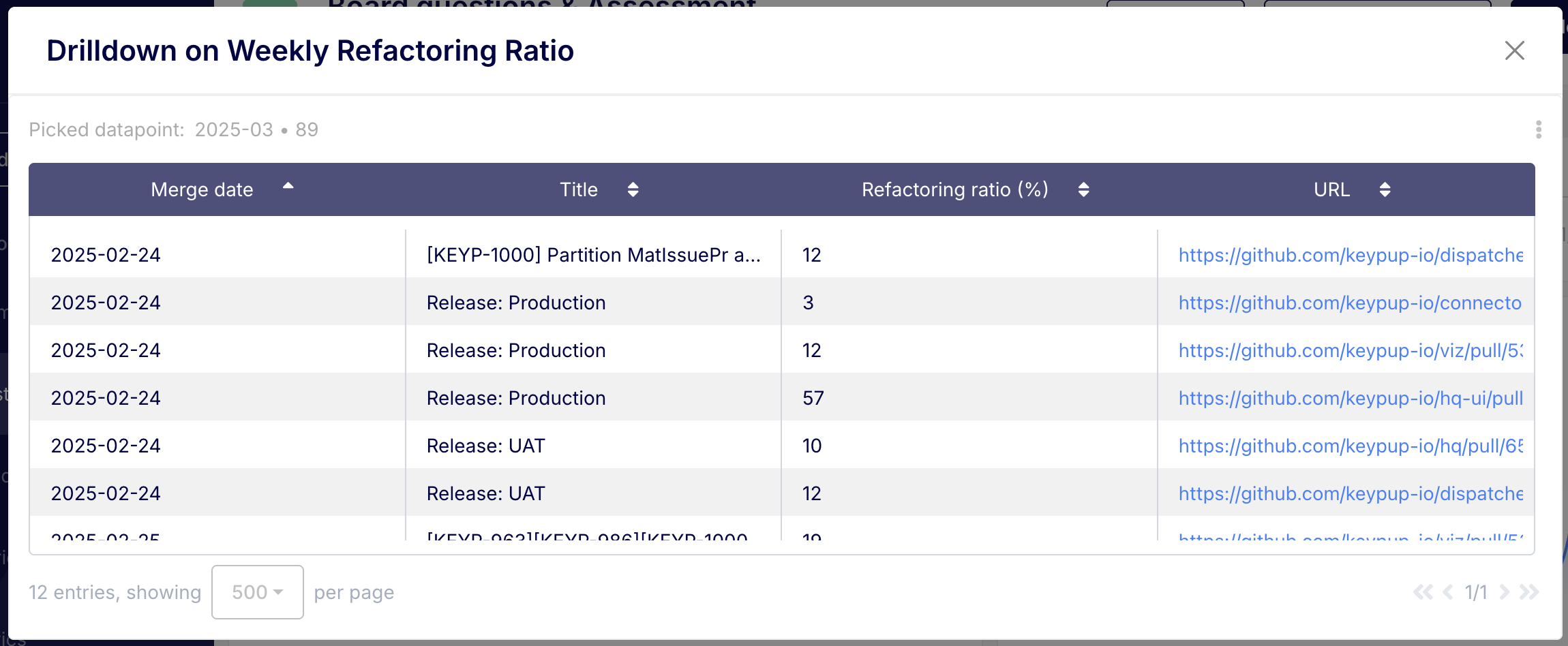
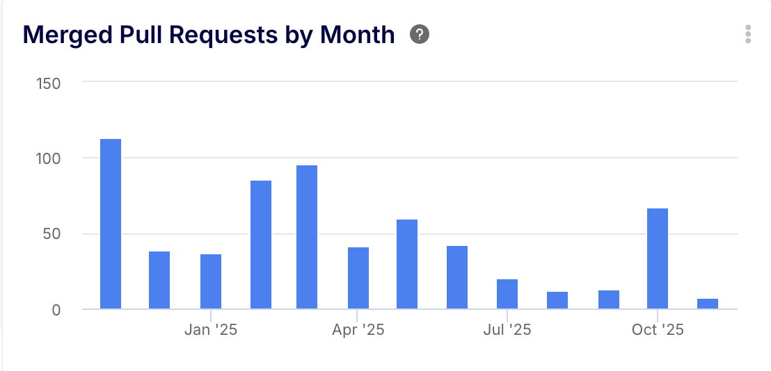
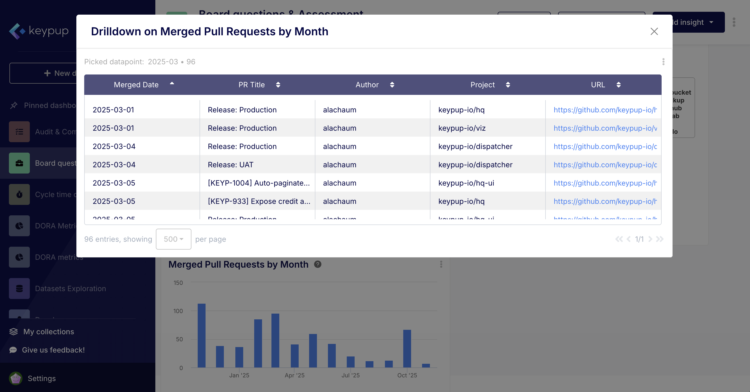
Native Azure DevOps widgets often feel static. The inability to seamlessly drill down from a high-level trend to the underlying data points—the specific pull requests, commits, or work items—forces users to switch contexts and perform manual searches to investigate issues.
The Keypup Solution: Fully Interactive, Drill-Down Dashboards
Every chart and report in Keypup is interactive.When you see a spike in build failures, a dip in deployment frequency, or an unusually long cycle time for a specific week, you can click directly on that data point. Keypup will instantly open a detailed view showing the individualr ecords that constitute that metric. This allows you to go from insight to investigation in a single click, without ever leaving the platform.
Put it into Practice with Keypup's AI Agent
The AI Agent builds charts that are interactive by default, enabling instant investigation.
Prompt: Generate a column chart of pull requests merged per month over the last year. I want to be able to click on any month to see the list of individual PRs.
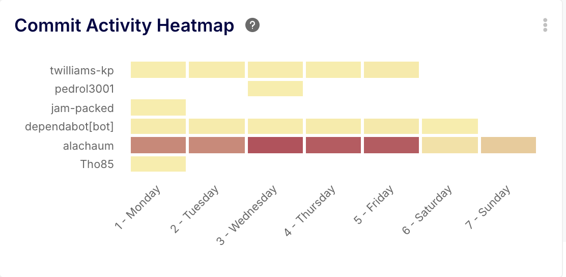
As projects scale and more data accumulates, nativeAzure DevOps dashboards can become slow and unresponsive. Lagging widgets and long load times create friction and discourage teams from relying on them for real-time decision-making.
Keypup is a dedicated SaaS platform architected specifically for high-performance engineering analytics. By offloading data processing, aggregation, and visualization to a purpose-built environment, Keypup ensures that your dashboards are always fast and responsive, no matter the scale of your data. Data is updated in near real-time using web hooks, so you can trust that you are always looking at the latest information.
Put it into Practice with Keypup's AI Agent
Feel confident in creating complex queries overlarge datasets, knowing the platform can handle it.
Prompt: Create a heatmap showing commit activity for all our projects over the last 12 months. Group commits by author and day of the week.
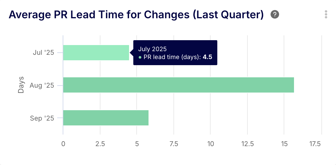
5. The Shortfall: Power BI is Powerful, but Complex and Costly
For advanced reporting, the official recommendation is to use Power BI. However, this introduces a steep learning curve, requires separate licensing costs, and presents its own data management challenges.Teams without dedicated data analysts struggle to build and maintain meaningful reports, and data refresh failures for large datasets are common.
The Keypup Solution: The Power of BI with the Simplicity of Natural Language
Keypup offers the analytical power you need without the complexity of a general-purpose BI tool. The platform is designed for engineering leaders and developers, not data scientists. The AI Agent is the ultimate expression of this simplicity. Instead of learning a new tool, designing data models, and writing queries, you simply ask for the insight you need. Keypup handles the data modeling, query generation, and visualization for you, delivering answers in seconds.
Put it into Practice with Keypup's AI Agent
Ask for sophisticated DORA metrics that would take hours to model and build in Power BI.
Prompt: What was our average'Lead Time for Changes' for pull requests last quarter? Break it down by month in a bar chart.
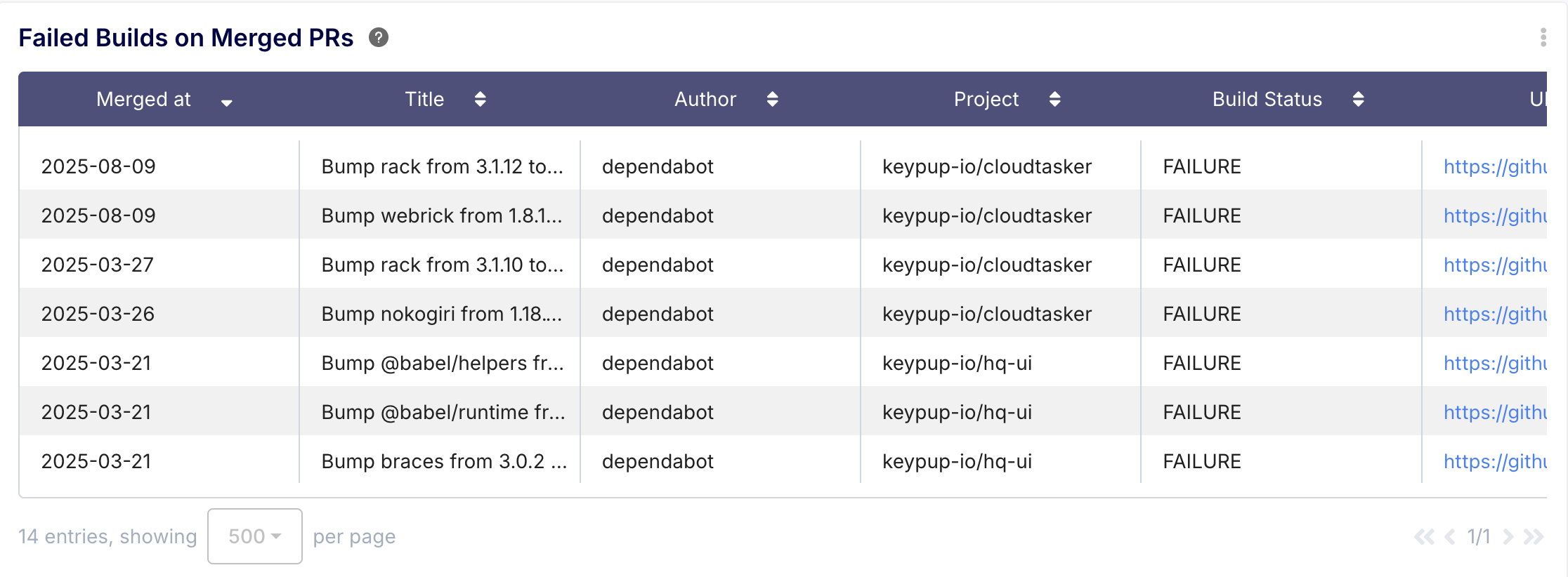
6. The Shortfall: Analytics Views Limited to Azure Boards
To simplify getting data into Power BI, Azure DevOps provides "Analytics Views." However, their utility is severely limited as they only support data from Azure Boards (work items). They do not include crucial data from Azure Repos (pull requests, commits) or Azure Pipelines (builds, deployments), making it impossible to create a complete end-to-end picture of the development lifecycle.
The Keypup Solution: A Complete, End-to-End Data Integration
Keypup’s native integration pulls data from the full Azure DevOps suite. It collects and correlates data from Pull Requests, Commits, Reviews, Comments, and Build Statuses. This allows you to analyze the entire development workflow, from the first commit to the final merge and build, providing insights that Analytics Views simply cannot.
Put it into Practice with Keypup's AI Agent:
Leverage Keypup’s comprehensive data by asking questions that connect different parts of your workflow.
Prompt: Give me a list of all pull requests merged in the last 12 months that had a 'failed' build status.
While Azure DevOps is an excellent platform for managing the software development lifecycle, its native reporting capabilities often leave teams wanting more. The path to advanced analytics through Power BI is fraught with complexity, cost, and limitations.
Keypup provides a purpose-built solution that directly addresses these shortfalls. By offering a real-time, cross-project, and fully integrated analytics platform with an intuitive AI-powered interface, Keypup empowers engineering teams to move beyond basic dashboards and start making truly data-driven decisions.
Instead of spending your time building reports, you can spend it understanding what the data is telling you.