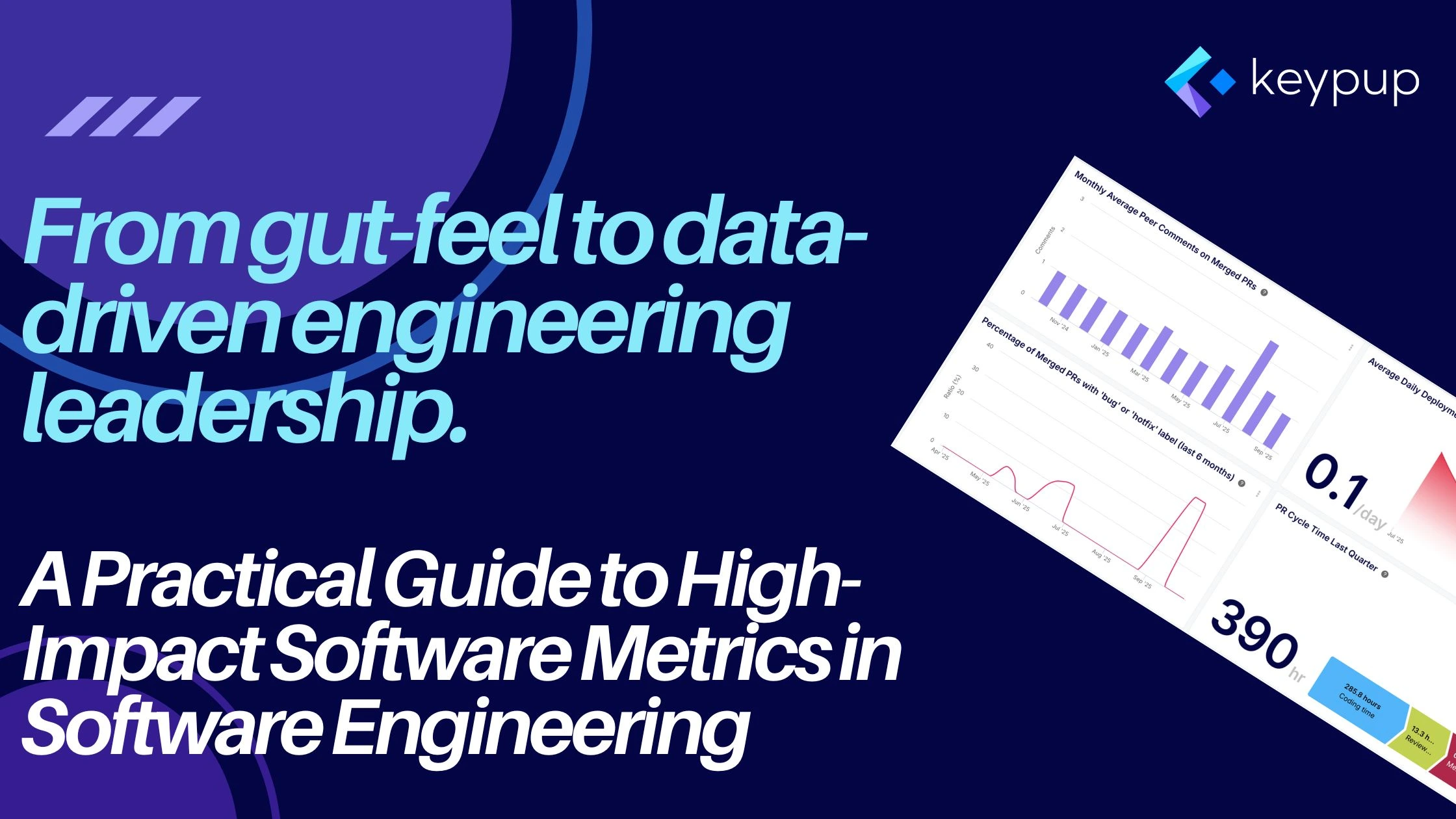
In the age of distributed teams and relentless delivery schedules, engineering leaders are often forced to manage in a fog. The traditional methods of gauging team performance—counting lines of code, tracking commit frequency, or relying on subjective "gut-feel"—are failing. They provide a distorted picture, creating a dangerous gap between perceived progress and actual value delivery. To navigate this new landscape effectively, leaders must adopt a more sophisticated, data-driven approach. The strategic use of meaningful software metrics in software engineering is no longer a luxury; it is the essential toolkit for building, scaling, and leading high-performing teams.
The fundamental challenge is not a lack of data, but a lack of unified insight. Your team's workflow is fragmented across a dozen specialized tools. Code lives in GitHub or GitLab; tasks and sprints are managed in Jira; deployments are handled by CI/CD pipelines. Each platform is a rich source of data, but in isolation, they tell an incomplete story. This is the visibility gap where bottlenecks hide, processes decay, and team frustrations grow.

The Limits of a Code-Only View
For a long time, the focus of engineering metrics was squarely on the codebase itself. Tools like SonarQube became industry standard for a reason: they provide critical, automated static analysis to enforce code quality, find bugs, and identify security vulnerabilities. This is a vital part of the development process, ensuring the technical integrity of the product.
However, a clean codebase is not the same as an efficient development process. A team can produce technically flawless code but still be crippled by systemic issues: pull requests that languish for days, unpredictable QA cycles, or inefficient handoffs between stages. Relying solely on code quality metrics is like judging a factory's efficiency by only inspecting the final product, without ever looking at the assembly line itself. This is the critical evolution in modern software metrics in software engineering: the shift from analyzing the static artifact (the code) to analyzing the dynamic, end-to-end process (the workflow).
Keypup: From Fragmented Data to Actionable Workflow Intelligence
This is precisely the visibility gap that a dedicated software development analytics platform like Keypup is designed to close. Keypup acts as an intelligence layer that integrates with your entire toolchain—Git repositories, project management tools, and CI/CD pipelines—to harmonize your fragmented data into a single, cohesive source of truth.
By moving beyond simple code analysis, Keypup illuminates the entire development workflow, allowing leaders to stop guessing and start making data-informed decisions. It provides real-time, actionable insights into the metrics that truly define engineering excellence. Here’s how you can translate abstract frameworks into concrete, valuable insights with Keypup.
1. Tracking DORA Metrics
The DORA metrics are the industry standard for measuring DevOps performance. Keypup automates their tracking, turning high-level goals into tangible KPIs.
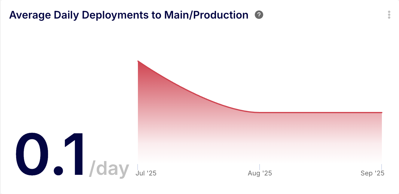
Insight Example 1: Deployment Frequency
- Description: A KPI chart showing the average number of deployments (merges to production branches) per day, trended over time.
- AI Agent Prompt: "Show me the average number of daily deployments to the 'main' and 'production' branches over the last 3 months."
- Formula Example:
COUNT() / ((MAX(merged_at) - MIN(merged_at)) / DAY()) on the INBOX_ITEMS dataset, filtered to merged pull requests targeting your production branches. - Key Benefit: This provides a direct, quantifiable measure of team throughput and release velocity. It replaces subjective feelings about "how fast we're shipping" with a hard number that clearly tracks your team’s delivery cadence.
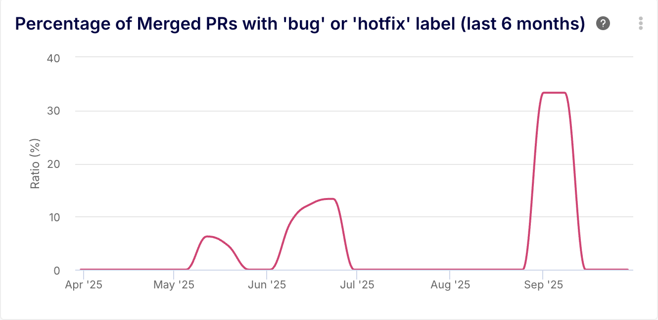
Insight Example 2: Change Failure Rate (CFR)
- Description: A line chart showing the weekly percentage of merged pull requests that are categorized as bug fixes or hotfixes, indicating deployments that caused a failure.
- AI Agent Prompt: "Create a weekly line chart for the last 6 months showing the percentage of merged pull requests that have the 'bug' or 'hotfix' label."
- Formula Example:
ROUND((COUNT_IF(CONTAINS(metatags, ['bug', 'hotfix'])) / IF_ZERO(COUNT(), 1)) * 100, 2) on the INBOX_ITEMS dataset for merged PRs. - Key Benefit: This directly measures the quality and stability of your deployments. It moves the conversation from "we feel like we have too many bugs" to a precise, trendable metric that can be actively managed to improve quality.
2. Optimizing Your Cycle Time
Long cycle times are a silent killer of productivity. Keypup allows you to dissect your entire workflow to find and eliminate the delays that are holding you back.
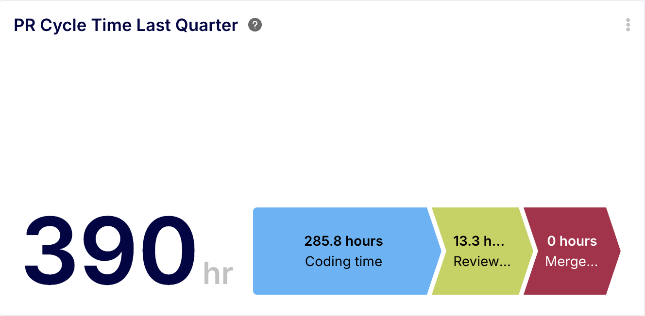
Insight Example 1: PR Cycle Time Breakdown
Description: A cycle time chart that breaks down the average pull request lifecycle into its core stages: Coding Time, Review Time, and Merge Time.
AI Agent Prompt: "Show me our average PR cycle time for the last quarter, broken down by coding, review, and merge stages." Formula Examples:
Coding Time: ROUND(AVG(first_review_submitted_at - LEAST(first_commit_at, created_at)) / HOUR(), 1)
Review Time: ROUND(AVG(review_approved_at - first_review_submitted_at) / HOUR(), 1)
Merge Time: ROUND(AVG(merged_at - review_approved_at) / HOUR(), 1)
Key Benefit: This insight pinpoints exactly where in the process delays are occurring. It moves the discussion from a generic "things feel slow" to a specific, actionable problem like, "Our average review time is 36 hours; let's investigate why."
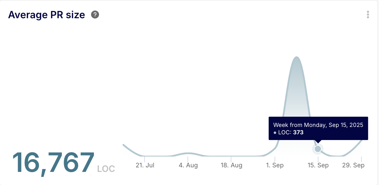
Insight Example 2: Average Pull Request Size Trend
- Description: A KPI with a sparkline showing the weekly trend of the average number of lines of code changed (additions + deletions) in merged pull requests.
- AI Agent Prompt: "What's our average PR size for merged PRs, and show me the weekly trend for the past 6 months."
- Formula Example:
ROUND(AVG(lines_changed), 0) on the INBOX_ITEMS dataset, grouped by YEAR_WEEK(merged_at). - Key Benefit: Large PRs are a primary cause of long reviews. This insight provides a concrete metric to manage this key driver. It allows teams to set tangible goals (e.g., "let's keep our average PR size below 300 LOC") and track their progress, making the abstract goal of "smaller PRs" measurable and achievable.
3. Implementing the SPACE Framework
The SPACE framework provides a holistic view of developer productivity, covering Satisfaction, Performance, Activity, Communication, and Efficiency. Keypup helps you measure these often-elusive dimensions.
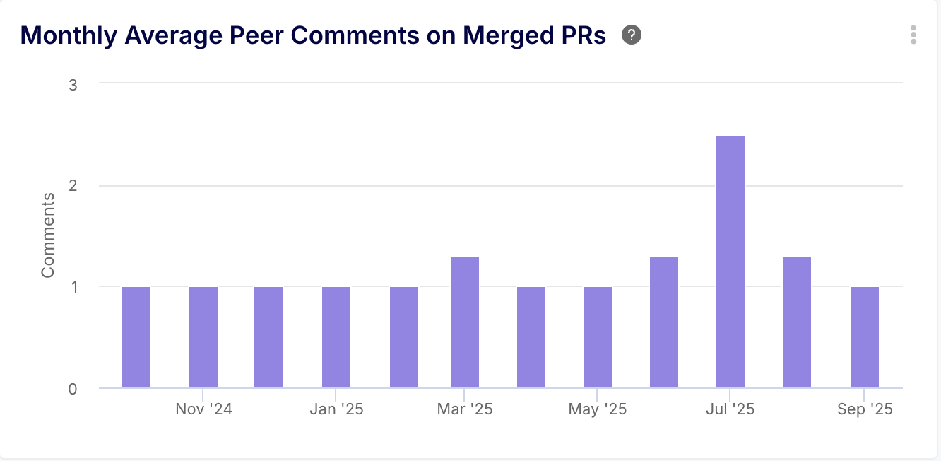
Insight Example 1: PR Collaboration Index (Communication & Collaboration)
- Description: A column chart showing the average number of comments per pull request, excluding comments from the PR author to focus on peer interaction.
- AI Agent Prompt: "Show me the monthly average number of peer comments on merged pull requests for the last year."
- Formula Example: Using the COMMENTS dataset:
ROUND(COUNT_IF(author_username != parent_author_username) / IF_ZERO(COUNT_DISTINCT(parent_system_id), 1), 1) - Key Benefit: This provides a valuable proxy for the level of Communication and Collaboration within the team. It helps managers spot trends where knowledge sharing might be dropping off or where certain PRs generate an unusual amount of discussion, indicating unclear requirements or technical complexity.
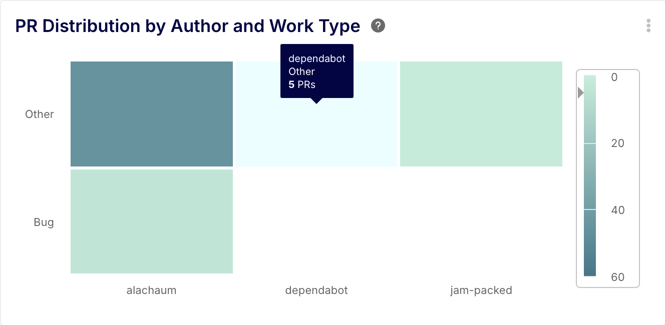
Insight Example 2: Engineering Workload Distribution (Activity & Satisfaction)
- Description: A heatmap showing how pull requests are distributed across different categories of work (e.g., Feature, Bug, Chore) for each developer.
- AI Agent Prompt: "Generate a heatmap for the last quarter showing the distribution of pull requests by author and work type. Categorize work as 'Feature', 'Bug', or 'Chore' based on PR labels."
- Formula Example (for a dimension):
IF(CONTAINS(label_names, ["bug"]), "Bug", CONTAINS(label_names, ["feature"]), "Feature", "Chore") - Key Benefit: This provides clear visibility into the Activity dimension of SPACE. It helps leaders ensure work is distributed effectively and prevents developers from being siloed into one type of task (e.g., one person doing all bug fixes), which can be a leading indicator for developer Satisfaction. It replaces "I feel like John is only doing bug fixes" with a data-backed view of the team's workload.
Case Study: How Juntos Somos Mais Drove a 45% Productivity Leap with Keypup
The transformative impact of applying the right software metrics in software engineering is powerfully illustrated by the success of Juntos Somos Mais, a Brazilian technology company.
The Challenge: With a remote-first engineering department of over 50 people, Head of Engineering Murilo Oliveira was struggling to factually assess team performance. Management was relying on "gut-feels" and laborious, manual data collection in Excel. They knew they needed to reduce cycle times and increase productivity but lacked the clear, data-driven insights to identify where to focus their efforts.
The Solution: Murilo's team implemented Keypup to get a unified and automated view of their development process. The platform was fully operational in just two weeks, with Keypup's support team helping them build custom dashboards tailored to their specific needs.
The Results: The impact was immediate and profound. By using Keypup's analytics to identify and address their bottlenecks, Juntos Somos Mais achieved a 45% increase in year-over-year productivity. They transitioned from subjective management to making confident decisions based on hard data.
As Murilo Oliveira stated in his testimonial:
"We increased our YoY productivity by 45% and Keypup helped us identify our pain points and change the game faster. Their support is the best – they helped us understand which metrics would suit our needs, built dashboards for us, and explained them in detail to us. With Keypup I can now say that we really manage our Engineering teams."
Putting Software Metrics into Practice
The success of Juntos Somos Mais shows that with the right tools and focus, any organization can achieve dramatic improvements. Here are a few principles for building your own data-driven culture:
- Start with Goals, Not Just Data: Don't measure for the sake of measuring. Define what you want to improve—whether it's delivery speed, predictability, or code review efficiency—and choose metrics that align with those goals.
- Focus on Trends, Not Absolutes: The real value lies in tracking improvement over time. Use metrics to see if your process changes are having the intended effect.
- Promote Improvement, Not Punishment: Metrics should be a tool for collaborative improvement, not a weapon for individual performance reviews. Foster a culture where teams are empowered to use data to identify and solve their own challenges.
- Automate to Stay Consistent: Manual data collection is time-consuming and error-prone. A platform like Keypup ensures your data is always accurate and available, allowing you to focus on analysis and action rather than collection.
Conclusion: Lead with Data, Not Guesswork
The field of software metrics in software engineering has matured far beyond simple code analysis. The most effective engineering leaders today are those who can analyze and optimize their entire development process. By unifying data from across the toolchain, platforms like Keypup provide the clarity needed to identify bottlenecks, accelerate delivery, and build a sustainable, high-performance engineering culture. It’s time to stop managing with gut-feel and start leading with data-driven confidence.