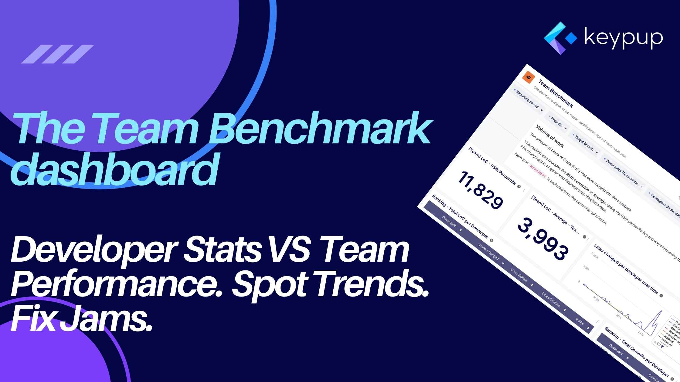
In the dynamic world of software development, understanding team performance, identifying bottlenecks, and fostering a culture of continuous improvement are paramount. But how can engineering leaders and teams get objective insights into their workflows? How can individual developers understand their contributions in the context of the broader team? Enters the Team Benchmark dashboard.
This dashboard is specifically designed to provide a comparative analysis of developer contributions against team-wide statistics, offering a nuanced view of performance, efficiency, and collaboration patterns.
The Aim of the Development Team Benchmark Dashboard: Context and Comparison
The core aim of the Team Benchmark dashboard is to move beyond isolated metrics. Instead of just looking at an individual's output or a team's average, it juxtaposes these, providing valuable context. It helps answer questions like:
- How does a developer's typical Pull Request (PR) size compare to the team average or percentile?
- Is a developer's PR cycle time significantly different from the team norm, and if so, in which phase (coding, review, merge)?
- How does the review load generated by an individual's PRs compare to the team's overall review activity?
By offering this comparative lens, the dashboard facilitates understanding, sparks constructive conversations, and helps identify areas for individual growth or process optimization across the team.
Overall Benefits of the Team Benchmark Dashboard
Leveraging this dashboard provides several key advantages:
- Identify Trends and Patterns: Visualize individual and team performance over time (typically configurable, often defaulting to 12 months) to spot emerging trends or recurring patterns.
- Pinpoint Bottlenecks: Break down PR cycle times into phases (Coding, Idle, Review, Merge) to see exactly where delays are occurring, both for individuals and the team.
- Facilitate Fair Comparisons: By comparing individual stats against team benchmarks (averages, percentiles), it provides a more objective basis for understanding contributions, avoiding unfair comparisons based on absolute numbers alone.
- Promote Data-Informed Conversations: Equip managers and team members with concrete data points to discuss workload, efficiency, collaboration, and potential areas for support or improvement.
- Understand Workload Distribution: Gain insights into how work (like LoC changes, commits, or generated review requests) is distributed across the team.
- Improve Process Efficiency: Identify team-wide inefficiencies (e.g., long average review times) that might require process adjustments or clearer guidelines.
The Team Benchmark dashboard is composed of several key insights (widgets), grouped into logical sections.
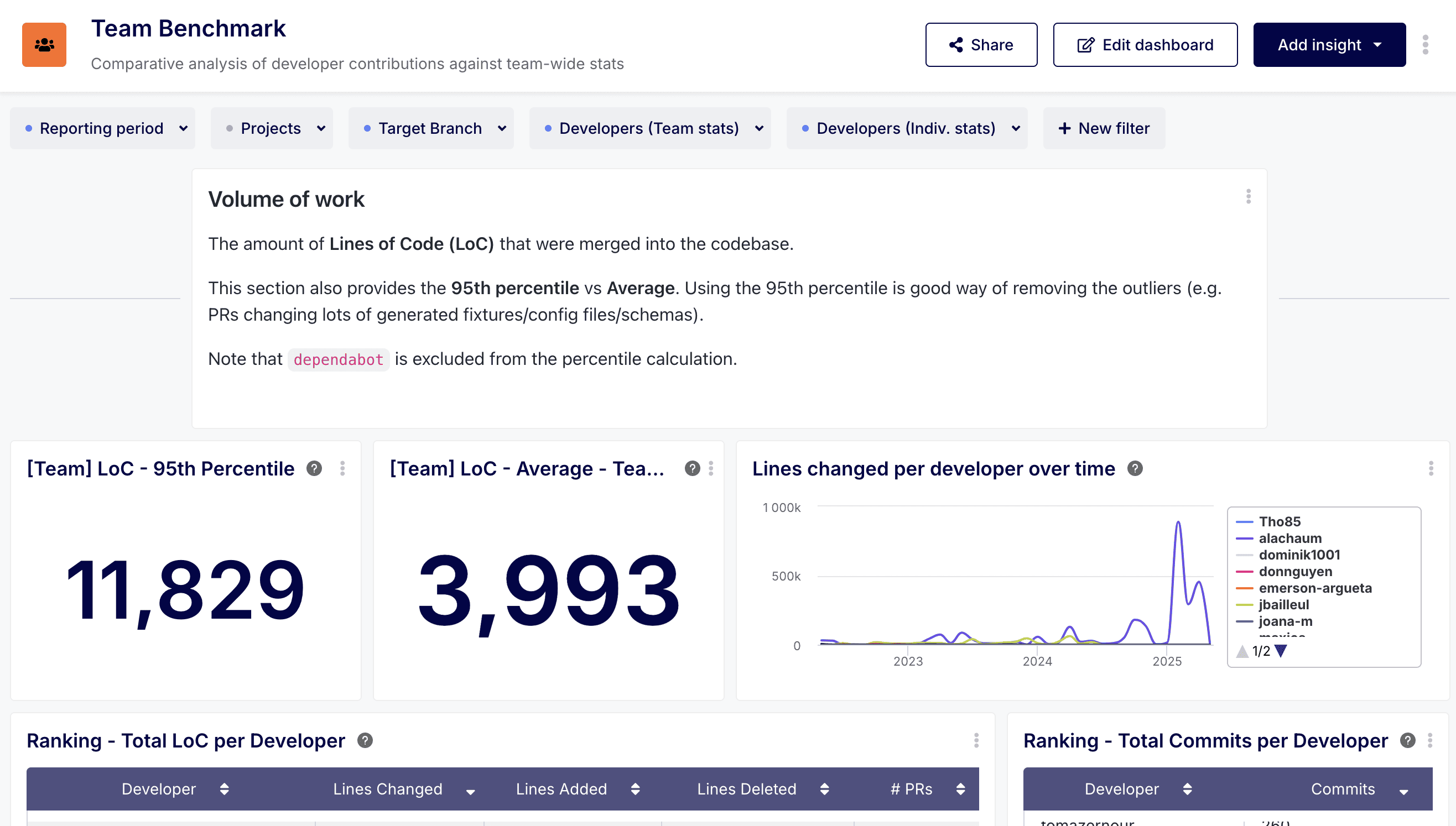
Section 1: Volume of Work
This section focuses on quantifying the output, primarily using Lines of Code (LoC) and commit counts, while providing context through team averages and percentiles. Remember, LoC should be viewed with caution and not as a direct measure of productivity or value, but rather as an indicator of change size and activity.
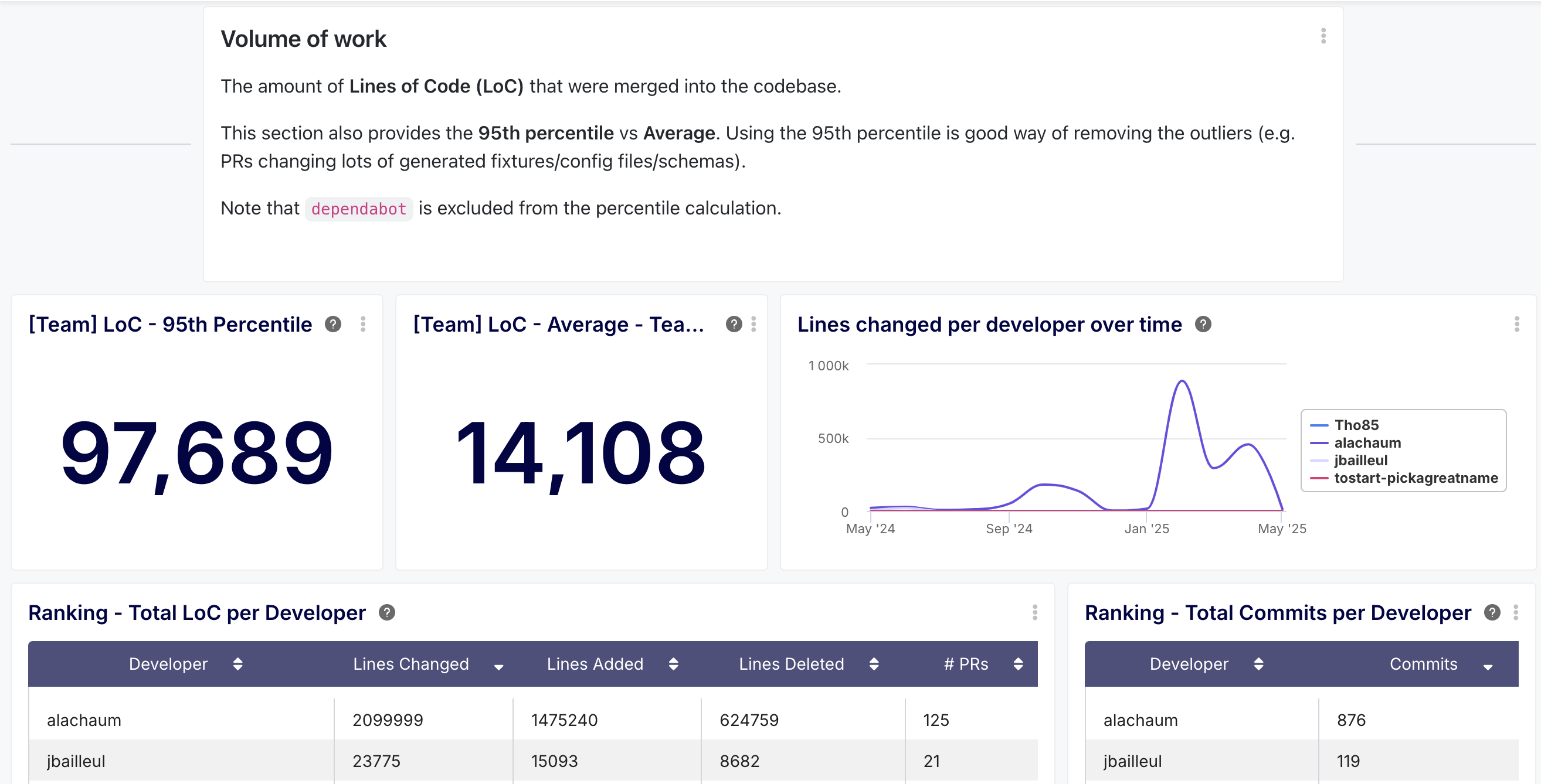
[Team] LoC - 95th Percentile
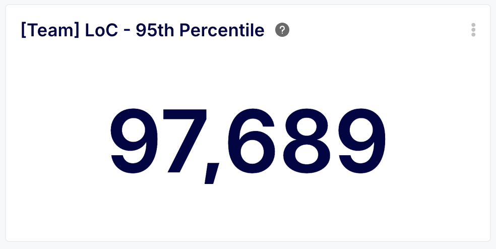
- Description: Shows the 95th percentile for lines of code changed per PR across the team (excluding bots like dependabot) over the selected period.
- Benefit: This metric helps understand the upper limit of typical PR size, filtering out extreme outliers (e.g., massive auto-generated files). Monitoring this helps gauge if PRs are becoming consistently too large, which can increase review difficulty and risk.
[Team] LoC - Average - Team Wide
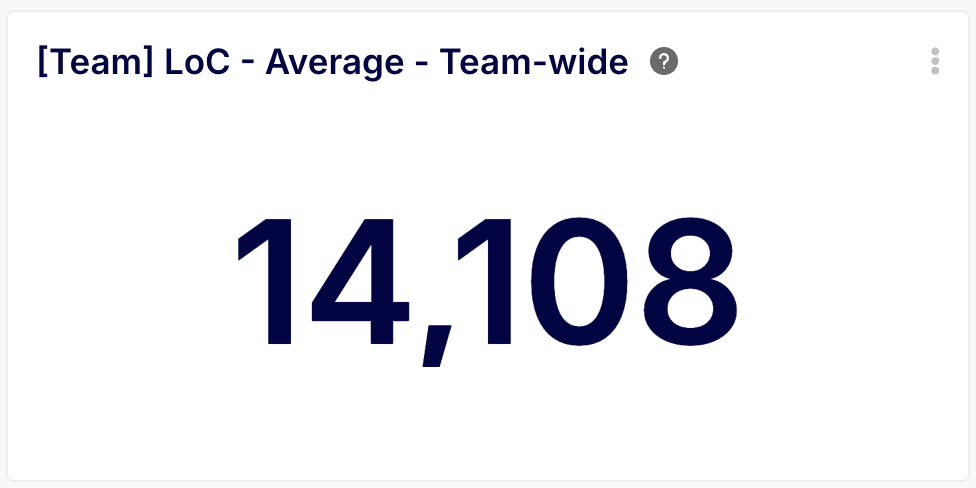
- Description: Displays the average LoC per PR for the entire team over the selected period.
- Benefit: Provides a baseline for typical PR size. Comparing this to the 95th percentile gives a sense of data skew. Tracking the average helps understand if feature decomposition practices are effective in keeping PRs manageable for review.
Lines Changed per Developer Over Time
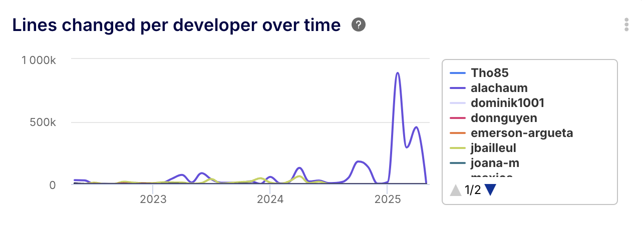
- Description: A line chart showing the total LoC merged by each developer, typically month over month.
- Benefit: Visualizes individual contribution trends regarding code volume. Helps identify developers with consistently high or low LoC output, which could indicate expertise, workload imbalance, or a need for support/mentorship. Crucially, use this for understanding context, not judgment.
Ranking - Total LoC per Developer
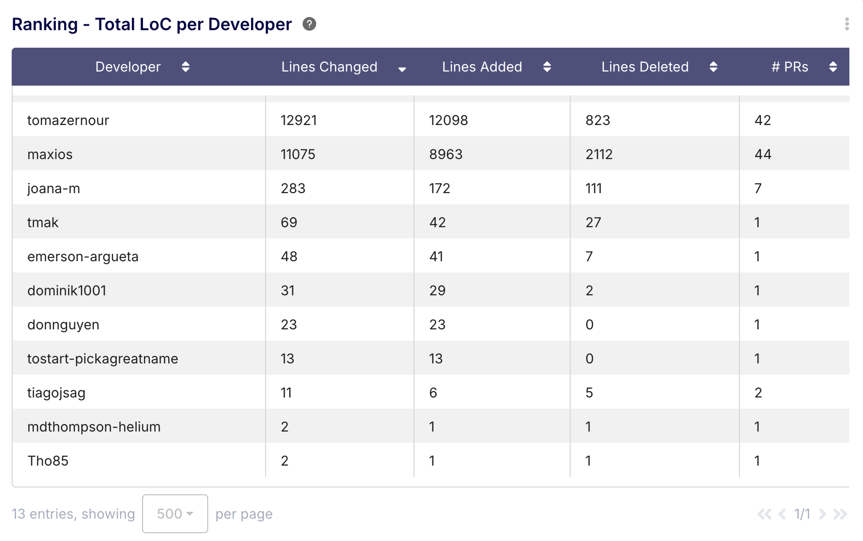
- Description: A list ranking developers by total lines changed (sum of additions and deletions) over the period, often including breakdowns for additions, deletions, and the number of PRs.
- Benefit: Offers a snapshot of total code churn per developer. Useful for understanding workload distribution and activity levels. Again, interpret cautiously and in conjunction with other metrics.
Ranking - Total Commits per Developer
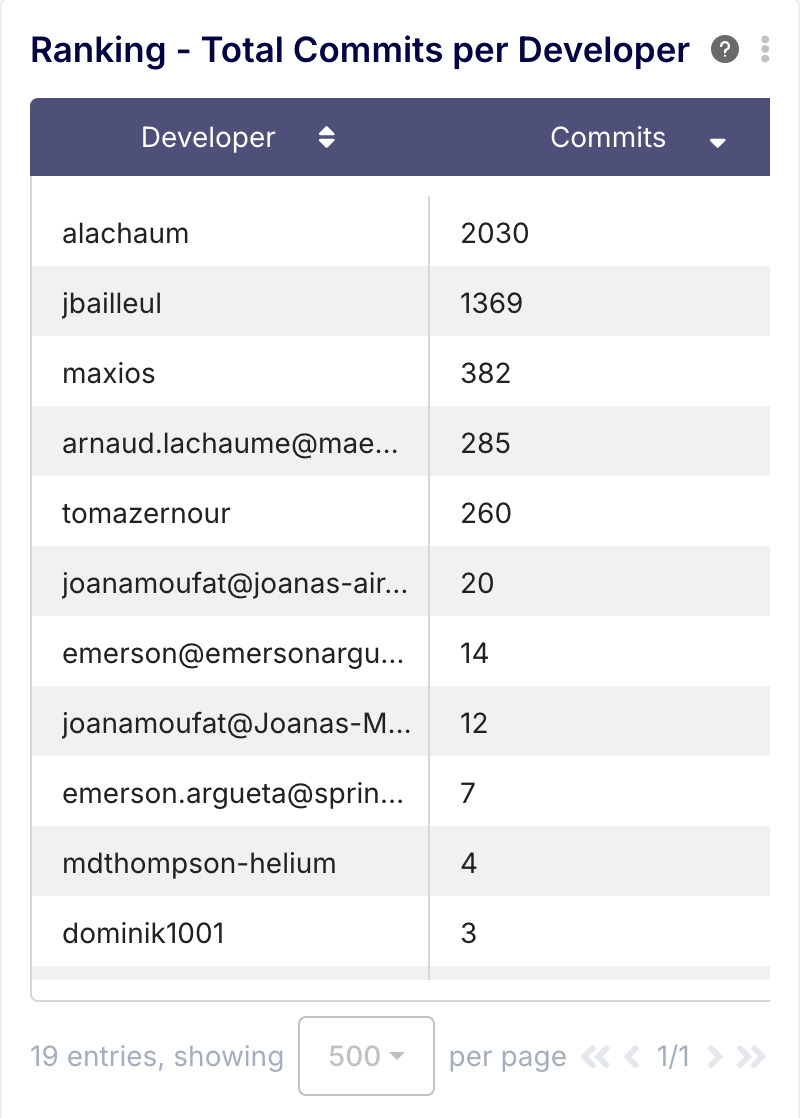
- Description: A list ranking developers by the total number of commits associated with merged PRs over the period.
- Benefit: Provides insight into developer activity and engagement frequency. A high number might indicate active involvement or smaller, frequent changes; a low number might signal non-coding focus or potential blockers.
Section 2: Cycle Times
This is often the most critical section, focusing on the efficiency of the development process from start to finish. The dashboard breaks down the total PR cycle time into distinct phases, allowing for granular bottleneck analysis both team-wide and per developer.
Note: Time metrics related to a developer's PR (e.g., "review time for Bob") refer to the time taken by others to act on Bob's PR.
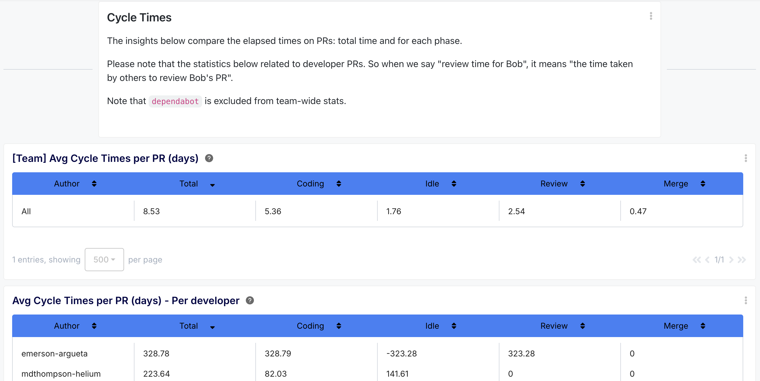
[Team] Average Cycle Times per PR (days)
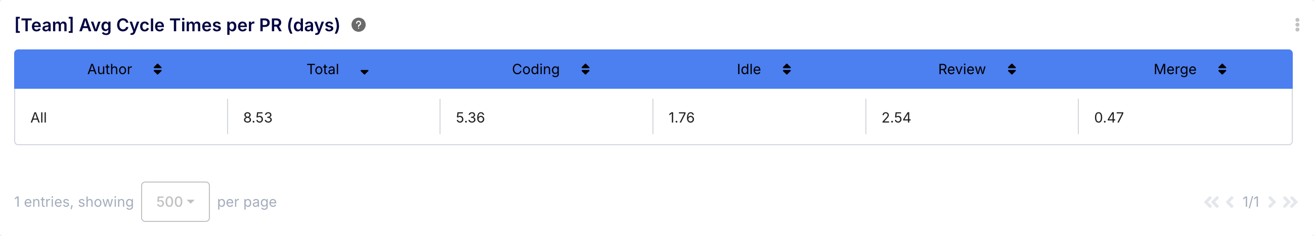
- Description: A summary list showing the team's average time (in days) for the total PR cycle and its breakdown into Coding, Idle, Review, and Merge phases, typically excluding bots.
- Benefit: Provides a high-level benchmark for the team's overall PR efficiency and identifies which phase, on average, contributes most to the total time. Essential for understanding team-level bottlenecks.
Average Cycle Times per PR (days) - per developer
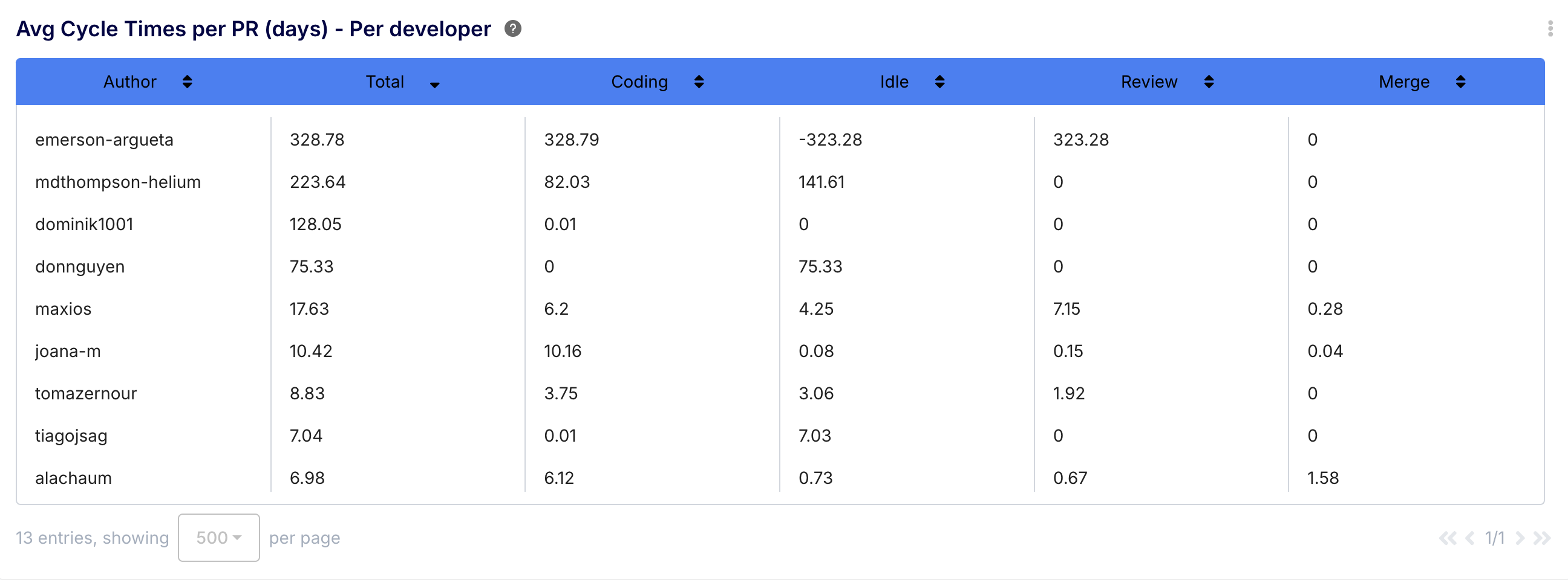
- Description: A detailed list showing the same average cycle time breakdown (Total, Coding, Idle, Review, Merge) for each individual developer.
- Benefit: This is the core comparative insight for cycle time. It allows developers and managers to see how an individual's PR lifecycle compares to the team average and identify specific phases where they might differ significantly. This can highlight individual workflow patterns or areas needing attention.
Average Cycle Time per PR (days)
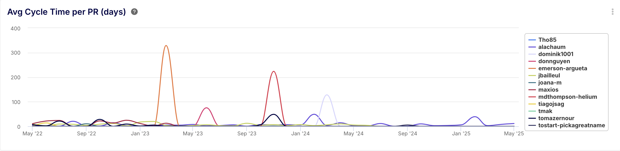
- Description: A line chart tracking the average total cycle time (creation to merge) per developer over time (e.g., monthly).
- Benefit: Visualizes trends in overall PR efficiency for each developer compared to others. Helps spot improvements or regressions in individual or team throughput over the selected period.
Average Coding Time per PR (days)
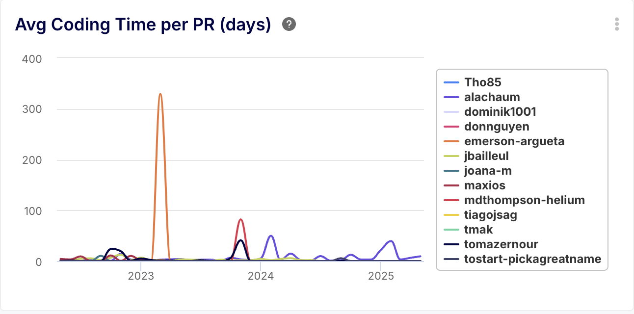
- Description: Tracks the average time from the start of development (first commit or PR creation) until the PR is ready for review (first review request or last commit before review).
- Benefit: Highlights the upfront development effort. Long coding times might indicate task complexity, unclear requirements, analysis paralysis, or skill gaps before review even starts. Monitoring this helps identify pre-review bottlenecks.
Average Idle Time per PR (days)
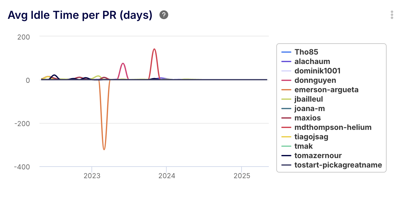
- Description: Measures the average time a PR waits after being marked ready for review (e.g., review requested) until the first review activity begins.
- Benefit: Directly indicates reviewer responsiveness. High idle times point to bottlenecks in starting the review process, possibly due to reviewer availability, notification issues, or unclear responsibilities. Reducing idle time is key to faster feedback loops.
Average Peer Review Time per PR (days)
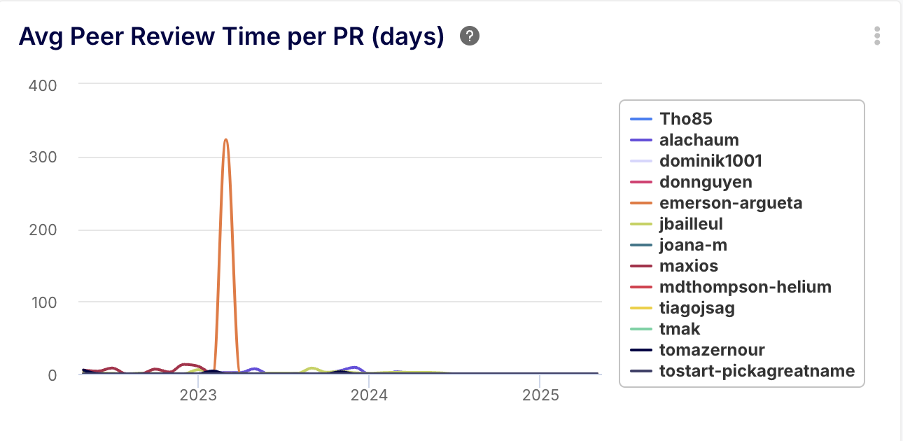
- Description: Tracks the average duration of the active review phase – from the first review submission to the last review submission on a PR.
- Benefit: Reflects the efficiency of the review process itself. Long review times might suggest complex code, thorough (or perhaps inefficient) reviews, or delays in reviewer discussions. Short times might indicate efficient reviews or potentially superficial ones.
Average Merge Time per PR (days)
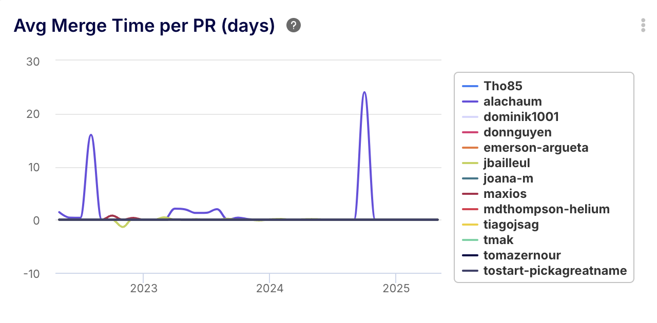
- Description: Measures the average time taken from the last review submission (often an approval) until the PR is actually merged.
- Benefit: Highlights post-review efficiency. Delays here could stem from the author addressing final comments, failing automated checks, merge conflicts, or CI/CD pipeline issues. It identifies the "last mile" bottlenecks.
Section 3: Work Generated for Others
This section estimates the downstream work created by a developer's contributions, primarily focusing on the review effort required from teammates.
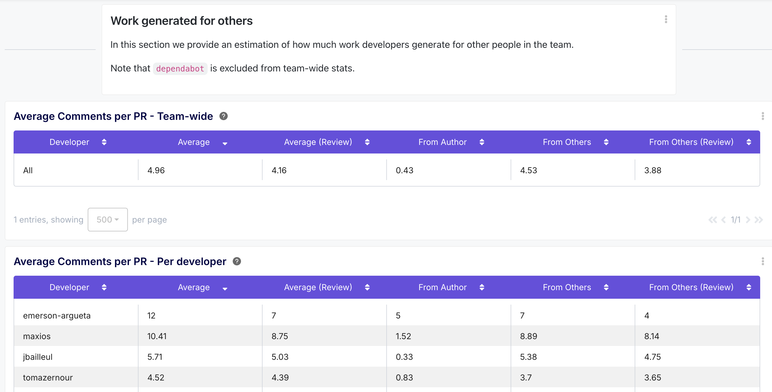
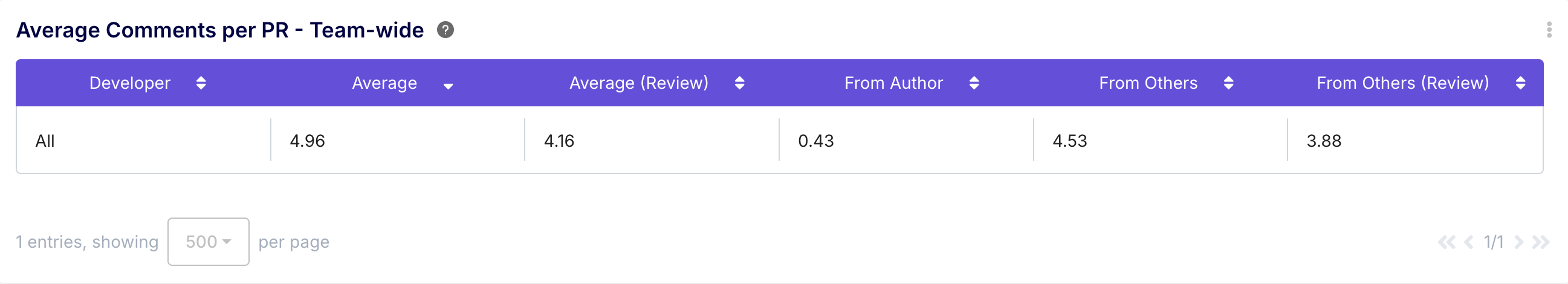
- Description: Displays the team's average number of comments per PR, potentially broken down by comments from the author vs. others, and review comments vs. general comments (excluding bots).
- Benefit: Acts as a proxy for the amount of discussion and interaction a typical PR generates. High comment counts can indicate complexity, thorough feedback, or potential misunderstandings. Low counts might mean simple code or less engaged reviews.
Average Peer Reviews per PR - per Developer
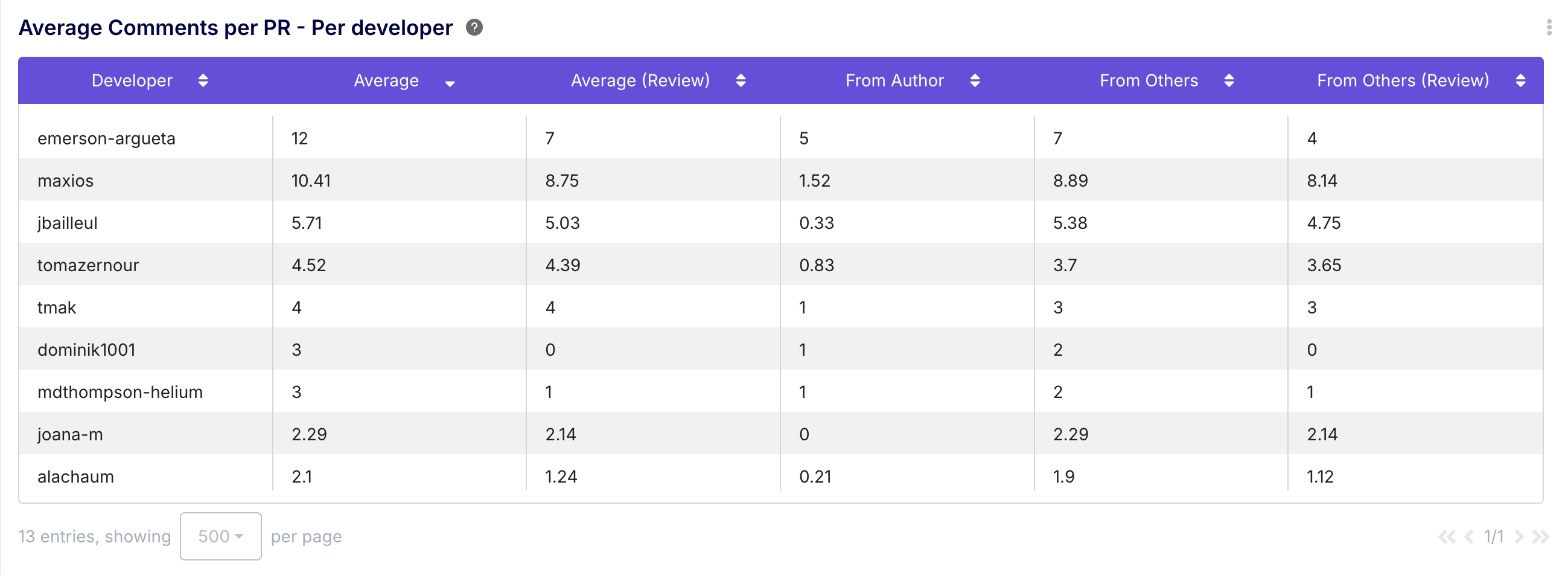
- Description: Breaks down the average comment statistics per PR for each developer, showing comments received (total, from author, from others, review-specific).
- Benefit: Provides insight into the discussion volume generated by an individual's PRs. Helps understand if certain developers' PRs consistently require more clarification or discussion, which could inform coaching or process improvements.
Average Peer Reviews per PR - Team Wide
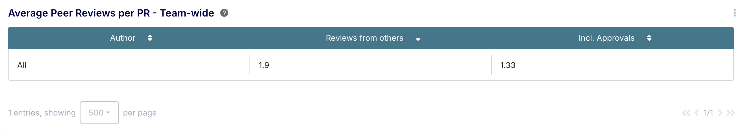
- Description: Shows the team's average number of peer reviews per PR, often broken down into total reviews and approving reviews (excluding bots).
- Benefit: Indicates the typical level of scrutiny PRs receive. A higher number generally suggests more thorough review coverage. Comparing total vs. approving reviews can hint at code quality or review strictness. Helps verify if review policies (e.g., requiring two approvals) are being met.
Average Peer Reviews per PR - per Developer
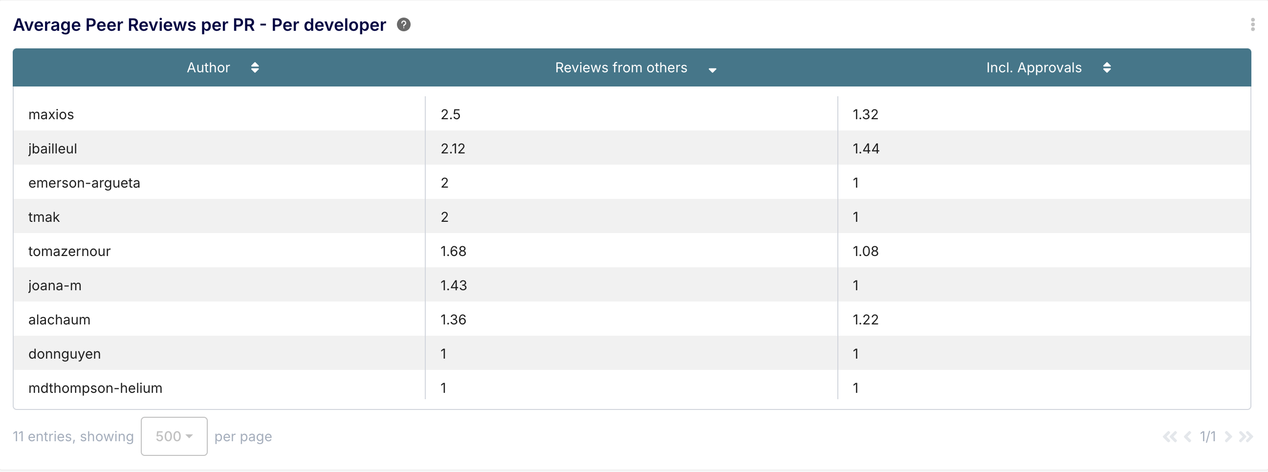
- Description: Lists the average number of peer reviews received per PR for each developer, again potentially split into total and approving reviews.
- Benefit: Shows how much review effort an individual's PRs typically require from the team. Consistently high review counts might correlate with complex changes or areas needing more upfront clarity.
Important Considerations
While powerful, the Team Benchmark dashboard requires thoughtful interpretation:
- Context is King: Metrics rarely tell the whole story. Understand the nature of the work, project complexity, and individual circumstances before drawing conclusions.
- Avoid Misuse: These metrics are for understanding and improvement, not for simplistic performance rankings or blame. LoC, in particular, is a poor measure of value.
- Focus on Trends: Look for sustained trends over time rather than reacting to short-term fluctuations.
- Use for Conversation: The primary value is facilitating constructive, data-informed discussions about workflow, collaboration, and potential improvements.
- Check Filters: Be aware of the active filters (reporting period, projects, target branches, developer exclusions) as they define the scope of the data. The defaults often focus on main branches and exclude bot activity over the past 12 months.
Conclusion: Empowering Development Teams with Insight
The Team Benchmark dashboard is a valuable tool for engineering teams and leaders seeking to understand their development processes more deeply. By providing a comparative view of individual contributions against team statistics across key areas like work volume, cycle time efficiency, and collaborative effort, it empowers teams to:
- Identify meaningful trends and outliers.
- Diagnose bottlenecks in the development lifecycle.
- Foster fairer understanding of individual contributions within the team context.
- Drive targeted improvements in process and collaboration.
When used thoughtfully and responsibly, the Team Benchmark dashboard moves beyond raw numbers, offering actionable insights to help teams continuously improve and deliver value more effectively. Start exploring the dashboard, understand the context behind the numbers, and use it to spark the right conversations within your team.