We’ve made some enhancements to Keypup’s Development Intelligence solution to facilitate your journey with us and improve your experience.
These enhancements include:
Insight Widget Designer’s enhancements
The “Configure source” step has been renamed “Select dataset” and moved to the top of the insight builder. The content of the pane was also reworked to make it more transparent that the purpose of this step is to select a dataset, not to configure fields or take any other action. The dataset fields are hidden by default - they can be displayed by clicking a link.
We no longer expand the formula input when focused to avoid distraction.
It is now possible to switch from a “large card” widget to a “board” widget and vice versa. A toaster notifies you about the actions that were taken, such as removing all columns when switching from board to “large card”.
To improve filtering, we removed duplicate custom fields for JIRA and GitHub. We also better organized custom fields inside the dropdown, with one section per app.
Displayed data increased
When working with tables, charts and KPIs, we increased the number of displayed data points from 100 to 500. This means that when grouping per week, you can now see up to 500 weeks of history (~ 9 years). When grouping per day you can now see up to 500 days (~ 1.5 years).
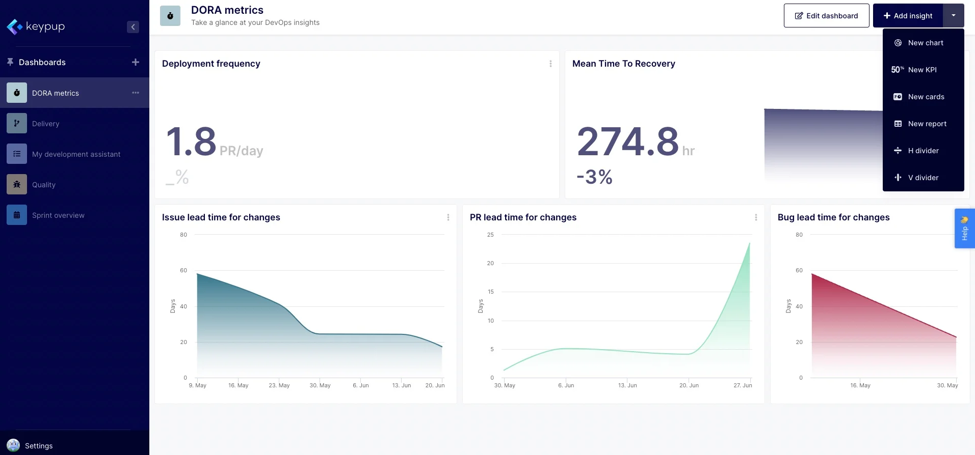
Dashboard Interface
We renamed the “Add Content” button to “Add insight”. The labels and icons of the shortcut dropdown have been reworked to be more self-descriptive.
Design improvements
Design > Loaders: All loading indicators are now consistent and use the same design.
Design > Empty insights: The legend is now hidden when an insight has no data and the placeholder content is displayed.
Have some ideas of cool features or datasets to capture? Ping us via the in-app chat or email us at [email protected].