KPIs (Key Performance Indicators) are quantifiable measures for a certain objective over time. KPIs provide teams with measurable goals to hit, such as milestones or success rates. They also allow members across the engineering organization to see how effective they are so they can identify areas for improvement.
If you're looking for a way to track your engineering team's performance, Keypup is the perfect tool. In just a few simple steps, you can create a KPI and start gathering valuable insights into your team's progress.
Here's how you can create a KPI with Keypup in 4 easy steps:
Add a KPI to a dashboard
Click on the little arrow next to the “Add chart” button on the top right corner of rany dashboard and select "Add KPI."

Select the KPI type
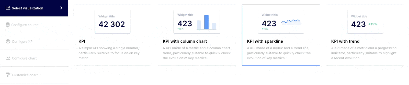
Click on the visualization that best expresses your data points. You can select from the following choices :
- Simple KPI: Select a simple KPI when you just want to express a target against a specific number, as an example, number of Pull Requests merged in a specific timeframe.
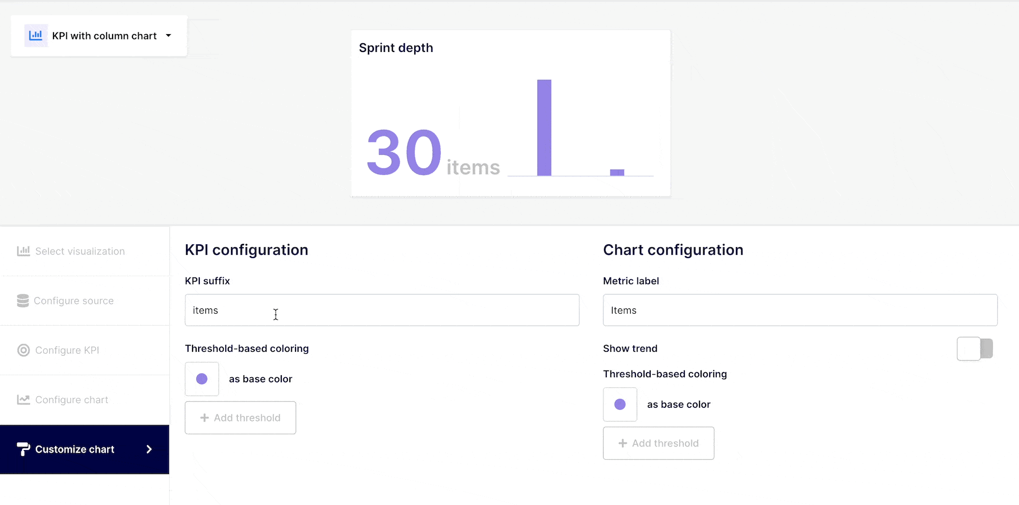
- KPI with column chart: Select a KPI with column chart to express a target against multiple variables. As an example, number of “items” addressed in a specific period by item type (PR, issues, bugs).
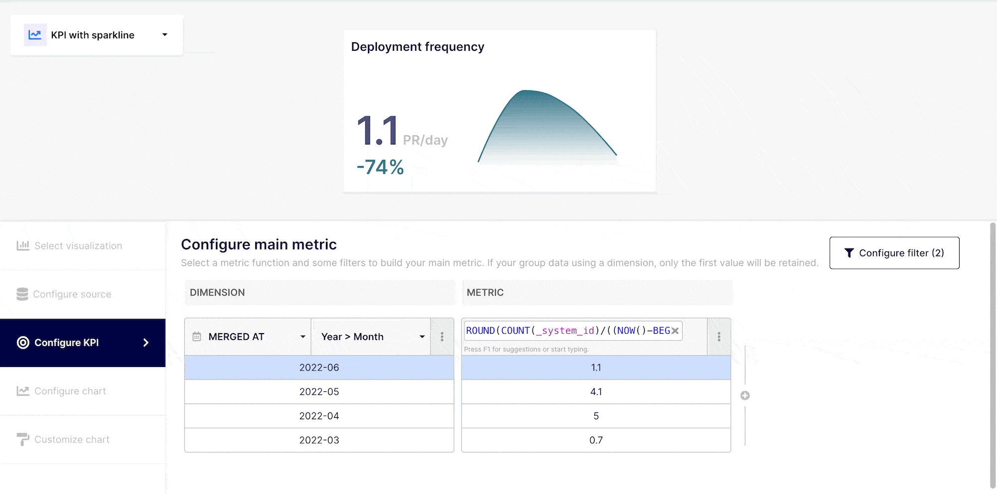
- KPI with sparkline: Use KPI with sparkline to express a value and its progression over time. As an example, you could see the number of Pull Requests merged against a specific target and how it trends over time.
- KPI with trend: KPI with trends is selected to showcase how a “target” number is trending over time and is expressed in percentage. As an example, the number of pull requests merged went up by 25% compared to the previous period.
Select data source
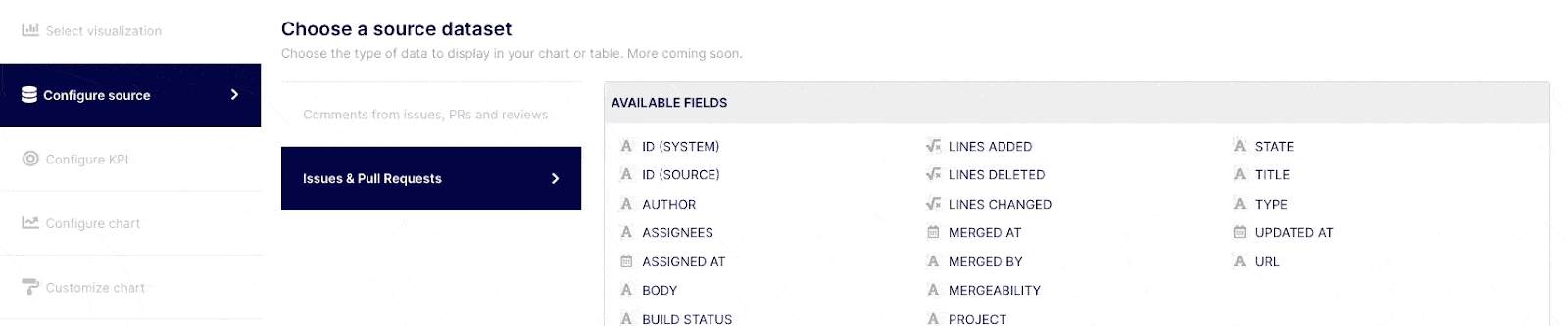
Select the "Configure source" tab from the navigation menu on the left side of the screen. Keypup grants you access to various datasets based on the applications and projects / gits you connected. You can identify the fields you can query on each dataset on the table titled "AVAILABLE FIELDS" on the right side of the screen as you select a dataset. Select the dataset containing the fields you are willing to use in your KPI.
Query your selected dataset
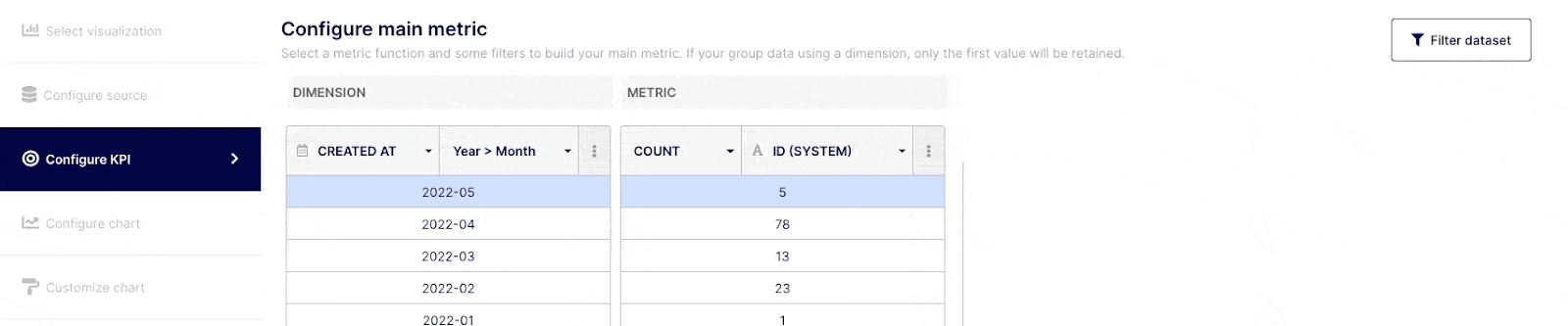
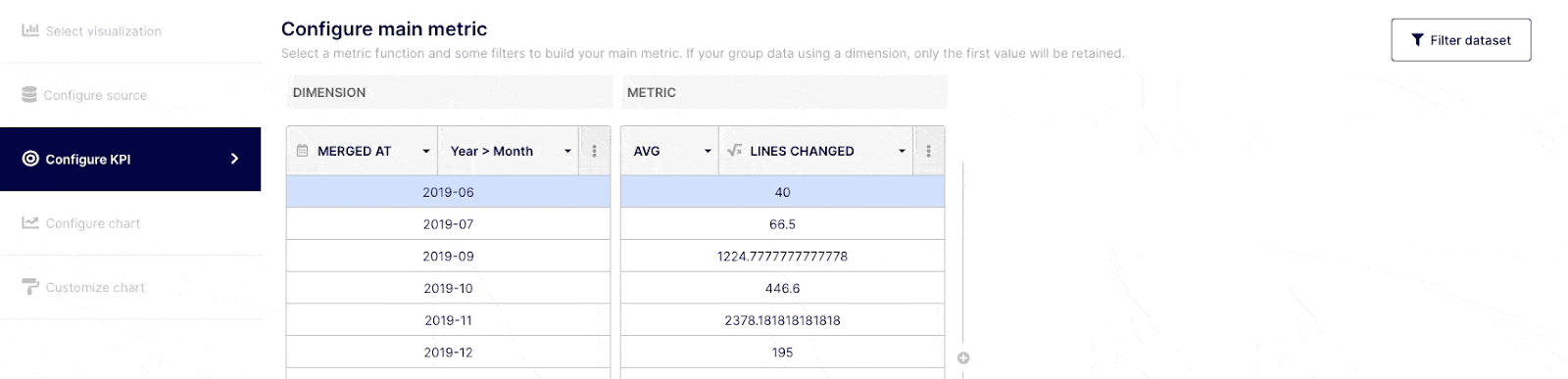
Once you have selected your KPI type and data source, you can begin building your insight by querying your dataset. Select the "Configure table" tab from the navigation menu on the left. The table will include two default columns : Dimension and Metric.
“Dimensions” are field attributes of your datasets. For example, it could be a date of merging, an author or a label, etc..
“Metrics” are the numerical values aggregated from the function applied to a specific field (Dimension).
The number of columns that are visible (Dimensions and Metrics) is determined by the visualization selected. You may add or remove dimensions and/or metrics columns by clicking on the (+) sign button on the right side of the column. To delete dimensions and/or metrics columns, click on the expand (...) button and choose "Delete".
Depending on how comfortable you are with query building, you can execute simple or complex queries. Select the field(s) you wish to query from the drop-down menu at the top of the "Dimension" column, or choose "custom formula." Choose an operator, aggregator, or "custom formula" from the drop-down menu at a Metric level.
To go further
Apply a filter (optional)
You may do a range of things with the data in your KPI. You can, if needed, create filter criterias using "AND" / "OR," commands. To accomplish this, go to the top right corner of your insight builder interface and click on the "Filter dataset" button.
Customize the trend to display (optional)
When selecting bar, sparkline or trend KPI, you will have this additional step to configure the trend you are willing to express. These selected data points to express the trend are highlighted in blue in the table.
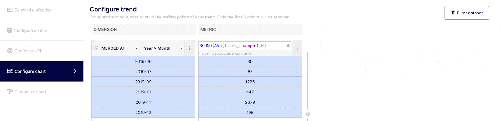
KPIs measure point-in-time performance against a target goal. When you create a bar, sparkline or trend, you should be able to associate a common data point with it. The following 3 use cases illustrate this:
KPI: Target KPI review to merge pull request = less than 2 days. The KPI will display the average time elapsed from reviewed to merged requests
You can display the trend to show:
The average time from reviewed to merged PR within the past 6 weeks in a sparkline to show a time serie of this specific event
The average reviewed to merged time by contributor in a bar chart (each bar representing a contributor)
The reviewed to merged PR period to period ratio expressed in % to check if the team is releasing faster or not over time
Customize your KPI “look & feel” (optional)
KPIs should be readily recognizable and indicate their value with a quick look. Although it is not necessary, it is suggested that you label your KPIs in accordance with value thresholds.
A high value can be a good or low indicator, based on the information you are evaluating. You could associate the color to the information you are conveying.
Any questions or tips you would like to share? You can contact us directly in the chat from your Keypup interface or use this contact form.