Compare the 5 best value stream analytics platforms for engineering leaders — Keypup, Pluralsight Flow, LinearB, Jellyfish and Swarmia — across DORA Metrics depth, cross-platform data unification, contextual analysis, customization, AI and natural language capabilities, and setup speed. Find out which value stream management platform turns Git, Jira and CI/CD data into prescriptive, actionable insights.
Liam Davis
•12 min read
Table of Contents
Your engineering team ships code across GitHub, Jira, and CI/CD pipelines every day. But when you need to answer "where is our process broken?" the data lives in five different tools that never agree. Value stream analytics platforms exist to close that gap. Choosing the right one determines whether you get contextual answers or another static dashboard collecting dust.
This article compares five value stream management analytics platforms built for engineering leaders who need DORA Metrics coverage, delivery visibility, and prescriptive recommendations. You will find evaluation criteria, feature breakdowns, and a comparison table to help you identify which platform fits your team's workflow.
Keypup leads this list because it moves past reporting into contextual analysis. The platform connects your Git and Jira data into a single source of truth and delivers prescriptive actions you can implement immediately.
Quick guide: 5 best value stream analytics platforms for engineering teams
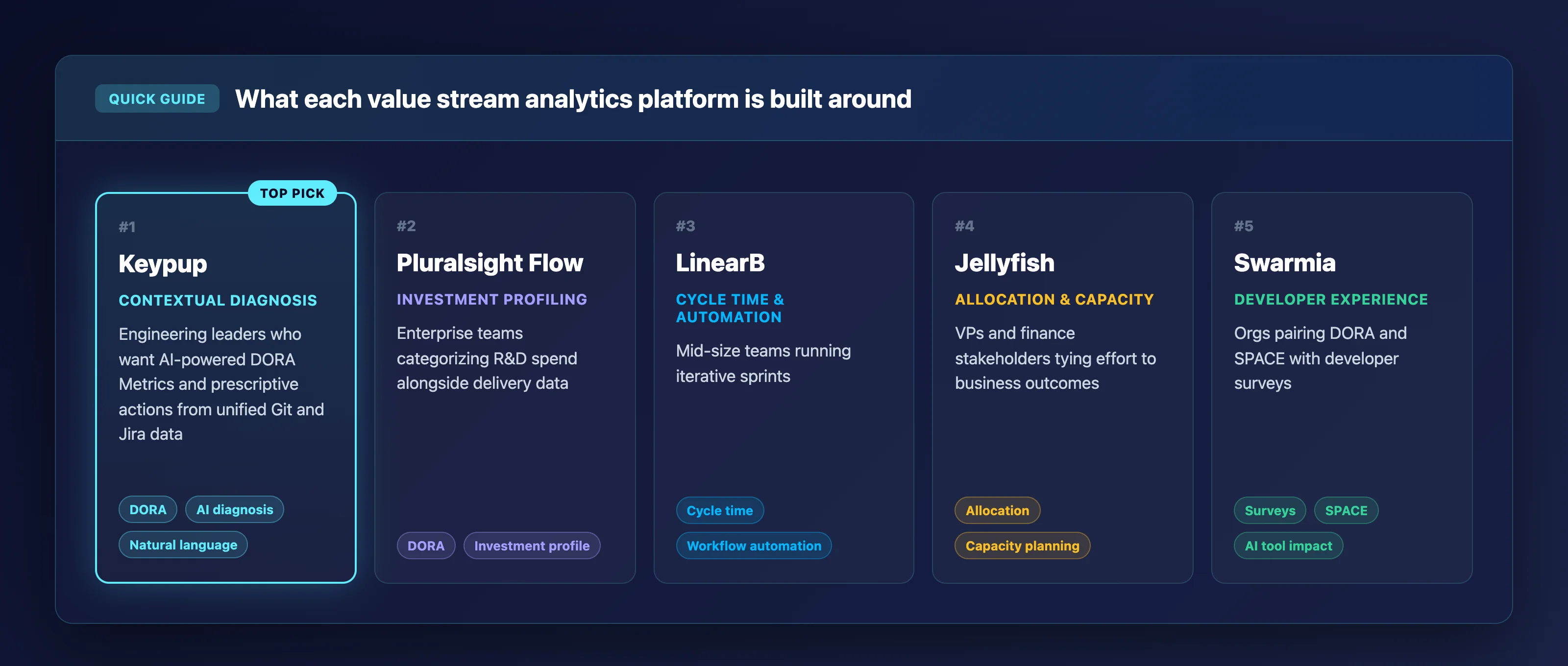
Keypup: The best overall Analytics Platform for engineering leaders who need AI-powered DORA Metrics, contextual delivery visibility, and prescriptive recommendations from unified Git and Jira data.
Pluralsight Flow: Covers DORA Metrics alongside investment profiling for enterprise teams that want to categorize R&D spending alongside delivery data.
LinearB: Tracks cycle time breakdowns and offers workflow automations geared toward mid-size dev teams running iterative sprints.
Jellyfish: Provides allocation modeling and capacity planning for VPs and finance stakeholders who need to connect engineering effort to business outcomes.
Swarmia: Focuses on developer experience surveys combined with DORA and SPACE tracking for orgs measuring AI tool impact on engineering output.
How we chose the best value stream analytics platforms
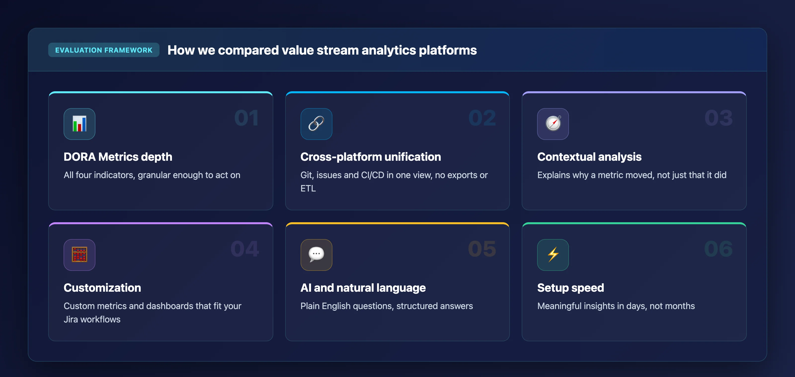
Picking the right analytics platform means understanding what actually moves the needle for your engineering team. We evaluated each platform against criteria that matter when you are trying to diagnose bottlenecks, not just visualize them.
DORA Metrics depth: Does the platform track all four DORA indicators (Deployment Frequency, Lead Time for Changes, Change Failure Rate, and Mean Time to Recovery) with enough granularity to act on the results?
Cross-platform data unification: Can the tool pull from your Git provider, issue tracker, and CI/CD pipeline into a single normalized view without manual exports or custom ETL scripts?
Contextual analysis vs. raw metrics: Does it explain why a metric moved, or does it just show a chart? Platforms that surface root causes and prescriptive actions scored higher.
Customization and flexibility: Can you define custom metrics, build tailored dashboards, and adapt the tool to your unique Jira workflows and sprint structures?
AI and natural language capabilities: Does the platform let you ask questions in plain English and receive structured, actionable answers, or does every query require manual configuration?
Integration speed and setup: How quickly can your team connect existing tools and start receiving meaningful insights? We favored platforms that deliver value in days, not months.
The 5 best value stream analytics platforms for engineering leaders
1. Keypup: Best overall value stream analytics platform for engineering teams
Keypup operates as the intelligent nervous system of your SDLC. Most platforms stop at charts and dashboards. Keypup's AI Agent translates plain English prompts into multi-insight dashboards, diagnoses bottlenecks across your entire delivery pipeline, and prescribes specific improvement actions you can track over subsequent sprints.
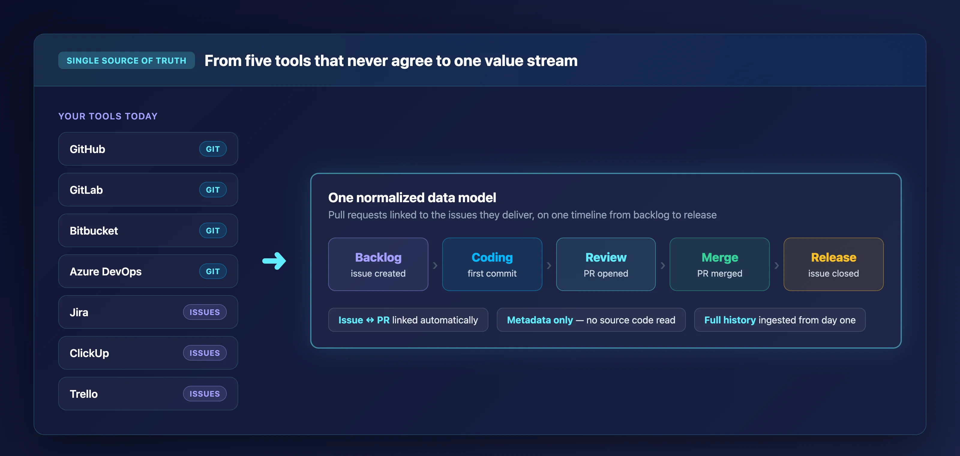
The platform unifies metadata from GitHub, GitLab, Bitbucket, Azure DevOps, Jira, ClickUp, and Trello into a single normalized data model. This Automated Contextualization means Keypup links issues to pull requests using context inference. You see the full delivery picture without manually tagging or reconciling data across systems.
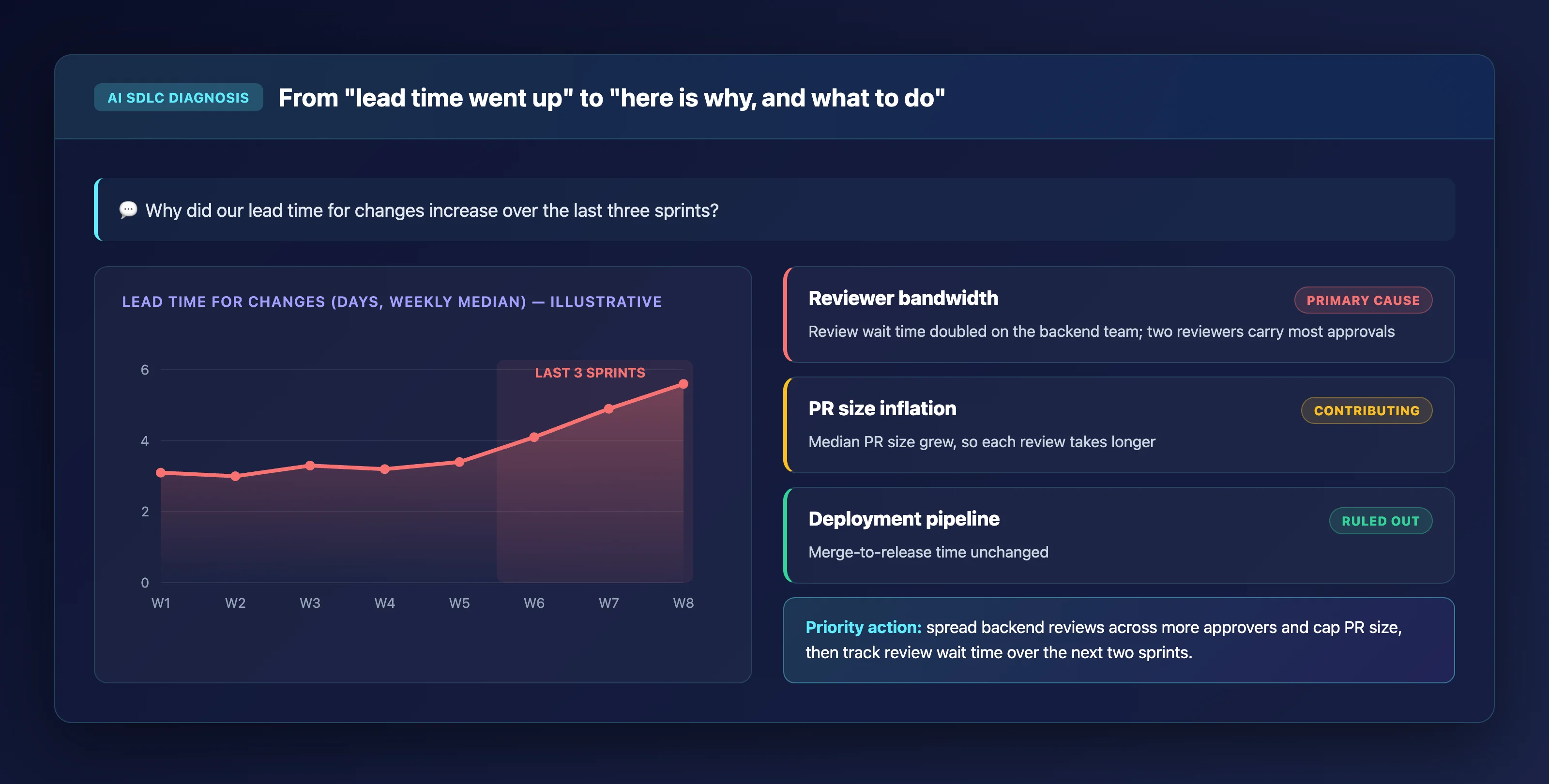
For DORA Metrics, Keypup provides turnkey dashboards covering Deployment Frequency, Lead Time for Changes, Change Failure Rate, and MTTR the moment you connect your tools. The AI SDLC Diagnosis layer then analyzes those metrics in context. It identifies whether a spike in lead time traces back to reviewer bandwidth, PR size inflation, or deployment pipeline delays.
Your proprietary source code is never read, processed, or stored. Keypup is strictly a metadata processor. The AI analyzes timestamps, pull request statuses, issue labels, and reviewer assignments. This makes it a secure, read-only layer on top of your existing stack.
Keypup features
Autonomous Prompt-to-Dashboard: Describe what you want to measure in plain English. The AI Agent builds the dashboard, writes the documentation, and sets sprint cycle filters automatically. You skip the manual query building entirely.
AI SDLC Diagnosis: Get structured analyses layered into Key Insights, Bottlenecks, Recommendations, and Priority Actions. Each diagnosis connects to specific process issues, not generic advice.
Uncapped historical trend analysis: Keypup ingests your entire project history from day one, giving you long-range baselines that make seasonal patterns and gradual process drift visible.
Custom metric definitions: Define your own calculation logic or let the AI formulate the precise formula. Exclude weekends, adjust for your branching strategy, or factor in custom Jira fields.
MCP Server integration: Query your Keypup data directly from Claude, ChatGPT, Cursor, or Gemini CLI using natural language through the Keypup MCP Server. Your metrics live wherever your team already works.
Team Benchmarking: Objectively compare teams against each other on specific habits like PR cycle time, review speed, and merge frequency with the Team Benchmark dashboard. Identify what top performers do differently and scale those patterns across the org.
Keypup pros and cons
Pros:
Delivers prescriptive analytics with contextual root-cause analysis, not just raw metric dashboards.
Connects to Git, Jira, and CI/CD tools in minutes with zero ETL and immediate DORA Metrics visibility.
Includes unlimited users, contributors, and historical data on every plan.
Cons:
The platform focuses on SDLC metadata analytics, so teams needing built-in financial capitalization reporting use it alongside existing finance tools.
Advanced AI SDLC Diagnosis capabilities are most impactful for teams with at least a few months of historical data connected.
The breadth of customization options means new users benefit from the onboarding support the team provides to unlock the platform's full depth.
2. Pluralsight Flow: Investment profiling alongside DORA reporting
Pluralsight Flow pulls data from Git and Jira to surface engineering metrics including DORA indicators and sprint movement reports. The platform includes an Investment Profile feature that categorizes engineering effort by strategic initiative, maintenance, and technical debt.
The tool also offers a Team Health Insights module that aggregates workflow signals to flag potential process issues across sprints. Pluralsight Flow integrates with Jira and Git providers, and sits within the broader Pluralsight ecosystem focused on technology workforce development alongside analytics.
Pluralsight Flow features
Investment Profile: Categorizes engineering effort into strategic buckets so you can report on where resources are allocated relative to company priorities.
Sprint Movement report: Visualizes how tickets move through sprint cycles to help identify predictability gaps and carryover patterns.
DORA Metrics integration: Offers standard DORA reporting within the Flow module to measure deployment frequency, lead time, change failure rate, and recovery time.
Pluralsight Flow pros and cons
Pros:
Combines delivery analytics with R&D investment categorization in a single platform.
Includes team health signals that flag workflow issues at the sprint level.
Integrates with the broader Pluralsight skills platform for organizations that use both.
Cons:
The analytics module is part of a larger workforce development platform, so teams focused solely on delivery analytics carry additional platform overhead.
Custom metric definitions and ad hoc querying options are more constrained compared to platforms built exclusively for engineering analytics.
Does not offer a natural language interface for querying metrics or generating dashboards from prompts.
3. LinearB: Cycle time breakdowns with workflow automation
LinearB tracks cycle time across coding, pickup, review, and deploy phases, giving engineering managers visibility into where PRs stall in the pipeline. The platform includes workflow automations that trigger actions based on metric thresholds, such as notifying reviewers when pickup time exceeds a target.
LinearB also offers industry benchmarking that lets you compare your team's DORA Metrics and cycle time against aggregated data from other organizations. The platform supports AI-powered iteration summaries that help teams run more focused retrospectives with data-driven starting points.
LinearB features
Cycle time decomposition: Breaks pull request lifecycle into coding, pickup, review, and deploy stages so you can pinpoint where delays accumulate.
Workflow automations: Configures automated nudges and actions tied to metric thresholds to reduce idle time in the PR pipeline.
Industry benchmarking: Compares your team's metrics against anonymized industry data to contextualize performance relative to peers.
LinearB pros and cons
Pros:
Provides granular cycle time breakdowns across each phase of the PR lifecycle.
Includes built-in workflow automations to reduce bottlenecks without manual intervention.
Offers AI-generated iteration summaries for retrospective discussions.
Cons:
Does not publish value stream mapping, flow metrics, or dependency mapping capabilities for end-to-end delivery visualization.
The platform's focus on PR-level metrics means broader issue lifecycle analytics require supplementary tooling.
Custom metric definitions are limited to the platform's predefined calculation models.
4. Jellyfish: Allocation modeling for engineering and business alignment
Jellyfish focuses on connecting engineering effort to business outcomes through a patented allocation model. The platform ingests data from engineering tools, calendars, finance systems, and HR platforms to give VPs of Engineering and CFOs a shared view of where developer time goes relative to company priorities.
Jellyfish includes capacity planning and delivery forecasting features that use historical performance data to predict staffing needs and flag delivery risks. The platform has accumulated a large customer dataset that powers its benchmarking and trend analysis capabilities.
Jellyfish features
Allocation modeling: Maps engineering effort against strategic initiatives, maintenance, and unplanned work using a patented allocation engine.
Capacity planning: Uses historical velocity and workload data to forecast whether current staffing can meet upcoming commitments.
Business alignment dashboards: Provides executive-ready views that translate engineering activity into investment categories that finance and product stakeholders understand.
Jellyfish pros and cons
Pros:
Provides allocation visibility that connects engineering effort to business investment categories.
Includes capacity planning and delivery forecasting based on historical performance.
Integrates calendar, HR, and finance data alongside engineering signals for broader organizational context.
Cons:
The platform's emphasis on business alignment means it offers less granularity on code-level and PR-level delivery metrics.
Implementation requires connecting multiple non-engineering data sources, which extends onboarding timelines.
Custom metric creation options are more limited for teams that need to define bespoke calculations tied to their SDLC stages.
5. Swarmia: Developer experience surveys with DORA and SPACE tracking
Swarmia combines system-level metrics with developer experience surveys to give engineering leaders both quantitative and qualitative perspectives on team health. The platform tracks DORA Metrics and supports the SPACE framework out of the box, and recently added features to measure the impact of AI coding tools on delivery speed and quality.
Swarmia's initiative tracking and investment balance features help organizations monitor cross-team projects and categorize engineering work for financial reporting. The platform also includes automatic change failure detection through application version rollbacks and PR revert identification.
Swarmia features
Developer experience surveys: Runs periodic surveys alongside system metrics so you can correlate quantitative delivery data with qualitative developer sentiment.
AI tool impact measurement: Tracks how coding assistants like Cursor, Claude Code, and Codex affect cycle time, review patterns, and deployment quality.
Automatic change failure detection: Identifies change failures by detecting version rollbacks, PR reverts, and configurable hotfix filters without manual tagging.
Swarmia pros and cons
Pros:
Combines system metrics with developer sentiment surveys for a multi-dimensional view of team health.
Includes built-in AI tool impact measurement to track how coding assistants affect delivery.
Supports both DORA and SPACE framework tracking out of the box.
Cons:
Does not offer a natural language query interface for generating ad hoc dashboards or analyses from prompts.
The platform's survey features require ongoing participation from developers, which adds process overhead to the measurement program.
Cross-platform data unification is limited to specific supported integrations rather than a universal normalized data model.
Comparison table: The best value stream analytics platforms for engineering teams
Value stream analytics platforms at a glance
Platform
AI-Powered Analysis
Natural Language Querying
Unlimited Historical Data
KeypupTop pick
AI-Powered AnalysisPrescriptive AI SDLC Diagnosis
Natural Language Querying
Unlimited Historical Data
Pluralsight Flow
AI-Powered Analysis
Natural Language Querying
Unlimited Historical Data
LinearB
AI-Powered AnalysisIteration summaries only
Natural Language Querying
Unlimited Historical Data
Jellyfish
AI-Powered Analysis
Natural Language Querying
Unlimited Historical Data
Swarmia
AI-Powered Analysis
Natural Language Querying
Unlimited Historical Data
How do DORA Metrics help engineering leaders evaluate delivery performance?
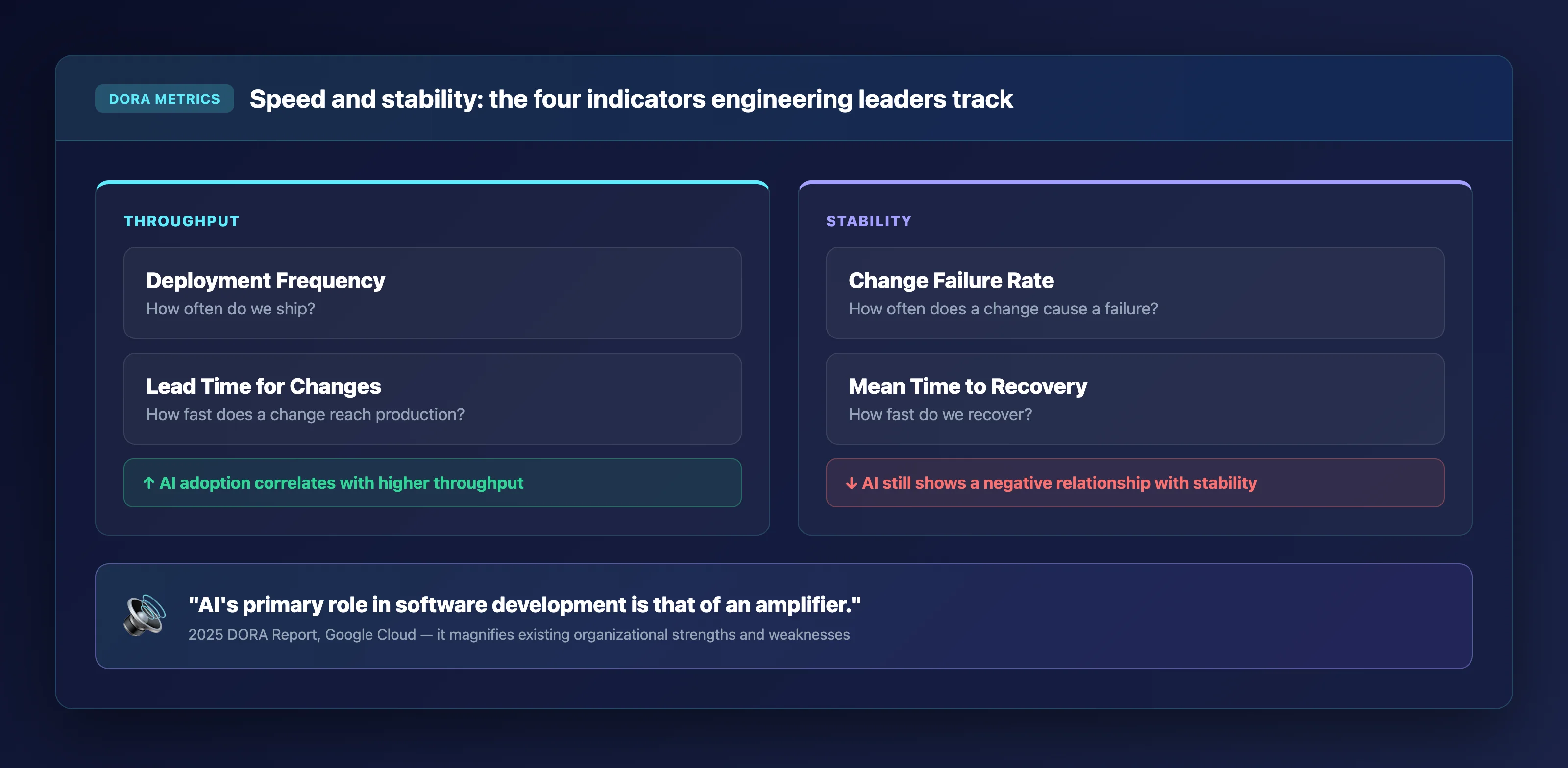
DORA Metrics give you four specific indicators that measure both the speed and stability of your software delivery process. Deployment Frequency and Lead Time for Changes capture throughput, while Change Failure Rate and Mean Time to Recovery measure the quality and resilience of what you ship.
The 2025 DORA Report from Google Cloud confirmed that AI adoption now correlates positively with software delivery throughput. However, AI continues to show a negative relationship with delivery stability. According to the 2025 report, "AI's primary role in software development is that of an amplifier" that magnifies existing organizational strengths and weaknesses.
This means tracking DORA Metrics alongside Value Stream Management data is critical. Raw deployment frequency numbers tell you what happened. Contextual analysis layered on top of those numbers tells you why it happened and what to change. Keypup's DORA and SPACE framework support connects these indicators to specific process stages so you can diagnose root causes rather than just measure symptoms.
What should you look for when comparing value stream analytics platforms?
Start with data unification. If the platform cannot normalize your Git, issue tracker, and CI/CD data into a single model, you will spend hours manually reconciling metrics across systems. Engineering teams without automated contextualization spend an average of 4.5 hours per week per manager simply reconciling Git and Jira data.
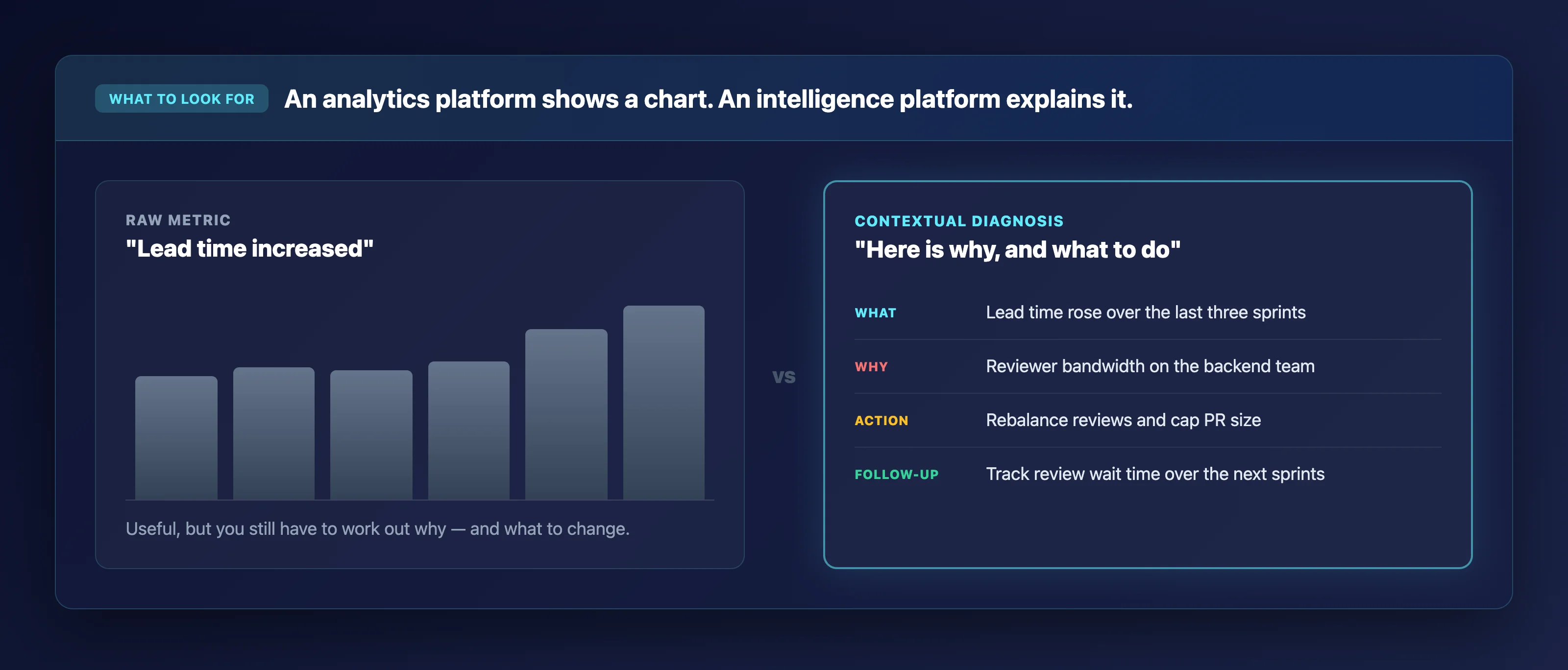
Next, evaluate whether the tool offers contextual analysis or raw metric display. A chart showing that your lead time increased is useful. A diagnosis that traces that increase to reviewer bandwidth constraints on your backend team is actionable. The difference between these two outputs separates analytics platforms from intelligence platforms.
Finally, consider how the platform handles customization. Every engineering organization runs different Jira workflows, branching strategies, and sprint cadences. Platforms that force you into rigid, predefined metric models will always leave blind spots in the areas where your process is most unique. Look for tools that let you measure what matters to your team specifically.
Why Keypup is the best value stream analytics platform for engineering leaders
Keypup delivers what static dashboards and rigid reporting tools cannot. It provides an autonomous intelligence layer that diagnoses your SDLC, prescribes targeted improvements, and tracks whether those improvements work. The shift from "here is your data" to "here is what your data means and what to do next" is what separates an analytics tool from an engineering intelligence platform.
The Automated Contextualization engine links your Git commits to Jira issues using inference, eliminating the manual reconciliation that fragments most analytics programs. Combined with the Team Benchmarking capability, you can identify what your highest-performing teams do differently and replicate those patterns across the organization.
Connect your Jira and GitHub to Keypup in minutes and ask the AI Agent for your first cross-platform dashboard today. No ETL. No configuration delays. No months-long integration projects. Connect, prompt, and start improving your delivery pipeline.
FAQs about value stream analytics platforms
What are value stream analytics platforms used for?
Value stream analytics platforms track and analyze the full software delivery lifecycle from code commit to production deployment. Keypup unifies data from your Git provider, issue tracker, and CI/CD tools into a normalized model, then applies AI analysis to surface bottlenecks and prescribe specific process improvements your team can act on immediately.
Which DORA Metrics should engineering leaders track first?
Start with Deployment Frequency and Lead Time for Changes to establish a throughput baseline, then add Change Failure Rate and MTTR to measure stability. Keypup provides turnkey DORA Metrics dashboards the moment you connect your tools, so you can track all four indicators from day one without manual configuration.
Can value stream analytics replace manual sprint retrospectives?
Analytics platforms complement retrospectives by providing objective data that grounds the discussion. Instead of relying on memory and anecdotes, your team can review actual cycle time breakdowns, PR bottleneck patterns, and sprint velocity trends. Keypup's AI Agent generates structured analyses that give retrospectives a data-driven starting point.
How long does it take to set up a value stream analytics platform?
Setup time varies significantly. Keypup connects to your Git and Jira tools in minutes and begins ingesting data immediately, with DORA Metrics and delivery dashboards available right after connection. Other platforms may require weeks of integration work depending on data source complexity and custom configuration needs.
Do value stream analytics platforms access source code?
Reputable platforms operate on metadata only. Keypup is strictly a metadata processor that analyzes timestamps, pull request statuses, issue labels, and reviewer assignments. Your proprietary source code is never read, processed, or stored, making Keypup a secure read-only layer on top of your existing development stack.
Ready to Transform Your Analytics?
Join teams already using AI to make data-driven decisions faster than
ever.
Ten-line pull requests get twenty comments. Two-thousand-line pull requests get "LGTM" in four minutes. Learn what engineering leaders on Reddit say about rubber-stamp code reviews in large organizations, why the problem stays invisible, and how Keypup MCP uses pull request size, review timestamps, approvals and comments to measure it repository by repository.
Enterprise Jira backlogs grow every month until nobody trusts them: thousands of zombie tickets, year-old "High" priorities and grooming sessions that change nothing. Learn what engineering leaders on Reddit say about backlog bankruptcy, why the problem stays invisible, and how Keypup MCP uses issue age, workflow history, priority, resolution and linked pull requests to measure it and plan a reset.
Story points are supposed to make delivery predictable, yet an 8-point issue rarely takes much longer than a 3-pointer and points inflate quarter after quarter. Learn what engineering leaders on Reddit say about story points, why the estimation gap stays invisible in enterprise reporting, and how Keypup MCP compares Jira story points with workflow history, sprints and linked pull requests to measure it.