6 Best Engineering Metrics Software for Board Reporting (2026)
Compare the 6 best engineering metrics software for board reporting in 2026 — Keypup, Swarmia, Code Climate Velocity, Jellyfish, Faros and LinearB — on board-ready reporting clarity, business context mapping, non-technical accessibility, DORA Metrics, customization and AI capabilities. Learn which metrics belong in an engineering board report and how to translate them into language your board understands.
Liam Davis
•13 min read
Table of Contents
Your board doesn't care about commit counts. They want to know whether engineering is delivering the strategy, how much it costs, and what's at risk. That gap between raw metrics and board-ready reporting is where most analytics tools fall short.
Keypup translates your Git and Jira data into engineering metrics software built for exactly this problem. It connects development activity to business outcomes so you can walk into your next board meeting with answers, not spreadsheets.
This article compares six platforms on their ability to turn engineering data into reports that non-technical stakeholders actually understand. You'll find detailed reviews, a feature comparison, and guidance on choosing the right tool for your team.
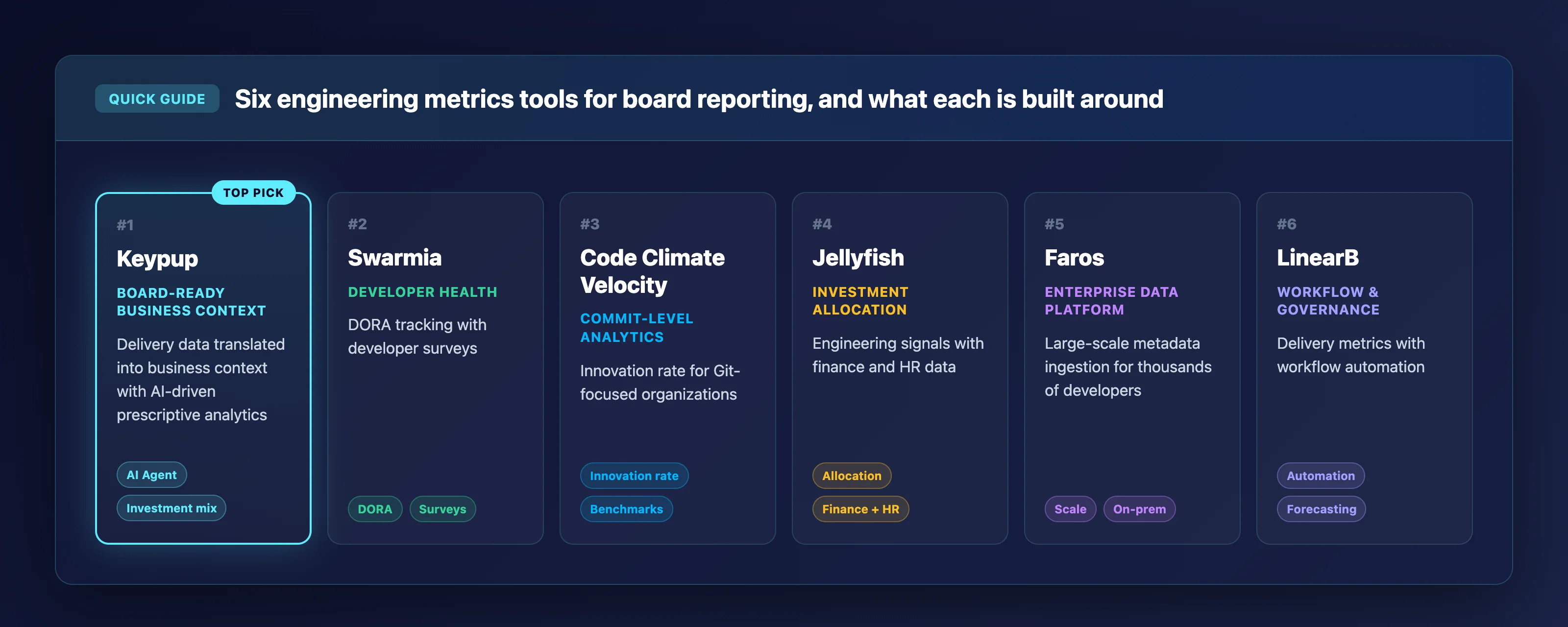
Quick guide: 6 best engineering metrics software for board reporting
Keypup: The best engineering intelligence platform for translating delivery data into board-ready business context using AI-driven prescriptive analytics.
Swarmia: Combines DORA tracking with developer surveys for teams that want health metrics alongside delivery data.
Code Climate Velocity: Provides commit-level analytics and innovation rate tracking for Git-focused engineering organizations.
Jellyfish: Contextualizes engineering signals with finance and HR data for investment allocation reporting.
Faros: An enterprise-grade data platform for organizations with thousands of developers needing large-scale metadata ingestion.
LinearB: Pairs delivery metrics with workflow automation and governance features for process-driven teams.
How we chose the best engineering metrics software for board reporting
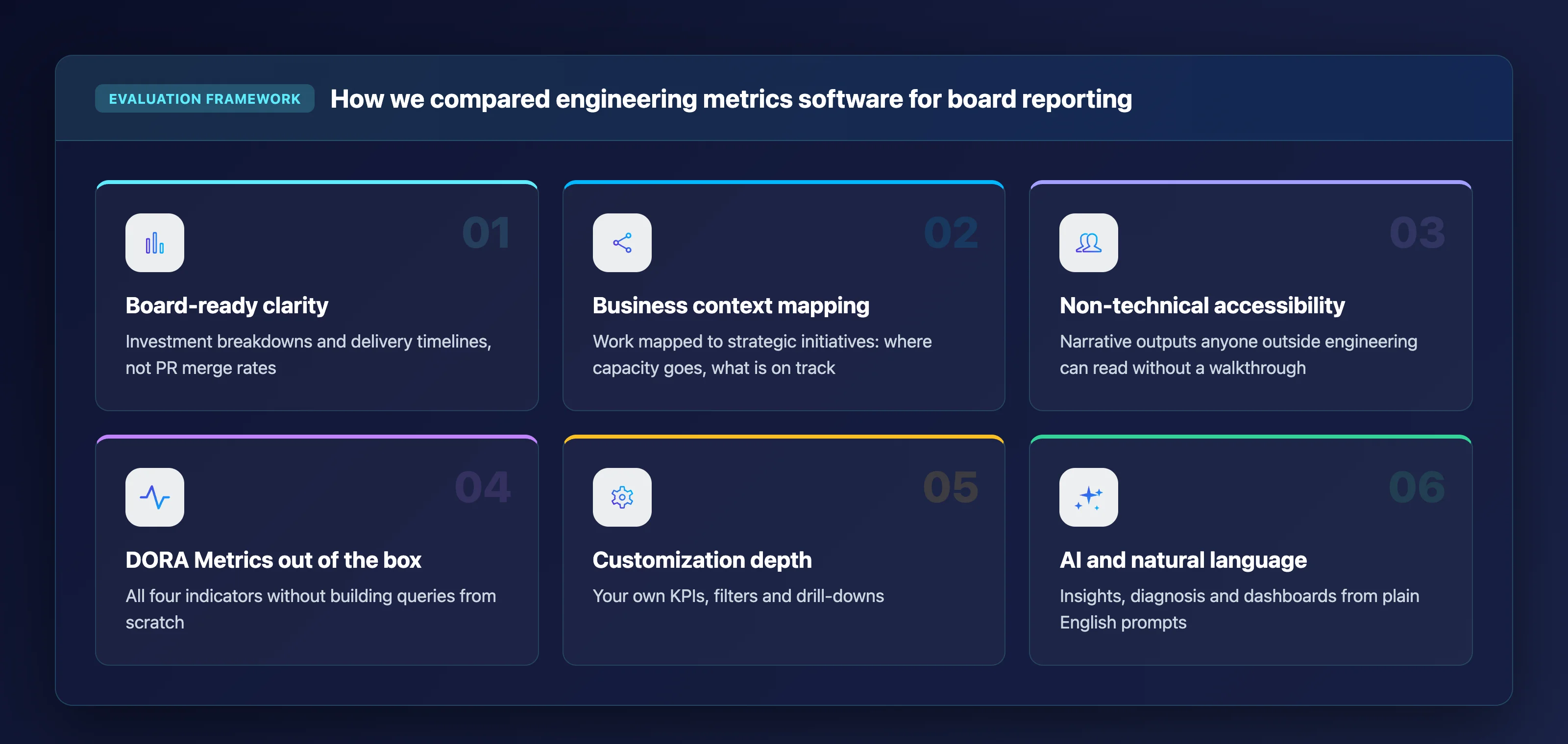
We evaluated each platform with a specific lens: how well does it help you communicate engineering performance to people who don't live in Git? Here's what guided our selection.
Board-ready reporting clarity: Can the platform produce reports that connect engineering activity to business outcomes without requiring manual translation? Your board needs investment breakdowns and delivery timelines, not PR merge rates.
Business context mapping: Does the tool map development work to strategic initiatives, so you can show where capacity goes and whether projects are on track?
Non-technical stakeholder accessibility: Can someone outside of engineering interpret the dashboards and reports without a walkthrough? Clean, narrative-style outputs matter more than dense metric grids.
DORA Metrics out of the box: Can you track Deployment Frequency, Lead Time for Changes, Change Failure Rate, and MTTR without building custom queries from scratch?
Customization depth: Can you define your own KPIs, filters, and drill-downs to match how your organization measures performance? Every engineering team operates differently.
AI and natural language capabilities: Does the platform use AI to generate insights, diagnose bottlenecks, or produce dashboards on demand from plain English prompts?
The 6 best engineering metrics software for board reporting
1. Keypup: Best overall engineering metrics software for board reporting
Keypup is an autonomous NLP engineering intelligence platform that unifies Git and ticketing metadata into a single normalized data model. Instead of forcing you to build dashboards manually, Keypup lets you describe what you need in plain English. The AI Agent then generates a multi-insight dashboard complete with filters, drill-downs, and auto-generated documentation.
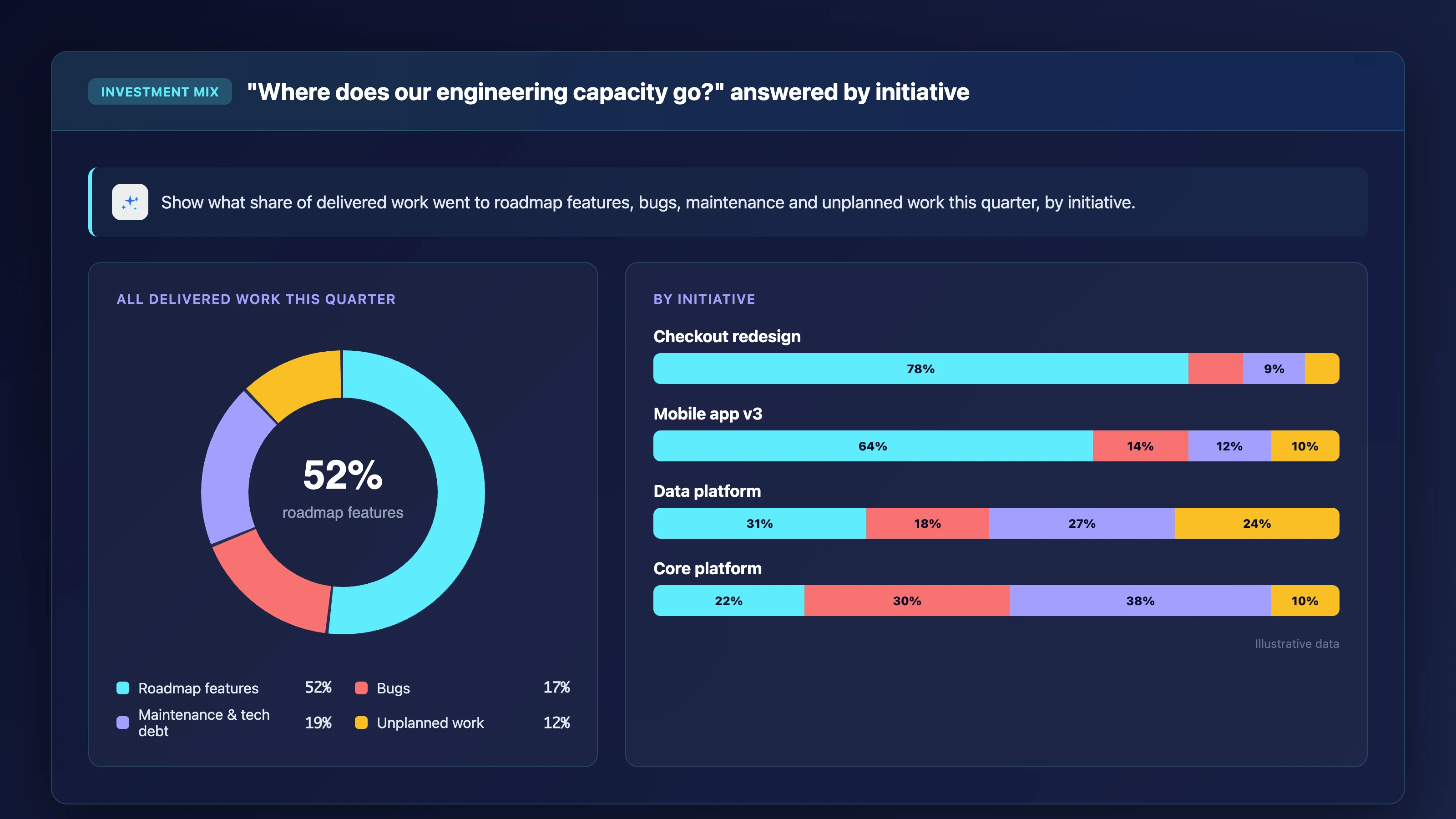
What makes Keypup stand out for board reporting is its ability to translate raw engineering activity into business context. You can show your board where capacity goes across roadmap features, maintenance, and unplanned work, broken down by initiative, team, or product line.
The platform's prescriptive analytics layer goes beyond visualization. Keypup performs AI SDLC Diagnosis, identifying systemic bottlenecks in your delivery lifecycle and recommending concrete improvements organized into Key Insights, Bottlenecks, Recommendations, and Priority Actions.
Keypup automatically enriches data by linking issues to pull requests using Automated Contextualization. This eliminates the hours engineering managers spend reconciling Git and Jira data to build status reports for leadership.
The platform provides turnkey DORA Metrics dashboards, Team Benchmarking, and Issue Cycle Time tracking immediately after connection. You also get uncapped historical trend analysis, so there are no arbitrary limits on how far back you can explore your data.
Keypup features
Prompt-to-Dashboard Infrastructure: Describe a reporting need in natural language and receive a fully built dashboard aligned to your sprint cycles. This replaces hours of manual widget configuration and means you can generate a board-specific view in seconds.
AI SDLC Diagnosis with Prescriptive Actions: The AI Agent narrates your development story in plain English, identifies process bottlenecks, and suggests specific improvement steps. You get a structured analysis you can share directly with stakeholders.
Automated Contextualization: Keypup infers the semantic relationship between Git commits, pull requests, and Jira issues automatically. No manual tagging or ETL pipelines required, so your reports reflect the full delivery picture from day one.
Investment Mix Reporting: See what percentage of delivered work goes to roadmap features, bugs, maintenance, and unplanned work. This is the exact breakdown your board wants when they ask "where does our engineering capacity go?"
Universal Integration with Zero Friction: Connect GitHub, GitLab, Bitbucket, Azure DevOps, Jira Cloud, Jira Data Center, ClickUp, and Trello through read-only integrations that ingest your full project history.
MCP Server and API Access: Query your engineering data through Claude, ChatGPT, or other AI assistants via the MCP Server, or build custom workflows using the Keypup API.
Keypup pros and cons
Pros:
The AI Agent generates complete dashboards and prescriptive analysis from a single plain English prompt, reducing the time from question to board-ready insight to seconds.
Automated Contextualization links Git and ticketing data without manual mapping, so your reports reflect the full delivery picture from the start.
Unlimited users, contributors, and historical data on every plan means you never have to choose between inviting stakeholders and managing costs.
Cons:
The platform focuses on SDLC metadata analytics and does not include built-in developer surveys. You can integrate survey data from other tools through the API.
Teams accustomed to rigid, pre-configured dashboards may need a short adjustment period to take full advantage of the configurable query engine.
Cross-platform diagnosis delivers its deepest insights when both Git and ticketing tools are connected. Teams using only one data source will still see value, though the full contextualization layer is where Keypup adds the most.
2. Swarmia: Developer health tracking alongside delivery metrics
Swarmia provides a measurement framework called BUILD that covers AI adoption, effectiveness, and return on engineering. The platform tracks DORA metrics, PR cycle time, and issue metrics alongside built-in developer surveys. This combined view gives you both system-generated data and qualitative team feedback in one place.
Swarmia also offers initiative tracking and engineering benchmarks that compare your team's metrics against industry averages. The platform supports both the DORA and SPACE frameworks natively, and it includes automatic change failure detection through pull request reverts and rollback analysis.
Swarmia features
BUILD Measurement Framework: A structured approach covering AI adoption, developer productivity, quality, and business value of engineering investment.
Built-in Developer Surveys: Captures developer sentiment data alongside system metrics, giving you a combined view of team health.
Automatic Change Failure Detection: Identifies DORA change failures from application rollbacks, PR reverts, and configurable hotfix filters.
Swarmia pros and cons
Pros:
Includes a structured measurement framework that helps teams choose which metrics to track first.
Built-in surveys complement system metrics with qualitative developer feedback.
Supports both DORA and SPACE framework tracking natively.
Cons:
Does not offer autonomous dashboard generation from natural language prompts.
Custom KPI creation requires working within predefined metric categories rather than writing open-ended queries.
Git-to-ticketing data integration uses standard linking methods without AI-driven semantic contextualization.
3. Code Climate Velocity: Commit-level analytics for Git-centric teams
Code Climate Velocity ingests data from Git repositories to surface commit-level analytics, code review metrics, and team productivity patterns. The platform tracks metrics like Innovation Rate, which measures the percentage of code changes that represent new functionality rather than edits to existing code. This helps you distinguish between maintenance effort and new feature development.
Velocity also includes PR cycle time tracking, review cycles analysis, and issue throughput metrics. The platform uses data from thousands of engineering organizations to provide benchmark comparisons, so you can see how your team's patterns compare to industry norms.
Code Climate Velocity features
Innovation Rate Tracking: Measures the portion of code changes that represent new code versus maintenance, helping you report on how much engineering time goes toward new value.
PR Activity and Review Metrics: Tracks pull request success rates, review cycles, and pushes per day to give visibility into code review bottlenecks.
Industry Benchmarks: Compares your team's metrics against aggregated data from other engineering organizations.
Code Climate Velocity pros and cons
Pros:
Provides granular commit-level visibility into how engineering time is distributed between new features and maintenance.
Includes industry benchmark data that helps contextualize your team's metrics for stakeholders.
Tracks multiple code review health indicators in a single view.
Cons:
The platform focuses primarily on Git data and does not natively unify ticketing or project management metadata.
Does not include AI-driven analytics or natural language querying capabilities.
Custom KPI configuration is limited compared to platforms with open formula builders.
4. Jellyfish: Business alignment reporting for cross-functional leadership
Jellyfish integrates engineering tool data with information from calendars, finance, and HR systems. This combination allows you to report on how development effort aligns with business priorities. The platform includes a Data Hub with customizable dashboards, AI-assisted custom queries, and a patented allocations model that maps engineering work to financial categories.
Jellyfish has accumulated a large customer dataset that it uses for industry benchmark comparisons. The platform also offers natural language querying for engineering data and tracks DORA metrics alongside investment allocation views.
Jellyfish features
Business Alignment Reporting: Contextualizes engineering signals with finance and HR data to demonstrate development effort allocation to stakeholders.
Data Hub: Combines DORA metrics, AI impact data, and custom metrics in extensible dashboards with flexible calculation logic.
AI-Assisted Custom Queries: Uses natural language to answer questions about engineering data with contextual responses.
Jellyfish pros and cons
Pros:
Integrates business data (finance, HR, calendars) with engineering signals for cross-functional reporting.
Includes a patented allocations model used for investment and resource alignment analysis.
Has a large customer dataset that provides industry benchmark comparisons.
Cons:
Requires additional data source connections beyond standard Git and ticketing tools to deliver its full value.
Git-to-ticketing data linking relies on standard field matching rather than AI-driven semantic inference.
Does not generate prescriptive improvement recommendations based on SDLC diagnosis.
5. Faros: Enterprise-scale data infrastructure for large engineering organizations
Faros is built for large engineering organizations that need to ingest and analyze terabytes of engineering metadata across thousands of developers. The platform includes analytics, AI-powered productivity tools, customizable dashboards, and engineering catalogs that unify HR and service data into a single navigable source.
Faros also offers an Experiments framework for measuring the impact of AI program changes with structured before-and-after analysis. The platform provides on-premises deployment options for organizations with strict data residency requirements, along with role-based experiences that surface relevant dashboards for different stakeholders.
Faros features
Enterprise-Scale Data Infrastructure: Handles thousands of engineers and millions of data points with dedicated monitoring for data freshness and feed health.
Experiments Framework: Measures the impact of AI program changes with structured before-and-after analysis across engineering metrics.
Engineering Catalogs: Unifies scattered HR and service data into a navigable source of truth for engineering operations.
Faros pros and cons
Pros:
Handles enterprise-scale data volumes with dedicated infrastructure for performance and compliance.
Includes AI-powered PR comment classification that categorizes code review feedback automatically.
Offers on-premises deployment options for organizations with strict data residency requirements.
Cons:
Designed for enterprises with large engineering organizations, and smaller teams may find the setup requirements more involved.
Natural language querying and autonomous dashboard generation are not core platform features.
Connecting all required data sources across code, HR, and service catalogs takes more initial configuration.
6. LinearB: Workflow automation paired with delivery metrics
LinearB connects Git and project management data to provide visibility into engineering delivery. The platform includes a Metrics Builder, project delivery trackers, and resource allocation reports that break down where engineering time goes across roadmap, customer, and maintenance work. LinearB also offers AI code review capabilities and DevEx surveys.
The platform includes forecasting capabilities that predict delivery timelines based on historical patterns. LinearB has an MCP Server for building custom reports and recently added integrations for AI coding tools. Cost capitalization features are also available for teams that need to categorize engineering effort for financial reporting.
LinearB features
Metrics Builder: Creates custom metrics views using Git and project management data, filtered by team, repository, or time period.
Project Delivery Trackers: Monitors progress across multi-repo, multi-team initiatives with combined Git and PM-based tracking.
Resource Allocation Reports: Visualizes where engineering effort goes across roadmap, customer, maintenance, and unplanned work categories.
LinearB pros and cons
Pros:
Includes workflow automation and governance features alongside analytics.
Offers DevEx surveys to capture qualitative developer sentiment data.
Provides forecasting tools that predict delivery timelines based on historical team behavior.
Cons:
Custom KPI configurability requires using the Metrics Builder rather than writing native formulas against a unified data schema.
Does not offer fully autonomous dashboard generation from natural language prompts.
AI code review features and advanced analytics are available on higher-tier plans only.
Comparison table: The best engineering metrics software for board reporting
Engineering metrics software for board reporting at a glance
Platform
AI Dashboard Generation
Git-to-Ticketing Semantic Linking
Uncapped Historical Data
KeypupTop pick
AI Dashboard Generation
Git-to-Ticketing Semantic Linking
Uncapped Historical Data
Swarmia
AI Dashboard Generation
Git-to-Ticketing Semantic Linking
Uncapped Historical Data
Code Climate Velocity
AI Dashboard Generation
Git-to-Ticketing Semantic Linking
Uncapped Historical Data
Jellyfish
AI Dashboard Generation
Git-to-Ticketing Semantic Linking
Uncapped Historical Data
Faros
AI Dashboard Generation
Git-to-Ticketing Semantic Linking
Uncapped Historical Data
LinearB
AI Dashboard Generation
Git-to-Ticketing Semantic Linking
Uncapped Historical Data
How do you translate engineering metrics into language your board understands?
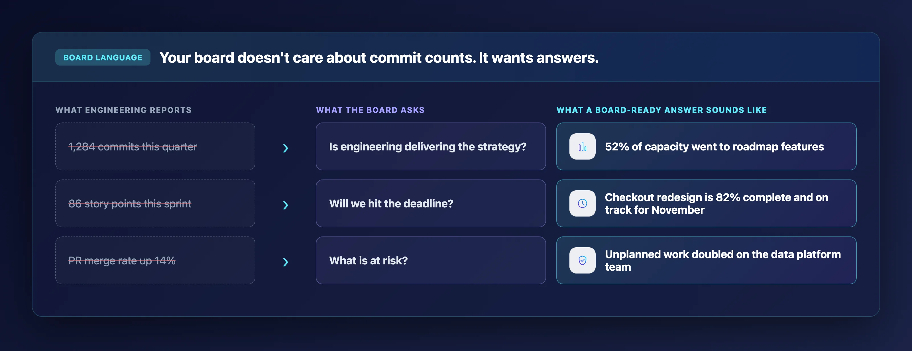
Board members evaluate engineering the same way they evaluate other business functions: through the lens of investment, return, and risk. The challenge is mapping delivery data to those categories without losing the nuance that makes the metrics meaningful.
Start by framing engineering output in terms of capacity allocation. Show where your team's effort goes across strategic initiatives, maintenance, and unplanned work. This gives your board a portfolio-style view they already know how to read.
Next, connect delivery milestones to business timelines. Instead of reporting sprint velocity, report on initiative completion percentage against committed deadlines.
A statement like "the checkout redesign is 82% complete and on track for the November deadline" communicates more than "we completed 86 story points this sprint." A NERVICO study on technology board reports found that 73% of board members admit they do not fully understand the technology reports they receive, reinforcing how important it is to translate metrics into business language.
What metrics should you include in an engineering board report?
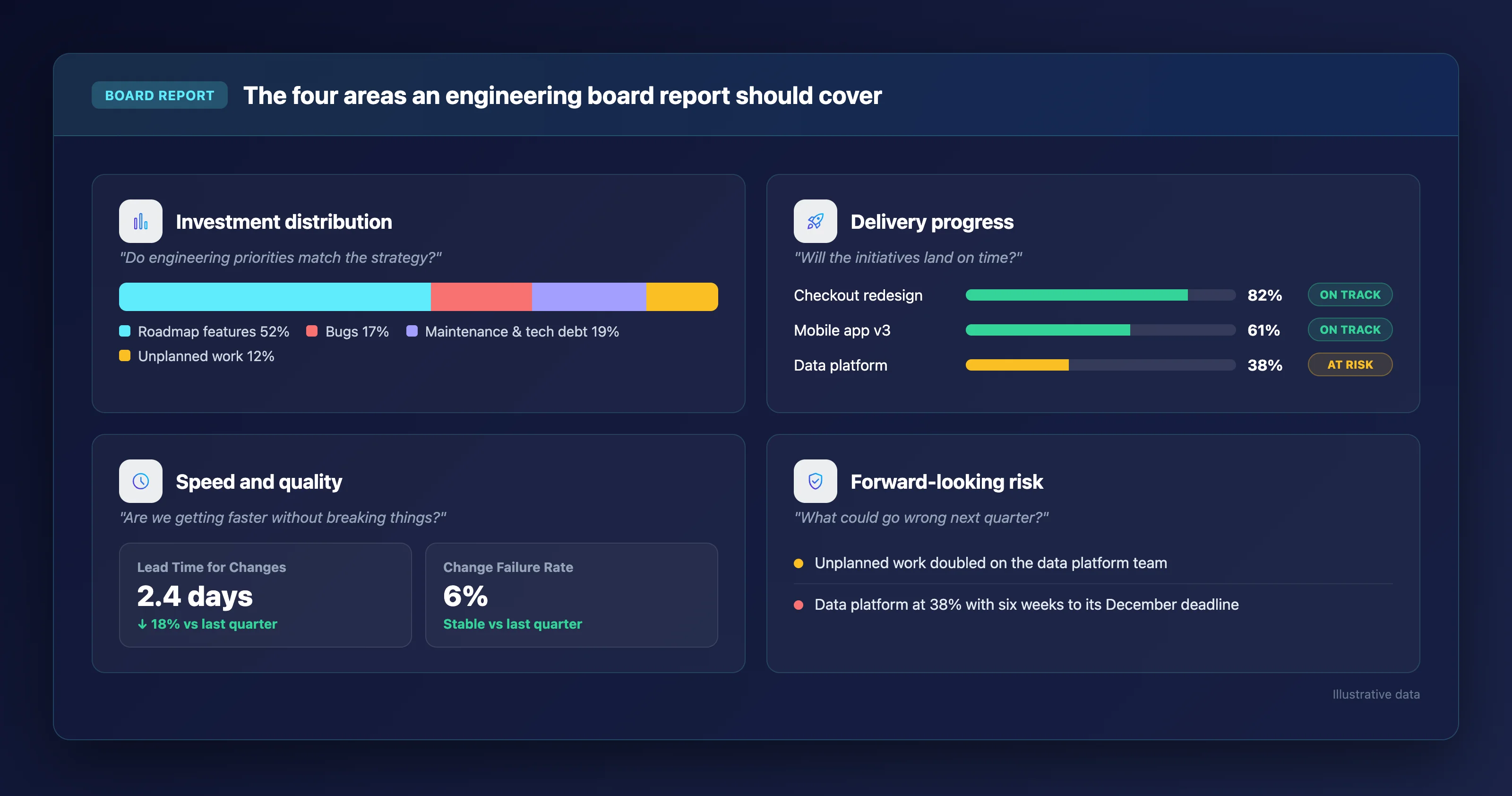
Your board report should cover four areas: investment distribution, delivery progress, speed and quality indicators, and forward-looking risk signals. Each one answers a question your board is already thinking about.
Investment distribution shows where engineering capacity goes. Break this down by initiative type (roadmap features, technical debt reduction, maintenance, unplanned work) so your board can evaluate whether engineering priorities match business strategy.
Delivery progress ties engineering work to specific business outcomes. Report on initiative-level completion rather than ticket-level throughput.
Include DORA Metrics like Lead Time for Changes and Change Failure Rate to demonstrate whether your team is accelerating delivery without compromising stability. According to the 2025 DORA Report from Google Cloud, AI amplifies what is already there, meaning teams with mature workflows see compounding gains while struggling teams see existing problems intensified. This makes tracking your baseline DORA Metrics essential before introducing new tools.
Keypup provides turnkey Issue Cycle Time and DORA dashboards that surface these indicators automatically. For a deeper look at what to report and how, see our guide to board reporting for engineering leaders.
Why Keypup is the best engineering metrics software for board reporting
Keypup solves the core problem that makes board reporting painful: the disconnect between raw engineering activity and the business context your stakeholders need. While other platforms give you metrics, Keypup gives you the narrative that connects those metrics to strategic outcomes.
The AI Agent is what makes Keypup uniquely effective for this use case. You describe a reporting need in plain English, and the platform generates a complete dashboard with investment mix breakdowns, initiative tracking, and prescriptive analysis. This means you can prepare for a board meeting in minutes rather than spending days assembling slides from multiple tools.
Keypup connects to your existing stack in minutes with zero configuration overhead. GitHub, GitLab, Bitbucket, Azure DevOps, Jira Cloud, Jira Data Center, ClickUp, and Trello are all supported through read-only integrations. Your source code is never accessed, processed, or stored.
Every plan includes unlimited users, contributors, and full historical data. Invite your entire leadership team to explore dashboards directly, and use uncapped historical trends to show how engineering performance has evolved quarter over quarter. Start your free trial and see how Keypup translates your engineering data into the business context your board expects.
FAQs about engineering metrics software for board reporting
What is engineering metrics software?
Engineering metrics software unifies data from Git repositories, project management tools, and deployment pipelines to give you visibility into delivery performance. Keypup takes this further by using an AI Agent that translates raw metadata into prescriptive insights and custom dashboards you can share with non-technical stakeholders.
Which DORA Metrics matter most for board reporting?
Lead Time for Changes and Change Failure Rate are the two metrics boards understand most intuitively. Lead Time shows how quickly your team turns ideas into shipped code. Change Failure Rate shows whether that speed comes at the cost of stability. Keypup tracks all four DORA Metrics from the moment you connect your tools.
Can engineering metrics software replace manual board report preparation?
Yes, if the platform automatically links Git activity to business initiatives. Keypup automates this through Automated Contextualization, which connects pull requests to Jira issues using semantic inference. The result is a complete delivery picture you can present to your board without hours of manual data reconciliation.
How long does it take to set up engineering metrics software for board reporting?
Setup time varies across platforms. Keypup connects to your existing Git and project management tools in minutes through read-only integrations. The AI Agent begins generating dashboards and prescriptive analysis immediately after data ingestion, with no ETL pipelines or lengthy onboarding required.
Is my source code safe with engineering metrics tools?
Not all platforms handle code data the same way. Keypup operates strictly as a metadata processor. The AI analyzes timestamps, pull request statuses, issue labels, and reviewer assignments. Your proprietary source code is never read, processed, or stored.
Ready to Transform Your Analytics?
Join teams already using AI to make data-driven decisions faster than
ever.
Microservices promised independent teams. In many enterprises, a single Jira story still needs coordinated pull requests in four or five repositories. Learn what engineering leaders on Reddit say about distributed monoliths, lockstep releases and cross-repository changes, and how Keypup MCP links Jira issues to the pull requests that resolve them to measure how many changes span several repositories, what each extra repository costs in cycle time, and which repositories always change together.
Engineering headcount grew 50%, yet merged pull requests and delivered Jira issues barely moved. Learn what engineering leaders on Reddit say about hiring that slows teams down, and how Keypup MCP uses pull request, review and Jira data to show where the extra capacity goes: review queues, overloaded reviewers and work that now spans several repositories.
Software capitalization, client billing and R&D tax credits all run on Jira time logs that engineers fill in on Friday afternoon, from memory. Learn what engineering and finance leaders on Reddit say about time tracking nobody trusts, and how Keypup MCP compares Jira worklogs with linked pull requests, commits and merges to show when time is logged, how late it arrives, and which hours have code behind them.