Two Paths to Engineering Excellence: Keypup Platform vs. MCP Server Integration
Discover which Keypup solution fits your workflow best. Compare our interactive web platform with AI-powered dashboards against our MCP Server for seamless AI assistant integration. Both leverage the same powerful analytics engine.
TL;DR: Keypup offers two powerful ways to access your engineering analytics—each with distinct strengths.
Keypup Platform: Interactive dashboards with live data, AI agent assistance, drill-down capabilities, and dynamic visualizations
MCP Server: Bring Keypup data into Claude, ChatGPT, Cursor—combine with external context and create custom reports
Common Foundation: Both use the same data harmonization engine, advanced calculations, and deliver insights from natural language prompts
Key Decision: Choose based on your workflow—interactive exploration vs. AI-native integration
Introduction: One Engine, Two Experiences
Engineering leaders face a common challenge: accessing the right data at the right time to make informed decisions. Keypup solves this through a powerful analytics engine that harmonizes data across GitHub, GitLab, Jira, Azure DevOps, and more. But we offer two distinct ways to interact with this engine—each optimized for different workflows.
This isn't about choosing between "good" and "better." It's about understanding which tool fits your specific needs. Some scenarios demand the interactive, visual-first experience of our web platform. Others benefit from the seamless AI integration our MCP Server provides.
Let's explore both approaches, understand their unique strengths, and help you decide which (or both) will transform your engineering analytics workflow.
Understanding the Foundation: What Both Solutions Share
Before diving into the differences, it's crucial to understand what makes both approaches powerful—they're built on the same foundation:
Unified Data Harmonization
The Challenge: Your engineering data is scattered across multiple tools—GitHub, Jira, GitLab, Azure DevOps, Bitbucket, and more. Each has its own data model, terminology, and quirks.
The Solution: Keypup's data harmonization engine automatically:
Connects pull requests to their originating Jira issues
Links commits to PRs and issues for full traceability
Normalizes workflow states across different tools
Correlates code changes with deployment events
Maps team members across systems
The Result: A unified view of your SDLC, regardless of which tools you use.
Advanced Calculation Engine
Both the platform and MCP Server leverage the same sophisticated calculation engine that powers:
DORA Metrics: Deployment frequency, lead time, MTTR, change failure rate
SPACE Framework: Satisfaction, Performance, Activity, Communication, Efficiency
Flow Metrics: Cycle time, flow efficiency, WIP, throughput
Custom Calculations: Team velocity, review load, pr size distributions, and 200+ other metrics
Natural Language to Insight
Whether you're using the web platform's AI agent or querying through the MCP Server, both support natural language queries:
"Show me our PR cycle time trend over the last quarter, broken down by team"
No SQL. No complex query builders. Just ask.
Approach #1: The Keypup Online Platform
The Keypup web platform is your command center for engineering analytics. It's designed for interactive exploration, visual discovery, and real-time monitoring.
Key Strengths
✅ AI-Powered Dashboard Generation: Describe what you want to see, and our AI agent builds the perfect dashboard in seconds
✅ Interactive Drill-Down: Click any data point to explore the underlying details—see the actual PRs, commits, or issues
✅ Live, Dynamic Data: Dashboards refresh automatically. Always see your current metrics without manual updates
✅ Visual-First Experience: Rich, interactive charts with hover details, filters, and cross-dashboard navigation
✅ Collaborative Workspaces: Share dashboards with your team, set up alerts, and collaborate on insights
✅ Historical Analysis: Time-travel through your data with date range selectors and comparison views
When the Platform Shines
The web platform is ideal when you need to:
Explore and Discover: You're not sure exactly what you're looking for—you need to browse, filter, and drill down
Monitor Continuously: Set up dashboards that teams can reference daily for standup meetings or retrospectives
Present to Stakeholders: Share live dashboards in leadership meetings where executives can click and explore
Investigate Incidents: Drill into specific time periods or teams when anomalies occur
Track Progress: Monitor improvement initiatives with always-current data
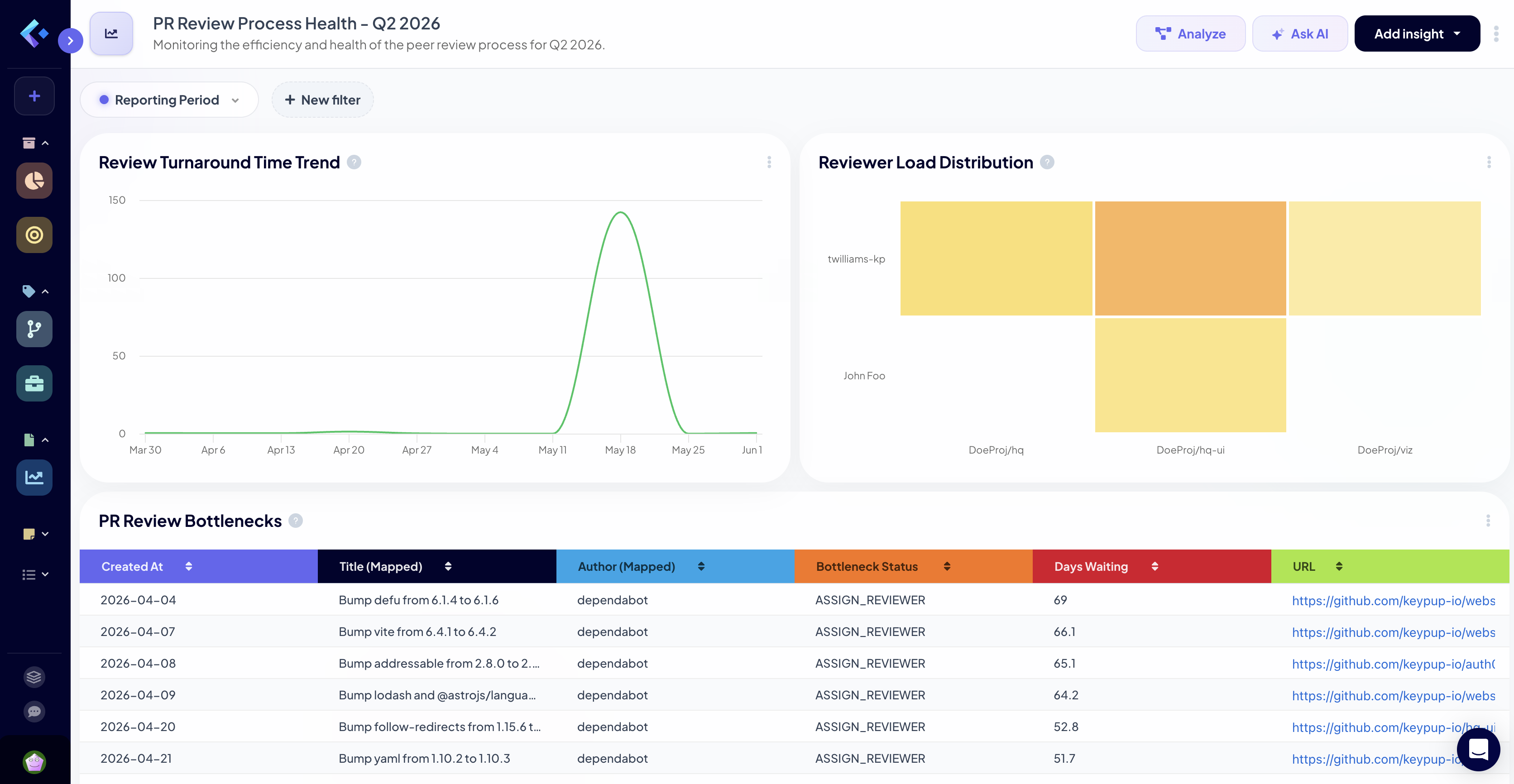
Real Example: Platform in Action
Let's see the platform handle a real-world scenario.
Prompt to Keypup Platform AI Agent
"Create a dashboard showing our PR review process health for Q2 2026. I need to see review turnaround time, reviewer load distribution, and identify any bottlenecks. Break it down by team."
What Happened on the Platform
Instant Dashboard Creation:
The AI agent analyzed the prompt and created a 4-panel dashboard
Panel 1: Review turnaround time trend (line chart)
Panel 2: Reviewer load heatmap showing distribution across team members
Panel 3: Bottleneck identification table with PRs waiting longest for review
Panel 4: Team comparison bar chart
Interactive Capabilities:
Clicking on any data point (e.g., a spike in review time) shows the specific PRs
Hovering reveals detailed tooltips with exact numbers
Date range selector allows zooming into specific weeks
Each panel can be expanded, filtered, or shared independently
Live Data:
Dashboard shows data through today (June 12, 2026)
Refreshes automatically when new PRs are merged or reviewed
No stale data—always reflects current reality
Key Insights Surfaced:
Review turnaround time averaged 8.2 hours in Q2 (35% improvement from Q1)
One team member (Sarah) handled 42% of all reviews—clear load imbalance
12 PRs have been waiting for review for >48 hours—immediate action needed
Backend team's review time is 2x faster than Frontend team—best practices to share
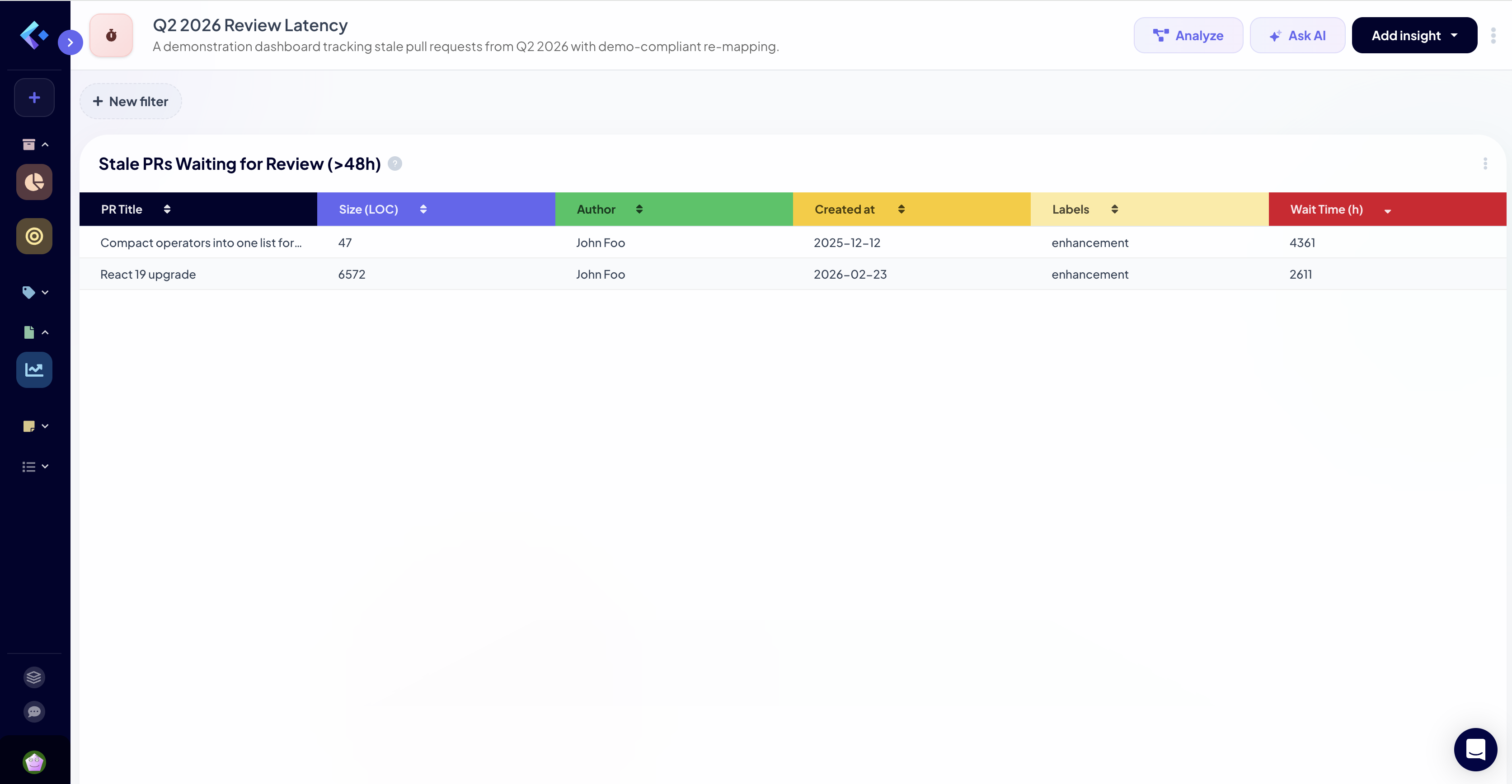
Another Platform Example: Drill-Down Power
Follow-Up Prompt
"Show me the 12 PRs waiting for review over 48 hours. I want to see their size, author, and when they were created."
Ability to export this list for follow-up communication
Immediate Actions Enabled:
Engineering manager can ping specific reviewers
Identify if large PR size is causing review delays
Check if certain labels correlate with slow reviews
Track these specific PRs in a custom "review SLA violation" dashboard
This type of drill-down from summary to detail is where the platform excels.
Approach #2: The Keypup MCP Server
The MCP Server takes a fundamentally different approach: instead of bringing you to the data, it brings the data to wherever you're already working—your AI assistant of choice.
Key Strengths
✅ AI-Native Integration: Query Keypup data directly from Claude, ChatGPT, Cursor, Windsurf, or any MCP-compatible AI tool
✅ Context Mixing: Combine Keypup metrics with external data—market trends, customer feedback, or other business metrics
✅ Custom Visualizations: AI generates charts tailored to your exact reporting needs, not pre-built templates
✅ Workflow Integration: Get insights without context-switching—stay in your IDE, terminal, or chat interface
✅ Flexible Output: Generate markdown reports, HTML visualizations, CSV exports, or inline summaries
✅ Scriptable Analysis: Programmatically query Keypup in your own automation workflows
When the MCP Server Shines
The MCP Server is ideal when you need to:
Stay in Your Workflow: You're in Claude/ChatGPT and need quick engineering metrics without switching tools
Mix Data Sources: Combine Keypup metrics with customer NPS scores, revenue data, or incident logs
Create Custom Reports: Build executive summaries that combine narrative, metrics, and visualizations
Automate Analysis: Schedule regular reports or trigger analyses based on events
Rapid Prototyping: Quickly test hypotheses by querying data conversationally
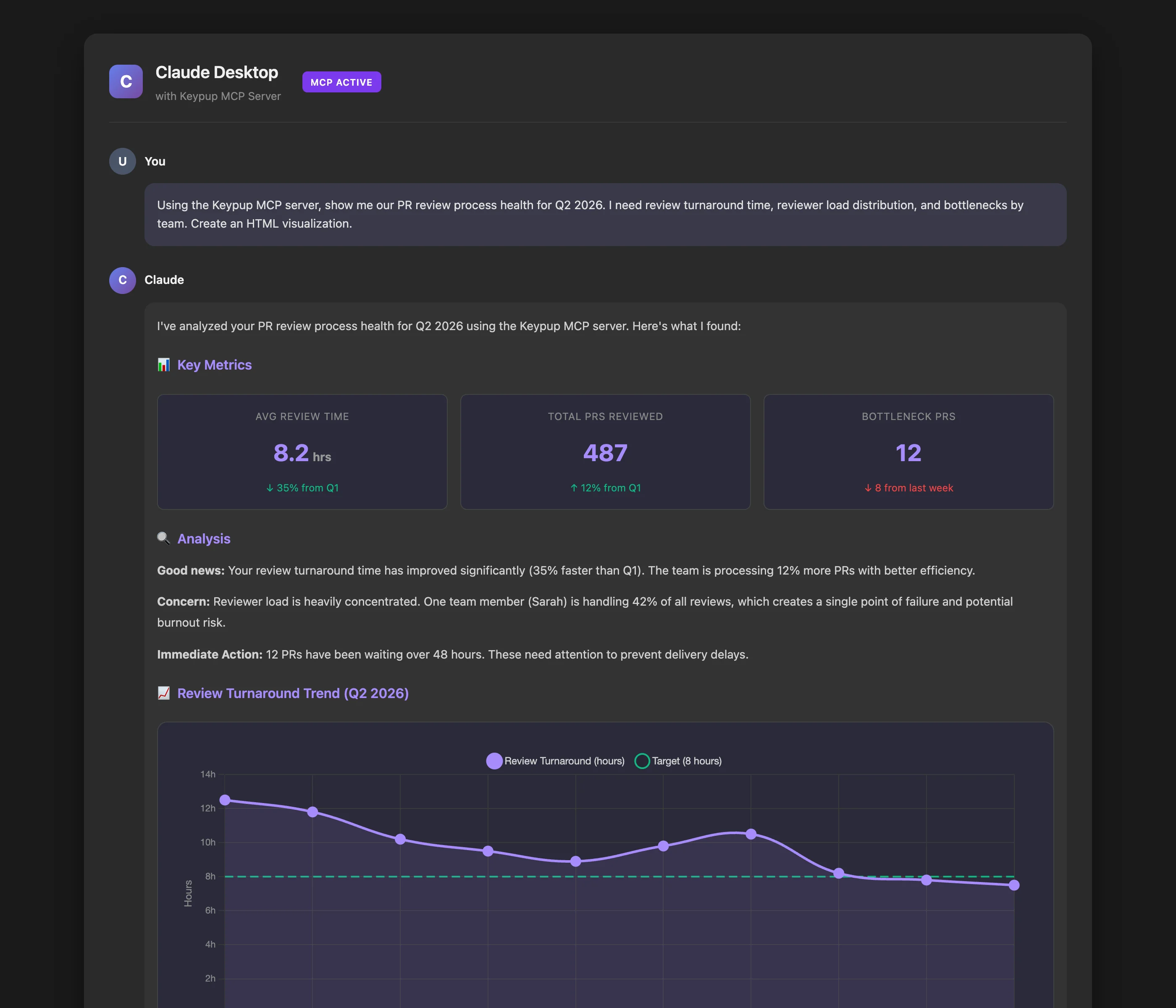
Real Example: MCP Server in Action
Let's use the same scenario but through the MCP Server in Claude Desktop.
Prompt to Claude Desktop (with Keypup MCP Server)
"Using the Keypup MCP server, show me our PR review process health for Q2 2026. I need review turnaround time, reviewer load distribution, and bottlenecks by team. Create an HTML visualization."
What Happened with MCP Server
AI-Generated Analysis:
Claude used the Keypup MCP server to query the underlying data
Generated a custom HTML file with interactive Chart.js visualizations
Created a narrative analysis explaining the patterns in plain English
Saved the visualization for sharing or inclusion in reports
Key Differences from Platform:
Data queried via MCP tools: query_dataset, list_dataset_fields
AI interpreted results and chose visualization approach
Output is a static snapshot (accurate for the query time)
Can be embedded in documentation, Notion, or slide decks
What the AI Provided:
Review turnaround metrics with trend analysis
Reviewer load distribution showing Sarah's 42% concentration
List of 12 delayed PRs with priority recommendations
Narrative summary in markdown format
Unique Capability: The AI can now combine this with other context. For example: "Compare these review metrics with our deployment frequency data and explain if there's a correlation."
MCP Server Example: Context Mixing
Here's where the MCP Server truly differentiates—combining multiple data sources:
Advanced MCP Prompt
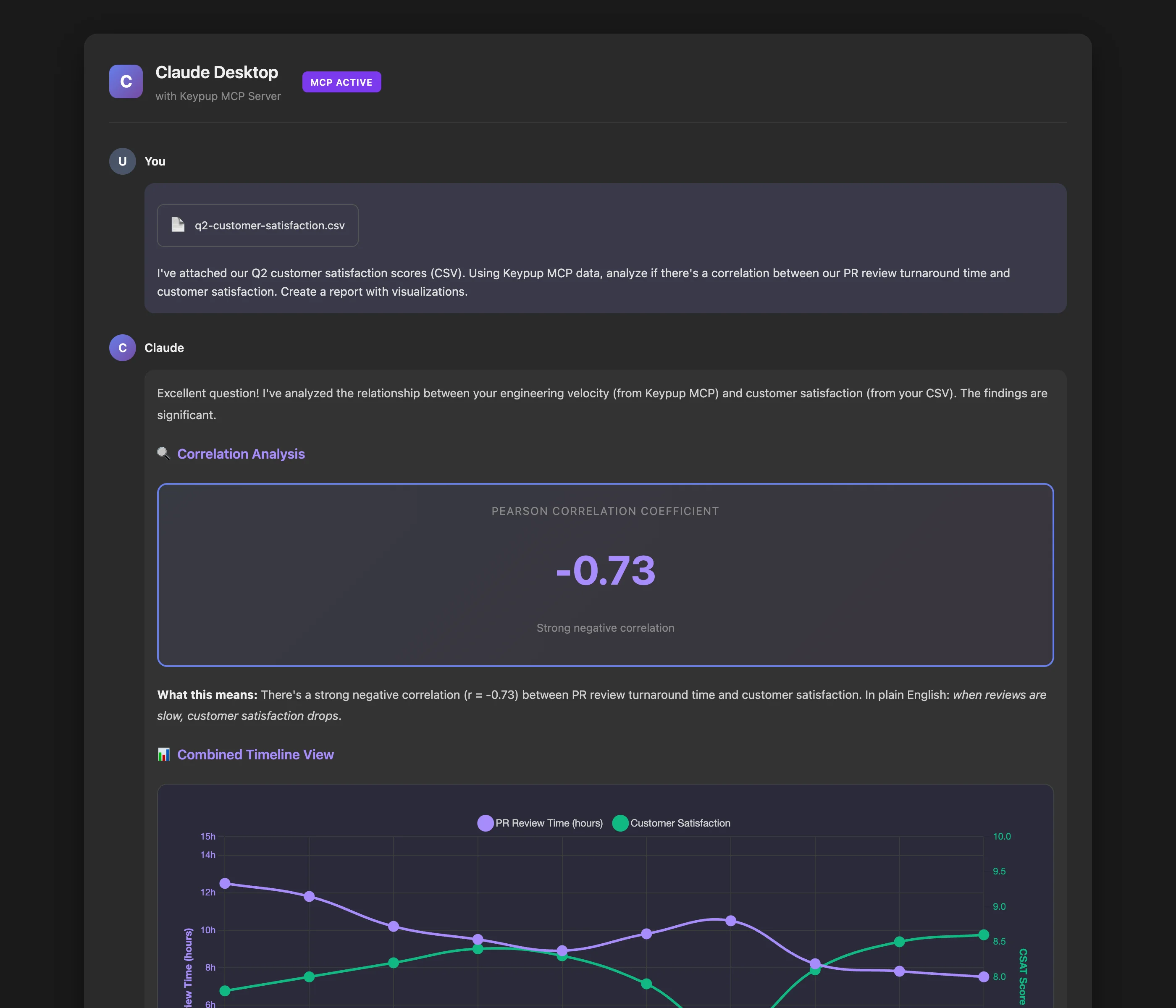
"I've attached our Q2 customer satisfaction scores (CSV). Using Keypup MCP data, analyze if there's a correlation between our PR review turnaround time and customer satisfaction. Create a report with visualizations."
Multi-Source Analysis
What the AI Did:
Read the customer satisfaction CSV
Queried Keypup MCP for weekly PR review metrics
Performed correlation analysis
Generated a comprehensive report showing:
Weeks with slow reviews corresponded to lower CSAT scores (r = -0.73)
Visual overlay chart showing both metrics on the same timeline
This type of cross-domain analysis is impossible with the platform alone.
The MCP Server lets you bring engineering metrics into conversations about business outcomes, customer impact, or strategic planning—all within your AI assistant.
Side-by-Side Comparison
Capability
Keypup Platform
MCP Server
Data Currency
Live, real-time data with auto-refresh
Snapshot at query time (not live)
Visual Exploration
Interactive dashboards with drill-down
AI-generated static visualizations
Context Switching
Requires opening web browser
Works in your existing AI tool
Data Mixing
Keypup data only
Mix with external data sources
Collaboration
Share live dashboards with teams
Share generated reports/visualizations
Drill-Down
Click to explore individual records
Request details via follow-up prompts
Monitoring
Always-on dashboards for team use
On-demand queries
Automation
Scheduled reports via platform
Scriptable via MCP protocol
Learning Curve
Web UI + dashboard concepts
Natural language prompts only
Output Formats
Platform dashboards
HTML, Markdown, CSV, images
Decision Framework: Which Should You Use?
The answer isn't "one or the other"—most teams benefit from both. Here's how to think about it:
Use the Keypup Platform When:
📊 You need ongoing monitoring: Set up dashboards for daily standups, weekly reviews, or executive updates
🔍 You're investigating issues: Drill into anomalies, explore patterns, and discover root causes interactively
👥 You're collaborating with teams: Share live dashboards that everyone can reference and explore
📈 You track improvement initiatives: Monitor KPIs over time with always-current data
💼 You present to leadership: Show live dashboards in meetings where stakeholders can click and explore
Use the MCP Server When:
🤖 You work primarily in AI tools: Stay in Claude, ChatGPT, or your IDE without context-switching
📝 You create custom reports: Build executive summaries combining narrative and data
🔗 You mix data sources: Correlate engineering metrics with business outcomes or customer data
⚡ You need quick answers: Get specific metrics without loading a full dashboard
🛠️ You automate workflows: Integrate Keypup data into your own scripts or tools
The Hybrid Approach (Recommended)
Most engineering leaders use both:
Platform for monitoring: Set up core dashboards (DORA metrics, team velocity, review health) that teams check daily
MCP for ad-hoc analysis: When a question arises in Slack or a meeting, quickly query via AI without switching contexts
Platform for investigation: When MCP surfaces something interesting, jump to the platform to drill down
MCP for reporting: Use AI to generate custom executive reports combining Keypup data with business context
Real-World Workflow: A Day in the Life
Morning Stand-Up (Platform)
Sarah, the engineering manager, opens the Keypup platform on her second monitor. Her "Daily Team Health" dashboard loads automatically:
3 PRs have been waiting for review >24 hours (red alert)
Yesterday's deployment had a 12-minute lead time (green, below target)
Review load is balanced this week (all team members between 15-25% load)
She shares her screen during stand-up. The team discusses the 3 delayed PRs and assigns reviewers on the spot.
Mid-Morning Analysis (MCP Server)
During a Slack conversation about slower-than-expected feature delivery, Sarah asks Claude:
"Using Keypup MCP, compare our PR cycle time this month vs. last month, broken down by feature vs. bugfix PRs"
Claude responds in 10 seconds with:
Feature PRs: 4.2 days (up from 3.1 days last month)
Bugfix PRs: 1.8 days (stable)
Root cause: Larger average PR size for features (422 LOC vs. 180 LOC last month)
Sarah shares this analysis directly in Slack. No dashboard needed.
Afternoon Deep Dive (Platform)
Intrigued by the PR size finding, Sarah opens the platform's "PR Size Analysis" dashboard. She:
Filters to show only feature PRs from the last 2 months
Sees that the team-metrics team has PRs 3x larger than other teams
Clicks on the largest PR to see it's a major refactoring
Drills into that team's workflow and sees they haven't broken down stories effectively
She schedules a 1-on-1 with that team lead to discuss breaking down work.
End of Week Report (MCP Server)
Sarah needs to send a weekly update to her VP. She prompts Claude:
"Using Keypup MCP, create a markdown report for the week of June 10-16, 2026. Include:
PRs merged (count and comparison to previous week)
Average cycle time
Deployment frequency
Any concerning trends
Format it for our weekly executive email."
Claude generates a polished markdown report in 15 seconds, including narrative context. Sarah makes minor edits and sends it.
Getting Started with Both
Setting Up the Platform
Sign up at https://hq.keypup.io/signup
Connect your GitHub, GitLab, or Jira accounts
Data synchronization begins automatically (initial sync: 10-30 minutes)
Use the AI agent to create your first dashboard: "Show me our team's PR velocity over the last month"
Setting Up the MCP Server
Install Claude Desktop, Cursor, or another MCP-compatible AI tool
Get your API token from https://hq.keypup.io/settings/api
Restart your AI tool
Try a query: "Using Keypup MCP, show me my team's DORA metrics for the last quarter"
Common Questions
Can I use both simultaneously?
Absolutely. They're complementary, not competing. Many teams:
Monitor via platform dashboards
Analyze via MCP Server when questions arise
Investigate deeply via platform drill-down
Report via MCP-generated visualizations
Is the data the same in both?
Yes. Both query the identical data harmonization engine. A metric queried via MCP Server will match the same metric on a platform dashboard (accounting for query time differences).
Which is more expensive?
Both are included in your Keypup subscription. No additional cost for using one vs. the other.
Can I share MCP Server results with non-technical stakeholders?
Yes. The visualizations and reports generated via MCP can be saved as HTML, images, or PDFs and shared with anyone. They don't need AI assistant access.
Is the platform faster than MCP?
The platform dashboards load quickly because they're optimized for visual display. MCP queries take 5-15 seconds because the AI is interpreting your request, querying data, and generating custom output. Both are fast enough for real-time decision-making.
Conclusion: The Best of Both Worlds
Keypup's dual approach gives you flexibility that no other engineering analytics platform offers:
For monitoring and collaboration: The web platform delivers live dashboards with interactive exploration
For integration and customization: The MCP Server brings data to your AI tools for context-rich analysis
Both are powered by the same world-class data harmonization and calculation engine. Both support natural language queries. Both deliver actionable insights in seconds, not hours.
The question isn't which to choose—it's how to leverage both for maximum impact.
Ready to transform your engineering analytics workflow? Start with the platform for your core dashboards, then add MCP Server integration to supercharge your AI assistant.
Get started today: https://hq.keypup.io/signup
Appendix: Technical Details
Data Freshness
Platform: Data refreshes every 15 minutes at least, or immediately for source tools with webhooks. Dashboards update automatically in your browser.
MCP Server: Queries always fetch the latest data at query time (no caching).
Data Sources Supported
Both platform and MCP Server support:
GitHub (Cloud & Enterprise)
GitLab (Cloud & Self-Hosted)
Jira Cloud & Data Center
Azure DevOps
Bitbucket
GitHub Projects
Trello
ClickUp
MCP Protocol Compatibility
The Keypup MCP Server implements the full Model Context Protocol specification and works with:
Claude Desktop
ChatGPT (with MCP plugin)
Cursor IDE
Windsurf
Any tool implementing the MCP client specification
CI/CD pipelines fail for dozens of reasons unrelated to code quality—network timeouts, resource exhaustion, flaky tests. Yet analytics tools treat every red build as a defect. Discover how to filter infrastructure noise and measure true engineering performance.
Squash merges, interactive rebases, and monorepos systematically corrupt SDLC analytics. Discover how modern Git workflows distort metrics by up to 95%—and how to get accurate insights anyway.
SDLC analytics tools excel at showing problems but fail at solving them. Learn how conversational AI analytics transforms "red dashboards" into actionable workflows that actually improve engineering performance.