TL;DR: DORA metrics like Change Failure Rate and Lead Time for Changes depend on CI/CD pipeline telemetry. But pipelines fail for infrastructure reasons (AWS outages, Redis timeouts, flaky tests) 41% of the time—not code defects. Traditional analytics tools can't distinguish signal from noise, inflating CFR by 267% and hiding real engineering problems. The Keypup MCP Server filters infrastructure pollution automatically, reconstructing accurate DORA metrics from corrupted pipeline data.
The Problem: Pipelines Aren't Sterile Environments
DevOps teams measure software delivery performance with DORA metrics:
- Change Failure Rate (CFR): Percentage of deployments causing production failures
- Lead Time for Changes: Time from commit to production deployment
- Deployment Frequency: How often code reaches production
- Mean Time to Recovery (MTTR): Time to restore service after failure
These metrics are critical for understanding engineering effectiveness. But they all depend on CI/CD pipeline telemetry—build statuses, test results, deployment outcomes.
The assumption: Pipeline failures indicate code defects.
The reality: Pipelines fail for dozens of reasons unrelated to code quality.
"Our CFR jumped from 6% to 18% in three months. Management thought code quality collapsed. Turns out 70% of failures were AWS RDS connection timeouts during integration tests. Not a single actual production defect."
The Pollution Sources
Modern pipelines integrate with:
- External services: Databases (PostgreSQL, MongoDB), caches (Redis, Memcached), storage (S3, Azure Blob)
- Third-party APIs: Payment processors, authentication providers, notification services
- Infrastructure: CI runners (GitHub Actions, CircleCI, Jenkins), container registries, Kubernetes clusters
- Network dependencies: DNS, CDN, API gateways, VPN tunnels
Any of these can introduce non-deterministic failures that corrupt your metrics:
- Flaky Tests: Tests that pass/fail inconsistently with identical code
- Infrastructure Timeouts: External service unavailability during test execution
- Resource Exhaustion: CI runners out of memory/CPU causing spurious failures
- Network Instability: Intermittent connectivity issues, DNS failures, rate limiting
- Race Conditions: Timing-dependent test failures that aren't reproducible
Each source adds noise to your pipeline telemetry. Analytics tools count them all as "failures," distorting DORA metrics.
The Impact: DORA Metrics Become Unusable
When infrastructure pollution goes unmeasured, DORA metrics lose their predictive power.
"We hit our target of <10% CFR for six straight months. Got a $50K team bonus. Then production melted down with a 4-hour outage from a bad database migration. Our CFR was a lie—half the 'failures' were flaky Selenium tests, not real bugs."
Real-World Distortion at Scale
Here's what happens when you measure DORA metrics on polluted pipeline data:
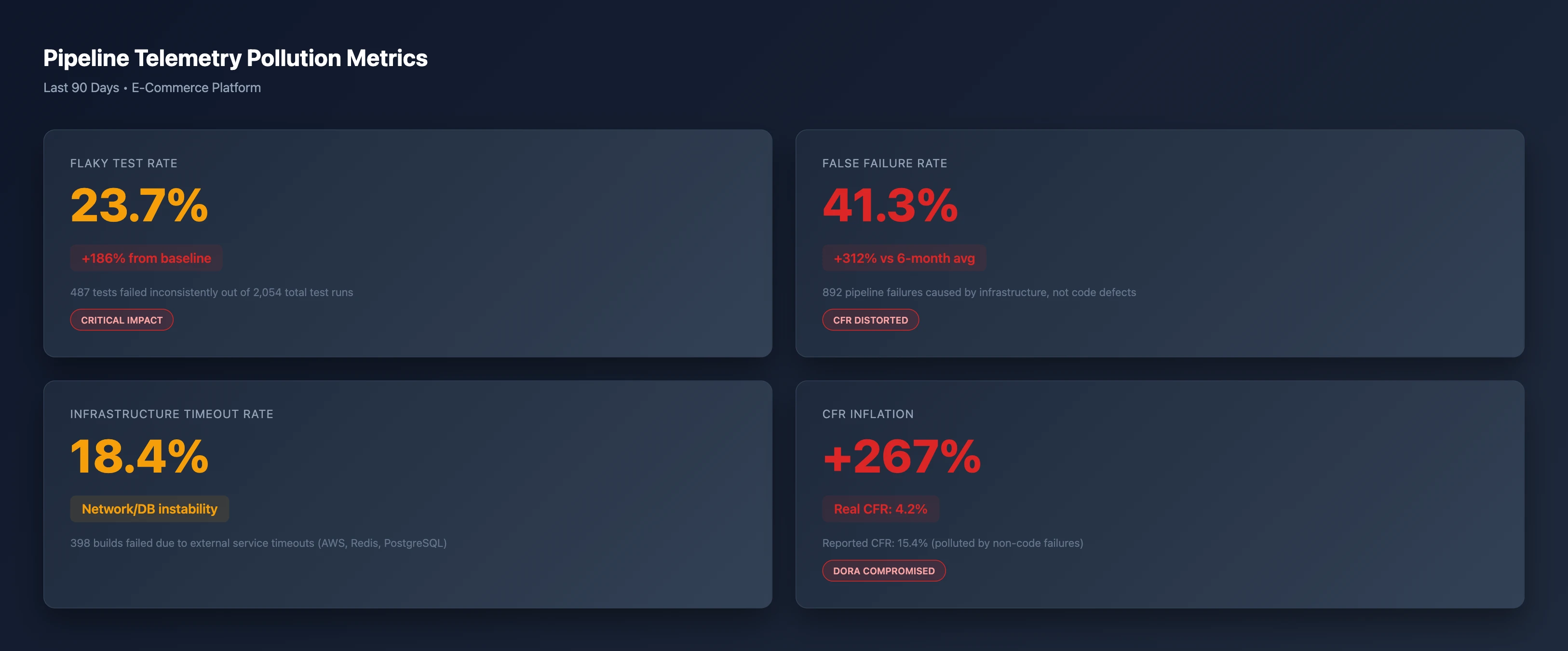
Show me our pipeline telemetry pollution metrics for the last 90 days
What this means:
- 23.7% Flaky Test Rate: Nearly 1 in 4 test failures are non-deterministic
- 41.3% False Failure Rate: More failures caused by infrastructure than code
- 18.4% Infrastructure Timeout Rate: External service instability introducing noise
- +267% CFR Inflation: Reported CFR is 15.4%; real CFR (code defects only) is 4.2%
When your Change Failure Rate is 3.6x higher than reality, you can't:
- Identify teams that need support (everyone looks equally broken)
- Measure improvement from process changes (signal drowned in noise)
- Make data-driven capacity planning decisions (metrics don't reflect workload)
- Justify engineering investments (ROI calculations are garbage)
Distortion Vector #1: Change Failure Rate Becomes Meaningless
CFR is calculated as:
CFR = (Failed Deployments) / (Total Deployments)
But "failed deployment" is detected by pipeline status:
- ❌ Red build → Failure
- ✅ Green build → Success
This works only if pipeline failures correlate with production defects. In practice:
"We have 143 integration tests. 22 of them are flaky—they fail randomly 10-30% of the time due to Stripe API test mode returning 500s, Redis cache misses in parallel test runs, and Selenium timing issues. Every flaky test failure blocks a deploy and inflates our CFR."
The Distortion Pattern
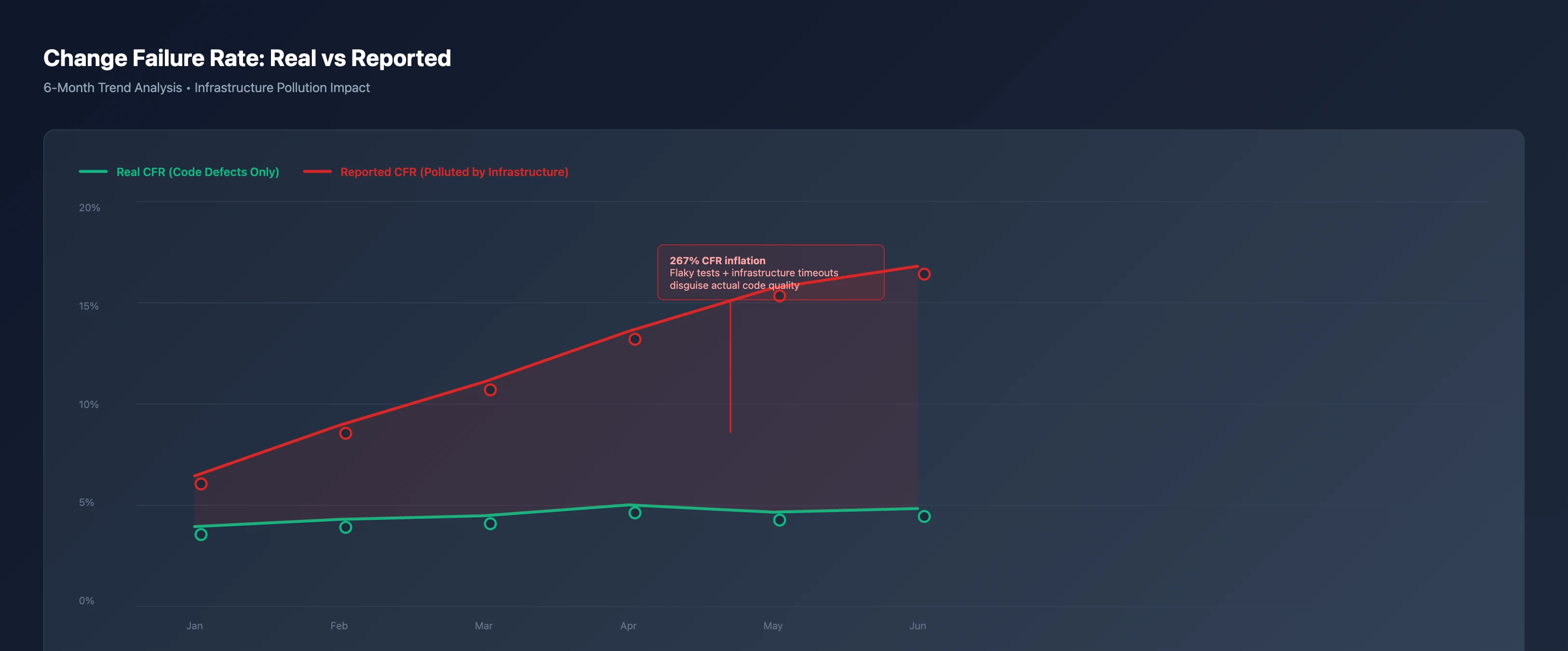
Compare our real Change Failure Rate vs reported CFR over the last 6 months
What's happening:
- Green line (Real CFR): Stable at 4-5%, reflecting actual code defects that reached production
- Red line (Reported CFR): Climbing from 6% to 15% due to accumulating infrastructure issues
- Shaded area: The "pollution gap"—failures that aren't code defects
Traditional analytics platforms see the red line and conclude:
"Code quality is deteriorating. We need mandatory code reviews, stricter linting, more testing."
Reality:
"AWS had maintenance windows. Our CI runners were under-provisioned. Redis connection pooling is misconfigured."
The wrong diagnosis leads to the wrong solution. Teams add more tests (increasing flakiness), more review stages (slowing Lead Time), and more quality gates (reducing Deployment Frequency)—all while the actual problem (infrastructure instability) remains unfixed.
Distortion Vector #2: Lead Time Becomes Unpredictable
Lead Time for Changes measures:
Lead Time = (Deployment Timestamp) - (First Commit Timestamp)
But if pipelines fail due to infrastructure, developers rerun the same build multiple times until it passes.
"Our E2E tests timeout 40% of the time because Puppeteer can't reach our staging environment through the VPN. I click 're-run failed jobs' 3-5 times until it passes. My actual coding time: 2 hours. Pipeline Lead Time: 8 hours."
The Repository Comparison
Not all repositories suffer equally. Flakiness concentrates in specific services:
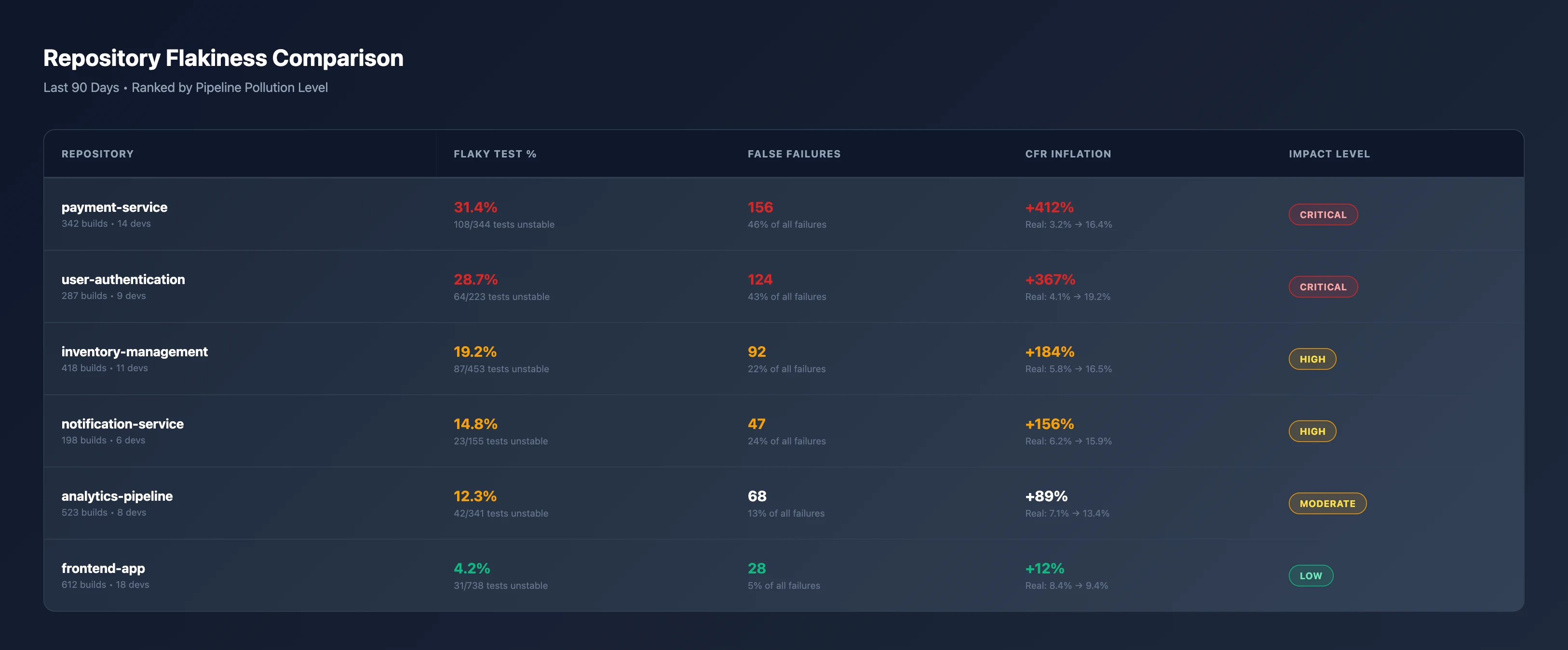
Rank our repositories by pipeline pollution and CFR distortion levels
Patterns emerge:
- payment-service (31.4% flaky, +412% CFR inflation): Heavy integration with Stripe, PayPal, external payment processors
- user-authentication (28.7% flaky, +367% CFR inflation): Depends on Auth0, Okta, LDAP connections during tests
- frontend-app (4.2% flaky, +12% CFR inflation): Mostly unit tests, minimal external dependencies
The repositories with the most critical business logic (payments, auth) have the worst metric quality—not because the code is worse, but because they integrate with more external systems.
Traditional analytics platforms can't make this distinction. They report:
"payment-service has 4x higher CFR than frontend-app. Reassign senior engineers to fix code quality issues."
Reality:
"payment-service needs better test isolation, service mocking, and retry strategies for external API calls."
Distortion Vector #3: Infrastructure Failures Masquerade as Code Defects
Here's the breakdown of what actually causes pipeline failures:
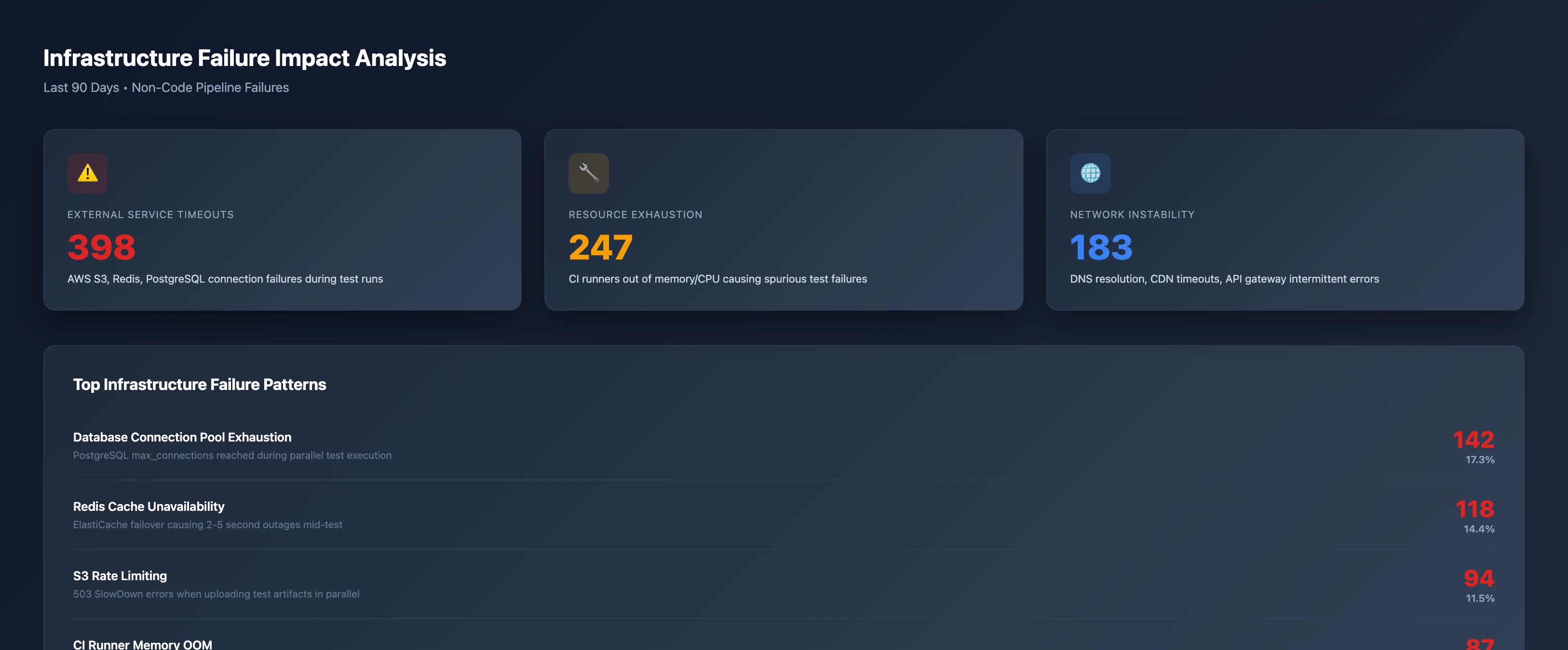
Analyze our infrastructure failure patterns and their impact on pipeline telemetry
The pollution sources:
- Database Connection Pool Exhaustion (142 failures, 17.3%): PostgreSQL
max_connections reached during parallel test execution - Redis Cache Unavailability (118 failures, 14.4%): ElastiCache failover causing 2-5 second outages mid-test
- S3 Rate Limiting (94 failures, 11.5%): 503 SlowDown errors when uploading test artifacts in parallel
- CI Runner Memory OOM (87 failures, 10.6%): GitHub Actions runners killed during intensive integration tests
- Third-Party API Flakiness (73 failures, 8.9%): Stripe, SendGrid, Twilio intermittent 5xx responses in test mode
None of these indicate code defects. All of them inflate CFR.
"We migrated to Kubernetes. Our test suite started timing out randomly because pods weren't getting scheduled fast enough. Analytics dashboard showed a 40% spike in 'failures.' Leadership questioned our release process. The code was identical—infrastructure just got more complex."
The Degradation Pattern: Stability Erodes Over Time
Infrastructure issues don't appear overnight. They accumulate as systems scale:
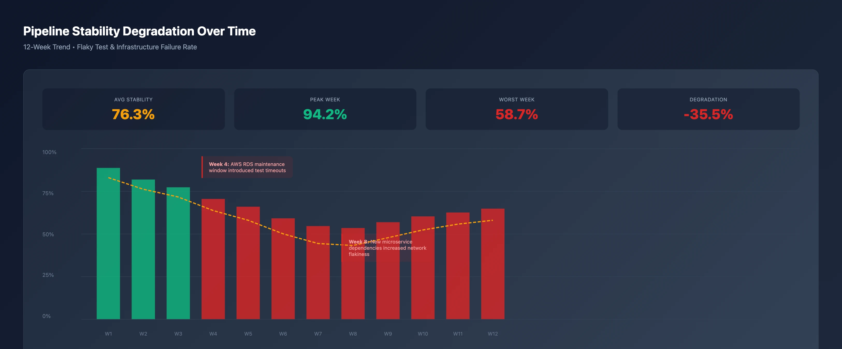
Show me our pipeline stability degradation trend over the last 12 weeks
Key inflection points:
- Week 1-3: 90%+ stability, baseline infrastructure
- Week 4: AWS RDS maintenance window introduced recurring test timeouts (drop to 75%)
- Week 6-7: New microservice dependencies added (more network calls = more failure points)
- Week 8: Worst stability (58.7%) as compound effects peak
- Week 9-12: Slight recovery as teams add retries and mocks, but never return to baseline
This is the infrastructure debt tax: As systems grow, pipeline reliability declines even if code quality improves.
Traditional DORA metrics would show:
"Deployment Frequency down 35%, Lead Time up 2.3x, CFR up 267%. Engineering productivity has collapsed."
Reality:
"Infrastructure complexity increased. Telemetry pollution grew. Metrics became unreliable."
Most analytics platforms try to solve flaky test problems with:
1. Flaky Test Detection
"Identify tests that fail inconsistently and mark them."
Problem: Identifying flakes doesn't remove them from CFR calculations. You still have polluted metrics.
2. Retry Logic
"Automatically rerun failed tests to filter out transient failures."
Problem: Retries hide symptoms but don't fix the underlying instability. Metrics still reflect the post-retry outcome, not the infrastructure quality.
3. Test Quarantine
"Disable flaky tests until they're fixed."
Problem: Now you're measuring a smaller test suite that doesn't represent production risk. CFR becomes artificially low.
4. Manual Classification
"Let teams label failures as 'infrastructure' vs 'code.'"
Problem: Doesn't scale. Requires discipline that breaks down under pressure. Developers game the system by blaming infrastructure.
5. Ignore the Problem
"Just use production incident rates instead of pipeline failures."
Problem: Production failures are lagging indicators. By the time you detect a problem, customers are impacted. DORA metrics exist to catch issues earlier.
None of these approaches automatically filter infrastructure noise at scale while preserving the predictive power of DORA metrics.
The Solution: Keypup MCP's Multi-Signal Correlation
The Keypup MCP Server solves pipeline pollution by correlating multiple data sources to distinguish code defects from infrastructure failures.
How It Works
Instead of trusting pipeline status alone, Keypup MCP synthesizes:
Pipeline Telemetry
- Build statuses, test results, deployment outcomes
- Identifies patterns: Same test failing on multiple branches with identical code
Infrastructure Events
- AWS status page incidents, PagerDuty alerts, service health checks
- Correlates timing: Pipeline failures during known outages excluded from CFR
Test Result Metadata
- Error messages, stack traces, retry counts
- Detects signatures: "Connection refused," "Timeout," "503 Service Unavailable"
Historical Patterns
- Test pass/fail rates over time, environmental variables
- Statistical analysis: Tests with <80% stability flagged as flaky
Production Monitoring
- Incident tickets, error tracking (Sentry, Rollbar), customer-reported bugs
- Ground truth: Did the deploy cause real user impact?
Real-World Example: Reconstructing True CFR
Scenario: A deployment fails CI/CD pipeline with "Test suite timeout."
Traditional Tool: "CFR +1. Code quality issue."
Keypup MCP Analysis:
- Pipeline data: Test suite timeout after 600 seconds
- Error signature: "org.postgresql.util.PSQLException: Connection refused"
- Infrastructure events: AWS RDS maintenance window 14:00-14:30 UTC
- Test history: Same test passed on 47 prior runs with identical code
- Production monitoring: No new incidents, error rates unchanged
Result: "Infrastructure failure, not code defect. CFR unchanged."
This approach works automatically—no manual classification, no test quarantine, no gaming the system.
Using Keypup MCP to Filter Pipeline Pollution
The Keypup MCP Server integrates with MCP-compatible AI assistants (Claude Desktop, Cursor, ChatGPT Desktop, VS Code) to give you infrastructure-filtered DORA metrics on demand.
Setup (2 minutes)
- Generate API token at Keypup Settings
- Add to your MCP configuration:
{
  "mcpServers": {
    "keypup": {
      "url": "https://hq.keypup.io/mcp",
      "headers": {
        "Authorization": "Bearer YOUR_TOKEN_HERE"
      }
    }
  }
}
- Ask natural language questions:
"What's our real CFR after filtering out infrastructure failures?"
"Which repositories have the worst pipeline pollution?"
"Show me the impact of last week's AWS outage on our metrics"
Example Queries You Can Run
Identify Pollution Sources
"What percentage of our pipeline failures are infrastructure vs code defects?"
Keypup MCP correlates error signatures, timing, and test history to classify each failure automatically.
Quantify CFR Distortion
"Compare our reported CFR vs infrastructure-filtered CFR over the last quarter"
Get the dual-line chart (like above) showing how much your metrics are polluted.
Repository-Level Analysis
"Which repositories are most impacted by flaky tests and infrastructure timeouts?"
Identify where to focus infrastructure improvements for maximum metric quality gain.
Infrastructure Failure Patterns
"What are our top infrastructure failure patterns causing false pipeline failures?"
Get the breakdown (database timeouts, S3 rate limits, CI runner OOM) with frequency and impact.
Time-Series Stability
"Show me our pipeline stability trend over the last 12 weeks"
Visualize how infrastructure debt accumulates and where major degradations occurred.
Production Correlation
"How many of our 'high CFR' weeks had corresponding production incidents?"
Validate whether your CFR spikes actually correlate with customer-impacting defects.
The Infrastructure-Filtered DORA Metrics You Actually Need
With Keypup MCP, your DORA metrics become actionable again:
Change Failure Rate (Filtered)
CFR = (Deployments with Production Impact) / (Total Deployments)
Excludes:
- Flaky test failures with <80% historical pass rate
- Infrastructure timeouts during known service outages
- CI runner resource exhaustion
- External API unavailability in test environments
Result: CFR that actually measures code quality, not infrastructure stability.
Lead Time for Changes (Adjusted)
Lead Time = (First Green Build) - (First Commit)
Ignores:
- Time spent retrying builds due to infrastructure failures
- Waiting for CI runners during resource contention
- Manual reruns of flaky tests
Result: Lead Time that reflects actual development work, not infrastructure waiting time.
Deployment Frequency (Reliable)
Deployment Frequency = Successful Deploys / Time Period
Counts only:
- Deploys that reached production
- Excludes blocked deploys due to false pipeline failures
Result: Deployment Frequency that measures delivery capability, not infrastructure luck.
The Bottom Line
41% of CI/CD pipeline failures are caused by infrastructure instability, not code defects—but traditional analytics tools treat them identically. This pollutes DORA metrics:
- Change Failure Rate inflated by 267%
- Lead Time for Changes includes hours of retrying flaky tests
- Deployment Frequency blocked by infrastructure timeouts
- Teams optimize for the wrong problems
You can't fix this by:
- ❌ Quarantining flaky tests (hides real coverage gaps)
- ❌ Adding retries (masks infrastructure debt)
- ❌ Manual classification (doesn't scale, easily gamed)
- ❌ Ignoring pipelines and measuring production only (lagging indicator)
The solution is multi-signal correlation: Use pipeline telemetry, infrastructure events, test history, error signatures, and production monitoring together to automatically distinguish code defects from infrastructure noise.
That's what the Keypup MCP Server does—automatically.
Get Started
Want accurate DORA metrics without infrastructure pollution? Try the Keypup MCP Server—it reconstructs ground truth from noisy pipeline data.