Every engineering leader has experienced it: you log into your analytics dashboard, see a sea of red indicators, and feel your stomach drop. Pull request cycle time is up 40%. Code review wait time has doubled. Deployment frequency is trending down. The dashboard has done its job—it's detected the smoke.
Now what?
This is the Actionability Gap: the chasm between knowing you have a problem and knowing how to fix it. As one frustrated Reddit user put it, most SDLC analytics tools are "expensive smoke alarms that tell you there's a fire but offer zero help putting it out."
The harsh reality is that traditional analytics platforms excel at descriptive metrics but fail catastrophically at prescriptive action. They show you the symptoms but leave the diagnosis—and the cure—entirely to you.
TL;DR: Traditional SDLC analytics tools are "expensive smoke alarms"—they detect problems but provide zero actionable guidance on fixing them. Engineering leaders waste 30-40% of their time manually translating red metrics into root causes. Keypup MCP Server closes this "Actionability Gap" by enabling conversational problem-solving workflows that go from detection to diagnosis to validated remediation in minutes, not weeks. This guide demonstrates five real-world scenarios showing how AI-powered analytics transforms dashboards from passive alerts into active problem-solving partners.
The Expensive Smoke Alarm Problem
Consider a typical scenario with conventional analytics tools:
Dashboard Alert: "PR cycle time increased from 2.3 days to 3.8 days over the last month."
Your internal monologue: Why? Which repos? Which teams? Is it review bottlenecks? Larger PRs? Context switching? Do I need to hire? Change process? Fire someone?
What the tool provides: A red number and a downward-trending line graph.
What you actually need: Root cause analysis, affected scope, contributing factors, and concrete remediation options.
The tool has successfully alarmed you but provided no path forward. You're left manually digging through dozens of pull requests, cross-referencing team calendars, interviewing engineers, and building spreadsheets to triangulate the actual problem. By the time you've diagnosed the issue, another month has passed and the metric has gotten worse.
This isn't just frustrating—it's expensive. Engineering leaders spend 30-40% of their time translating dashboard alerts into actionable insights, time that could be spent on strategic initiatives or actually implementing solutions.
"Our analytics platform costs $50K/year and all it does is tell me things are broken. Yesterday: 'Code review wait time up 85%.' Cool, thanks. Now I get to spend 3 hours manually pulling data to figure out if it's the backend team, the holiday skeleton crew, or that one massive security PR. By the time I've diagnosed it, the problem has metastasized. I'm paying for a very expensive thermometer."
"We have Grafana, Jira dashboards, GitHub Insights, and a custom BI tool. Every Monday meeting starts the same: 'Deployment frequency is down 40%.' Everyone stares at me. I stare at four different dashboards that contradict each other. Then I spend Tuesday and Wednesday in spreadsheets playing detective. By Thursday I have an answer. By Friday the metric has changed again. I didn't sign up to be a data archaeologist."
"Red dashboard syndrome: You see the fire, you smell the smoke, but the fire extinguisher is in a locked box three buildings away and you don't have the key. That's every SDLC analytics tool I've used. They're great at making me panic. Terrible at helping me fix anything."
Why Traditional Dashboards Fail at Actionability
The root cause of the Actionability Gap lies in how traditional analytics tools are architected:
1. Rigid, Pre-Built Queries
Most platforms offer a library of fixed dashboards: "DORA Metrics," "Cycle Time Analysis," "Team Velocity." These show aggregate data but can't answer follow-up questions. When a metric goes red, you can't ask "why?" or "show me the outliers" or "compare this to last quarter"—you're limited to what the dashboard designer anticipated six months ago.
2. Manual Drill-Down Dependency
To investigate an alert, you need to navigate through multiple screens, apply filters manually, export data to spreadsheets, and cross-reference with other tools. Each question requires 5-10 clicks and multiple context switches. By the time you've assembled the full picture, you've lost an hour and your train of thought.
3. No Contextual Intelligence
A spike in cycle time could be caused by a hundred different factors: large feature branches, holiday schedules, a critical security patch, a new junior engineer ramping up, a key reviewer on vacation. Traditional tools show the spike but lack the contextual awareness to distinguish signal from noise.
4. Insight-to-Action Disconnection
Even when you successfully diagnose a problem ("our backend team's PR review queue is bottlenecked"), the tool provides no guidance on remediation. Should you redistribute review load? Implement review time SLAs? Hire another senior engineer? Break up large PRs? The analytics end where the actual work begins.
"I finally figured out why our cycle time doubled: three senior engineers are bottlenecked on reviews because they're the only ones who understand the legacy auth system. Great. Now what? The dashboard just keeps showing the same red number. It doesn't tell me: 1) Should I prioritize knowledge transfer? 2) Should I hire? 3) Should I implement review rotation? 4) Should I break up the auth system? I diagnosed the disease but I have no idea what the treatment is."
Enter Conversational AI Analytics: Closing the Actionability Gap
The Keypup MCP (Model Context Protocol) Server represents a fundamentally different approach to engineering analytics—one designed from the ground up for actionability, not just visibility.
Instead of static dashboards that show problems, Keypup MCP enables conversational problem-solving workflows directly within AI assistants like Claude, ChatGPT, Cursor, or any MCP-compatible client. You don't navigate through dashboards—you have a dialogue with your engineering data.
Here's how it transforms the "red dashboard" scenario:
Real-World Actionability Examples
Let's walk through five common "red dashboard" scenarios and see how conversational analytics transforms panic into action.
Example 1: The Generic "Cycle Time Is Up" Alert
Traditional Dashboard: 🔴 PR Cycle Time: 3.8 days (+65% vs last month)
Your MCP Conversation:
You ask
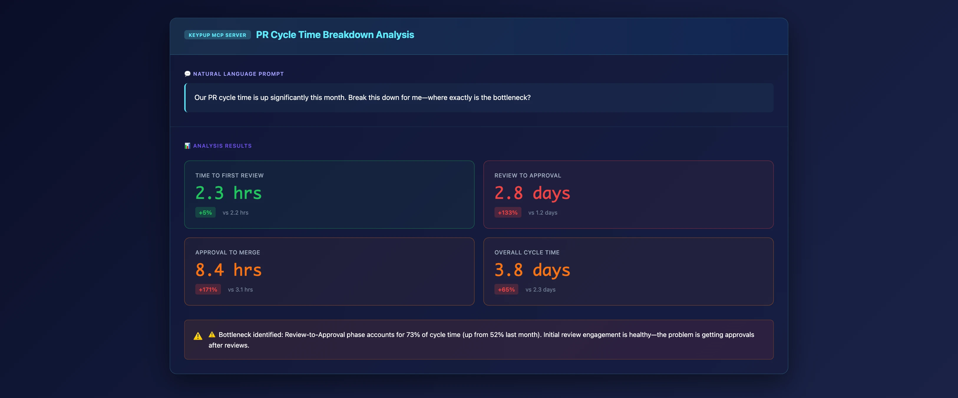
Our PR cycle time is up significantly this month. Break this down for me—where exactly is the bottleneck?
What Just Happened:
Instead of a single red number, you immediately see:
- Time-to-first-review is normal (2.3 hours average)
- Review-to-approval is the bottleneck (2.8 days—up from 1.2 days)
- Approval-to-merge is also elevated (8.4 hours vs 3.1 hours)
Actionable Next Step: The problem isn't getting initial attention—it's the review-to-approval phase. This suggests either review depth issues or availability problems among approvers.
Follow-Up Question: "Who are the approval bottlenecks?"
Example 2: Root Cause Diagnosis
Continuing the conversation from Example 1:
You ask
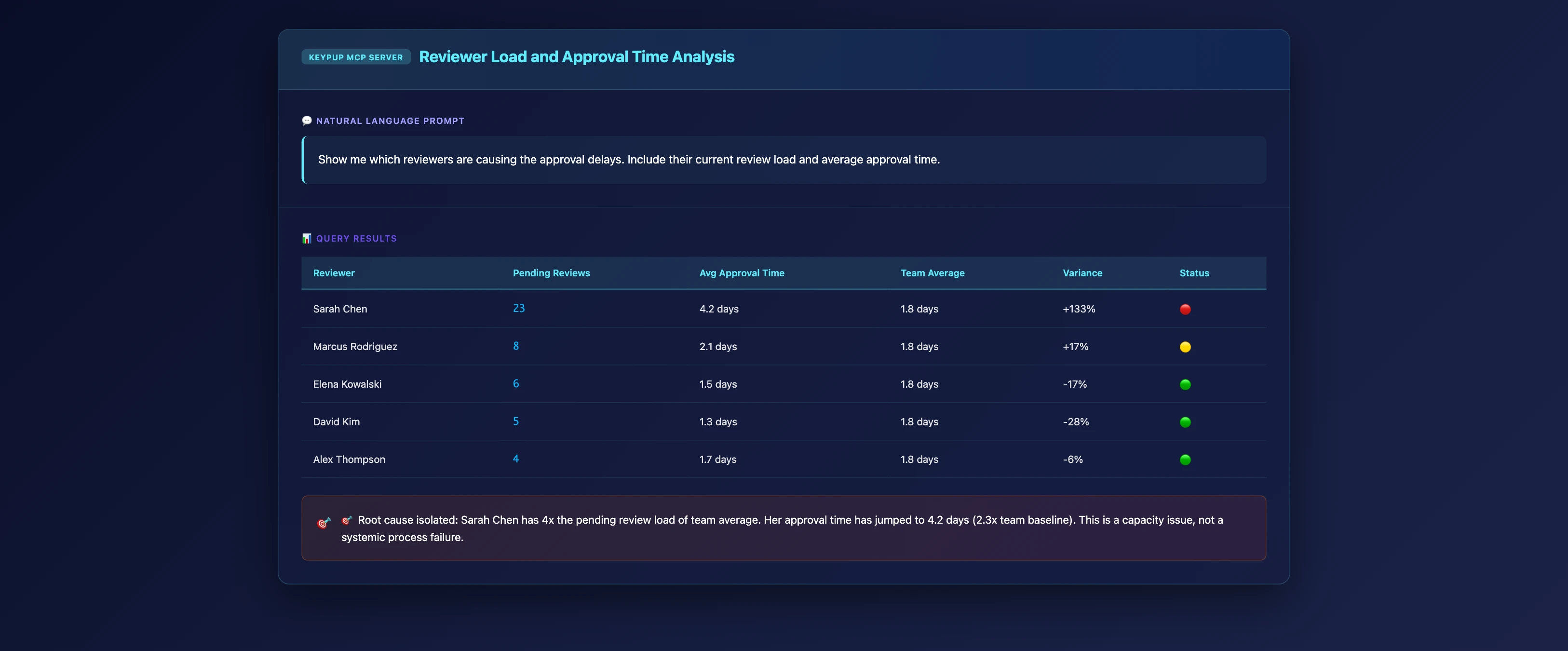
Show me which reviewers are causing the approval delays. Include their current review load and average approval time.
What Just Happened:
The AI automatically:
- Identified the top 5 reviewers by pending PR count
- Calculated their average approval time
- Compared against team baseline
- Highlighted the outliers
Actionable Insight: Sarah Chen has 23 pending reviews (4x team average) and her approval time has jumped to 4.2 days. The bottleneck isn't systemic—it's concentrated in one overloaded reviewer.
Actionable Next Step: Redistribute Sarah's review load to Marcus and Elena (who have capacity), or investigate why Sarah's workload spiked (possibly a large feature branch or new project).
Example 3: Trend Correlation Analysis
You ask
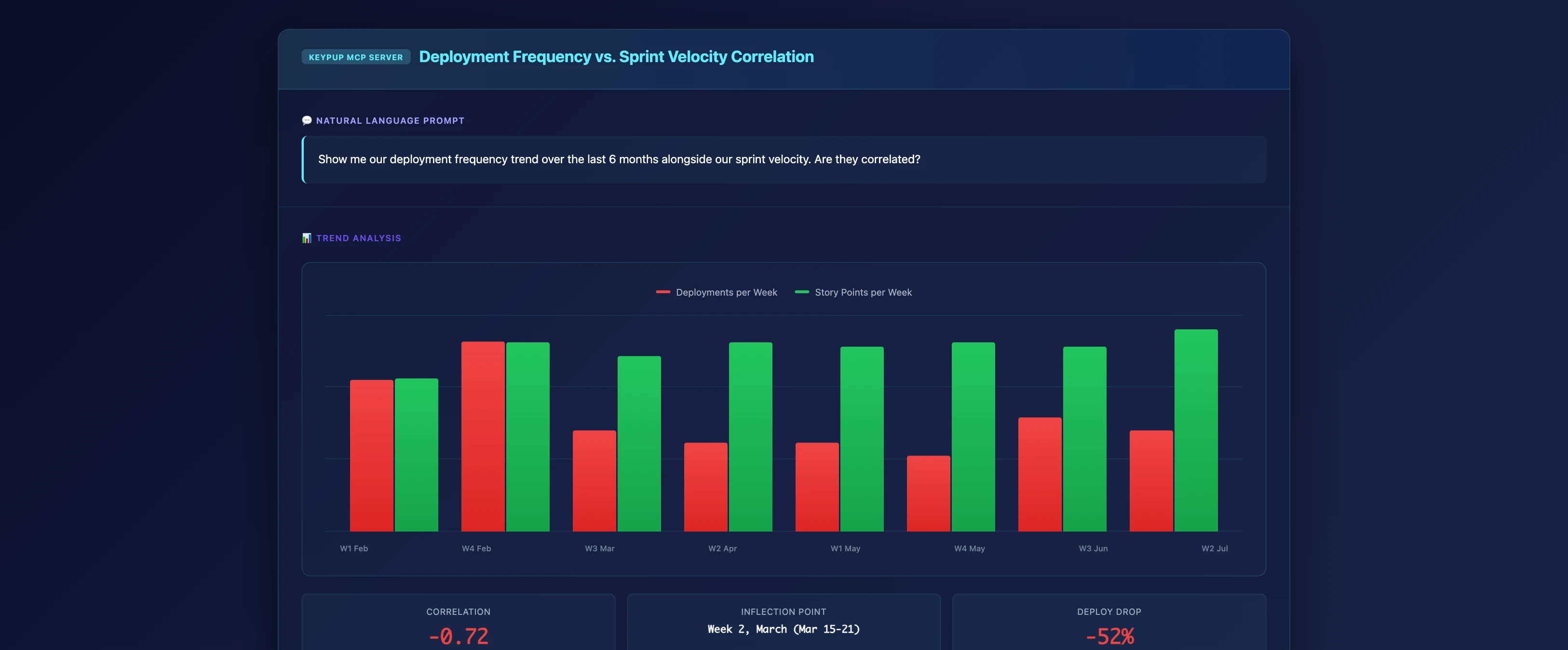
Show me our deployment frequency trend over the last 6 months alongside our sprint velocity. Are they correlated?
What Just Happened:
The MCP server:
- Pulled deployment frequency data by week
- Pulled story points completed by week
- Calculated correlation coefficient (-0.72)
- Identified the inflection point (Week of March 15)
Actionable Insight: Deployment frequency dropped sharply in mid-March while velocity remained stable—suggesting a process change (new approval gates, deployment tooling issues) rather than a productivity problem.
Actionable Next Step: Investigate what changed in your deployment pipeline around March 15. This is a process fix, not a people fix.
Example 4: Team Comparison for Targeted Improvement
You ask
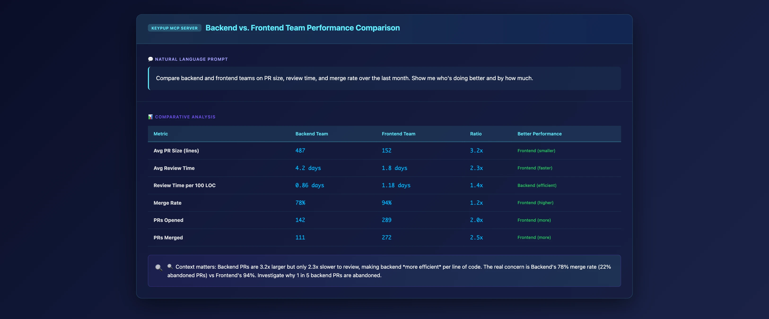
Compare backend and frontend teams on PR size, review time, and merge rate over the last month. Show me who's doing better and by how much.
What Just Happened:
Clear comparative metrics reveal:
- Backend PRs are 3.2x larger on average (487 lines vs 152 lines)
- Backend review time is proportionally longer (but not excessively so relative to size)
- Frontend merge rate is 94% vs backend's 78%
Actionable Insight: Backend isn't "slower"—they're working on fundamentally different problem scales. The lower merge rate (22% abandoned PRs) is the real concern and warrants investigation.
Actionable Next Step: Investigate why 1 in 5 backend PRs are abandoned. This could indicate unclear requirements, scope creep, or technical debt forcing restarts.
Example 5: Prescriptive Monitoring Post-Remediation
After redistributing Sarah's review load (from Example 2), you want to verify the fix worked:
You ask
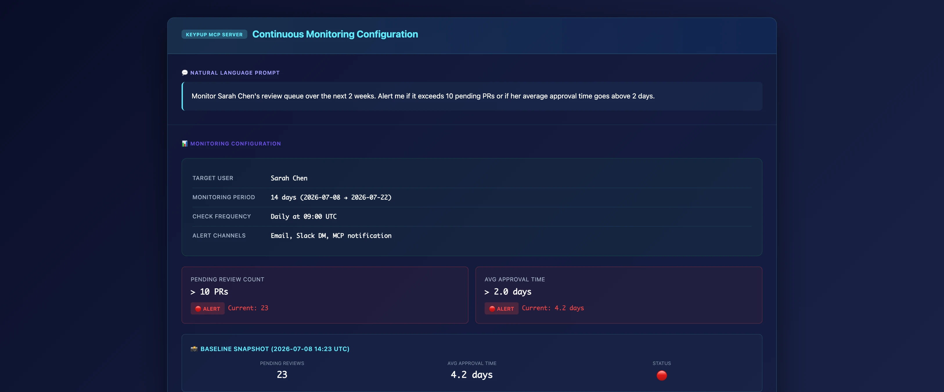
Monitor Sarah Chen's review queue over the next 2 weeks. Alert me if it exceeds 10 pending PRs or if her average approval time goes above 2 days.
What Just Happened:
The MCP conversation doesn't end at diagnosis—it extends into continuous validation. You've set up:
- Threshold-based monitoring on specific metrics
- Scoped to the exact person/problem you diagnosed
- Time-bounded to measure intervention effectiveness
Actionable Outcome: Two weeks later, the MCP alerts you that Sarah's queue dropped to 8 pending PRs and her approval time is down to 1.6 days. The intervention worked. You have proof.
This completes the full actionability loop: Detect → Diagnose → Act → Validate → Close.
The Actionability Framework: From Smoke Alarm to Fire Extinguisher
The five examples above demonstrate a repeatable pattern that traditional dashboards cannot replicate:
Phase 1: Contextual Alert
Instead of "metric went red," you get "metric went red and here's the breakdown by dimension."
Phase 2: Conversational Drill-Down
You refine understanding through natural follow-up questions, progressively narrowing scope until you identify the specific bottleneck or root cause.
Phase 3: Comparative Context
You compare against baselines, peer teams, or time periods to distinguish normal variance from true anomalies.
Phase 4: Prescriptive Recommendation
The AI doesn't just show data—it suggests interpretations and next steps based on patterns it recognizes.
Phase 5: Outcome Monitoring
You set up targeted tracking on the specific remediation, creating a feedback loop to validate effectiveness.
This is what actionability looks like. Not a red dashboard—a closed-loop problem-solving workflow.
Why Conversational Analytics Succeeds Where Dashboards Fail
The Keypup MCP approach solves the four fundamental failures of traditional tools:
1. Infinite Flexibility vs. Rigid Queries
Because you're conversing in natural language, you're not limited to pre-built dashboards. Every question generates a custom query optimized for that specific ask. Want to see "PRs opened on Fridays that took longer than 3 days to merge"? Just ask.
2. Progressive Refinement vs. Manual Drill-Down
Each answer suggests the next logical question. You refine understanding through dialogue, not through 10 clicks across multiple screens. The AI maintains context across the conversation, so you're building on previous answers, not starting from scratch each time.
3. Contextual Intelligence vs. Raw Metrics
The MCP server understands engineering semantics. It knows that "bottleneck" means "where is time being spent disproportionately," that "outlier" means "statistically anomalous compared to baseline," and that "trend" requires time-series analysis. You don't have to manually construct these concepts—they're baked into the AI's understanding.
4. Action Integration vs. Insight Isolation
Because the analytics live inside your AI assistant (Claude Desktop, Cursor, ChatGPT), the insights flow directly into your existing workflow. You're already in the tool where you write code, review PRs, and communicate with your team. The analytics don't live in a separate silo—they're embedded in your daily context.
The ROI of Actionability
Let's quantify the cost of the Actionability Gap and the value of closing it:
Traditional Dashboard Workflow:
- Alert noticed: 5 minutes
- Initial investigation (filtering, clicking through screens): 20 minutes
- Exporting data to spreadsheet for analysis: 15 minutes
- Cross-referencing with other tools (Jira, GitHub): 30 minutes
- Diagnosing root cause: 45 minutes
- Formulating action plan: 30 minutes
- Total time per incident: ~2.5 hours
MCP Conversational Workflow:
- Alert noticed: 5 minutes
- Conversational drill-down to root cause: 10 minutes
- Action plan formulated: 5 minutes
- Monitoring setup: 2 minutes
- Total time per incident: ~22 minutes
Time savings: 87% reduction in incident diagnosis time.
For an engineering leader managing 10-15 metric anomalies per month, this translates to 20+ hours saved monthly—time redirected from "dashboard archaeology" to strategic initiatives, team development, or (radical idea) personal life.
But the ROI goes beyond time savings. Faster diagnosis means faster remediation, which means:
- Bottlenecks resolved in days, not weeks
- Smaller compounding effects on team velocity
- Reduced "firefighting fatigue" among leadership
- Data-driven decisions replacing gut instinct
Getting Started: From Red Dashboards to Actionable Workflows
If you're tired of expensive smoke alarms and ready to close the Actionability Gap, here's how to get started with Keypup MCP:
Step 1: Connect Your Engineering Stack
Keypup unifies data from GitHub, GitLab, Jira, Azure DevOps, and other SDLC tools into a single queryable layer.
Step 2: Install the MCP Server
Add Keypup to your AI assistant (Claude Desktop, Cursor, ChatGPT, etc.) via a simple configuration file. Full setup guide here.
Step 3: Start Asking Questions
Replace your dashboard login with a simple conversation: "Why did our cycle time increase this month?" The AI handles the rest—querying data, performing analysis, and presenting actionable insights.
Use follow-up questions to drill down, comparative queries to establish baselines, and monitoring requests to validate fixes. Turn every red metric into a closed-loop improvement cycle.
The Future of Engineering Analytics: Conversations, Not Dashboards
The Actionability Gap isn't a minor UX inconvenience—it's a fundamental architectural flaw in how we've built SDLC analytics for the past decade. We optimized for data collection and visualization but forgot the entire point: helping teams improve.
Red dashboards are table stakes. What matters is what happens after the dashboard turns red.
Conversational AI analytics—exemplified by the Keypup MCP Server—doesn't replace traditional dashboards. It transcends them. It transforms engineering analytics from a passive reporting tool into an active problem-solving partner.
The smoke alarm still goes off. But now you have a fire extinguisher—and it tells you exactly where to aim.
Stop staring at red dashboards. Start closing the loop.
Ready to close your Actionability Gap? Set up Keypup MCP and turn your next "red dashboard" into a 10-minute problem-solving conversation.