The Standardization Fallacy: Why Uniform DORA Metrics Fail Heterogeneous Engineering Portfolios
A single VP overseeing cloud-native SaaS, legacy mainframe, firmware, and regulated banking teams cannot grade them all on the same DORA scale. Discover why forcing uniform "Elite" deployment frequency and lead-time targets onto heterogeneous portfolios penalizes safety-critical teams and introduces real operational risk — and how Keypup MCP builds risk-adjusted, tier-based benchmarks for every team automatically.
TL;DR: A VP of Engineering overseeing a heterogeneous portfolio — cloud-native SaaS, legacy mainframe, firmware, and a regulated core banking platform — cannot fairly grade every team against the same "Elite" DORA targets. Deployment frequency and lead time mean something different when a team is shipping a marketing site versus modifying a core ledger. Forcing a single pane of glass onto fundamentally different risk profiles doesn't just demoralize safety-critical teams — it incentivizes them to cut the exact corners that keep the business safe. The Keypup MCP Server solves this by building risk-adjusted, tier-based DORA benchmarks per team, so every business unit is measured against a target that reflects its actual constraints — not a generic industry average.
At the enterprise scale, a single VP or Director of Engineering might oversee dozens of different teams working on completely different technology stacks — ranging from cloud-native SaaS applications to legacy mainframe COBOL systems, firmware, or internal data platforms. On paper, this is just organizational scale. In practice, it creates one of the most persistent and least-discussed failure modes in engineering leadership: the standardization fallacy.
The Friction: One Dashboard, Many Realities
Senior leadership often attempts to find a single "pane of glass" to compare and grade all teams using uniform KPIs — most commonly the four DORA metrics (deployment frequency, lead time for changes, change failure rate, and time to restore service) benchmarked against the well-known "Elite / High / Medium / Low" performance tiers.
The appeal is obvious: one dashboard, one scale, one number to report to the board. The problem is that DORA's benchmarks were derived primarily from cloud-native, continuously-deployed software — and they implicitly assume every team can and should ship as fast as possible. That assumption breaks down the moment your portfolio includes:
A core banking database team bound by regulatory change-control windows and mandatory manual sign-off
A firmware team shipping to physical hardware that cannot be rolled back with a git revert
An internal data platform team whose "deployments" are batch pipeline changes validated over days, not minutes
A marketing website team that can, and should, deploy a dozen times a day
Rank all four on the same "Deployment Frequency" axis, and the banking team looks like a chronic underperformer next to the marketing site — even though its actual job is to never be the reason a customer's balance is wrong.
Why This Matters: Demoralization Is the Least of the Risks
The Human Cost
Being told your team is "Low performing" on a scale you were never designed to win is corrosive. It erodes trust in engineering leadership, invites Goodhart's Law gaming (teams start shipping smaller, cosmetic changes just to move the deployment-frequency needle), and makes it nearly impossible to have a credible conversation about resourcing or headcount.
The Operational Risk
The more dangerous consequence is behavioral. When a safety-critical team is pressured to close the gap with a generic "Elite" target, the fastest way to do it is to loosen the very controls that exist for good reason: fewer manual reviews, shorter regression cycles, smaller change-advisory-board windows. Forcing a core banking database team to aim for the same deployment frequency as a marketing website team doesn't just feel unfair — it introduces real operational and compliance risk.
The Enterprise Discussion: What Engineering Leaders Are Actually Saying
This exact friction shows up constantly on engineering leadership forums, where VPs and directors managing heterogeneous portfolios describe the same pattern: a generic DORA rollup that makes regulated or legacy teams look broken.
Director of Engineering (r/ExperiencedDevs)
"Our board deck has one DORA slide for the whole org. The mainframe team is permanently in the red quadrant next to teams shipping trivial SaaS features 20 times a day. Everyone knows it's an apples-to-oranges comparison, but nobody wants to be the one who says 'don't measure us that way' — it sounds like an excuse."
VP Engineering, Regulated Fintech (r/devops)
"We had a genuine push from leadership to hit 'Elite' deployment frequency on our core ledger service. The only way to get there in the time given was to compress our change-advisory-board review from five days to one. We pushed back hard, but it took an incident on a peer team's system — not ours — to get the target reconsidered."
The pattern is consistent: the metric isn't wrong, the comparison is. Deployment frequency, lead time, and change failure rate are all legitimate signals — they simply need a different reference point depending on what a team is actually optimizing for.
How Keypup MCP Solves the Standardization Fallacy
The Keypup Model Context Protocol (MCP) Server replaces the single generic DORA rollup with risk-adjusted, tier-based benchmarking — grading every team against a target that matches its actual constraints, not an industry-wide average pulled from a different kind of business entirely.
1. Surfacing the Real Spread Across the Portfolio
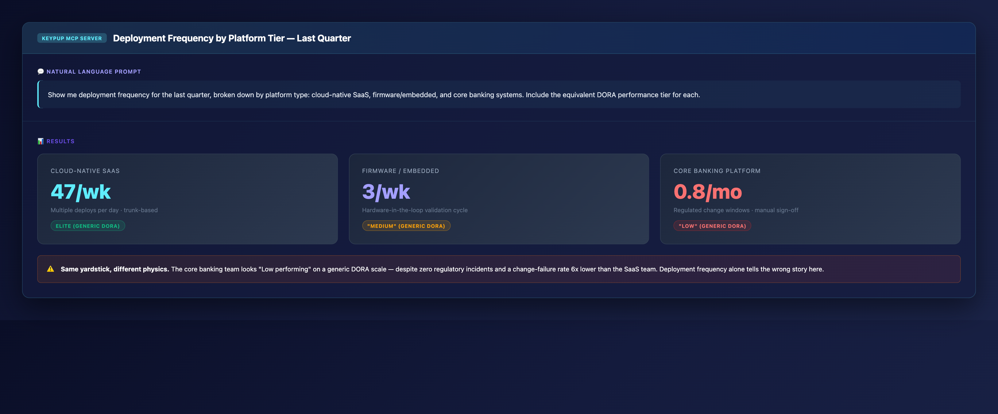
Before you can fix a uniform benchmark, you need to see how wide the actual spread is. Keypup MCP pulls deployment frequency directly from the underlying Git and CI data, segmented by platform type.
MCP Prompt:
Show me deployment frequency for the last quarter, broken down by
platform type: cloud-native SaaS, firmware/embedded, and core
banking systems. Include the equivalent DORA performance tier for
each.
Output: KPI Comparison Cards
Key Insight: The core banking team looks "Low performing" on a generic DORA scale — despite zero regulatory incidents and a change-failure rate 6x lower than the SaaS team. Deployment frequency alone tells the wrong story.
2. Visualizing Where a Uniform Threshold Breaks Down
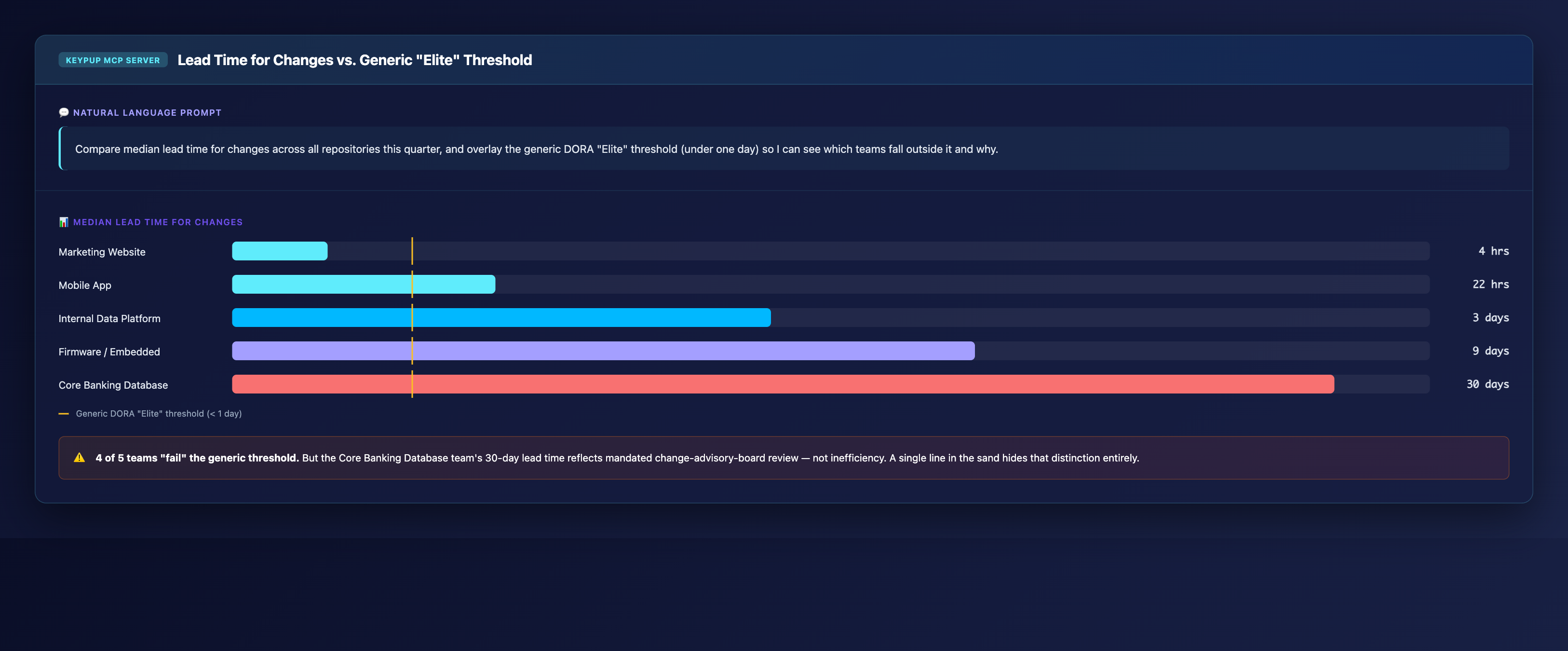
A single number per team is useful, but leadership needs to see why a generic threshold fails — not just that it does. Keypup MCP can overlay the generic "Elite" benchmark directly onto the real distribution.
MCP Prompt:
Compare median lead time for changes across all repositories this
quarter, and overlay the generic DORA "Elite" threshold (under one
day) so I can see which teams fall outside it and why.
Output: Benchmarked Bar Chart
Key Insight: 4 of 5 teams "fail" the generic threshold. But the Core Banking Database team's 30-day lead time reflects mandated change-advisory-board review — not inefficiency. A single line in the sand hides that distinction entirely.
3. Proving the Shape of the Trade-Off, Not Just the Score
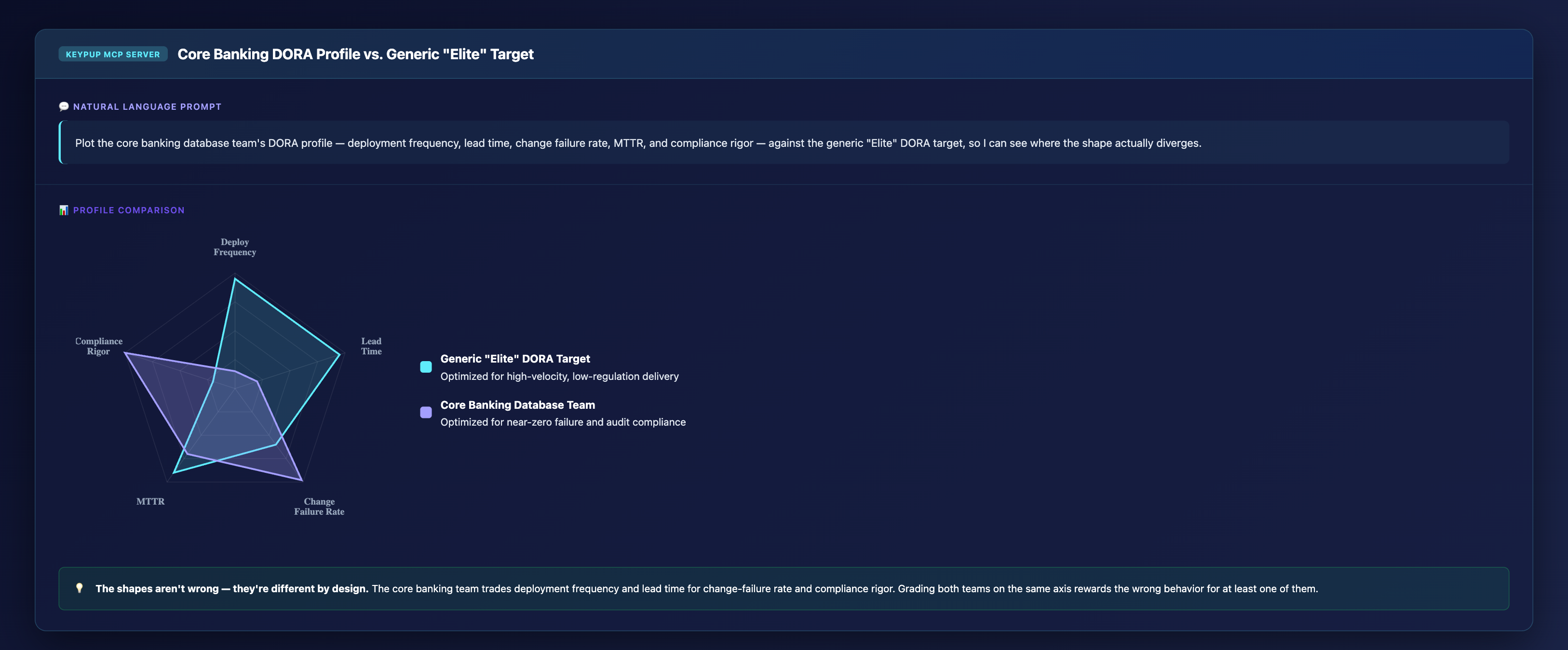
Sometimes a single chart isn't enough to change a leadership team's mind — you need to show that a team's whole profile is optimized differently, not just lagging on one axis. Keypup MCP can render a multi-dimensional comparison against the generic target.
MCP Prompt:
Plot the core banking database team's DORA profile — deployment
frequency, lead time, change failure rate, MTTR, and compliance
rigor — against the generic "Elite" DORA target, so I can see
where the shape actually diverges.
Output: Radar Profile Comparison
Key Insight: The shapes aren't wrong — they're different by design. The core banking team trades deployment frequency and lead time for change-failure rate and compliance rigor. Grading both teams on the same axis rewards the wrong behavior for at least one of them.
4. Building the Risk-Tier Segmentation Automatically
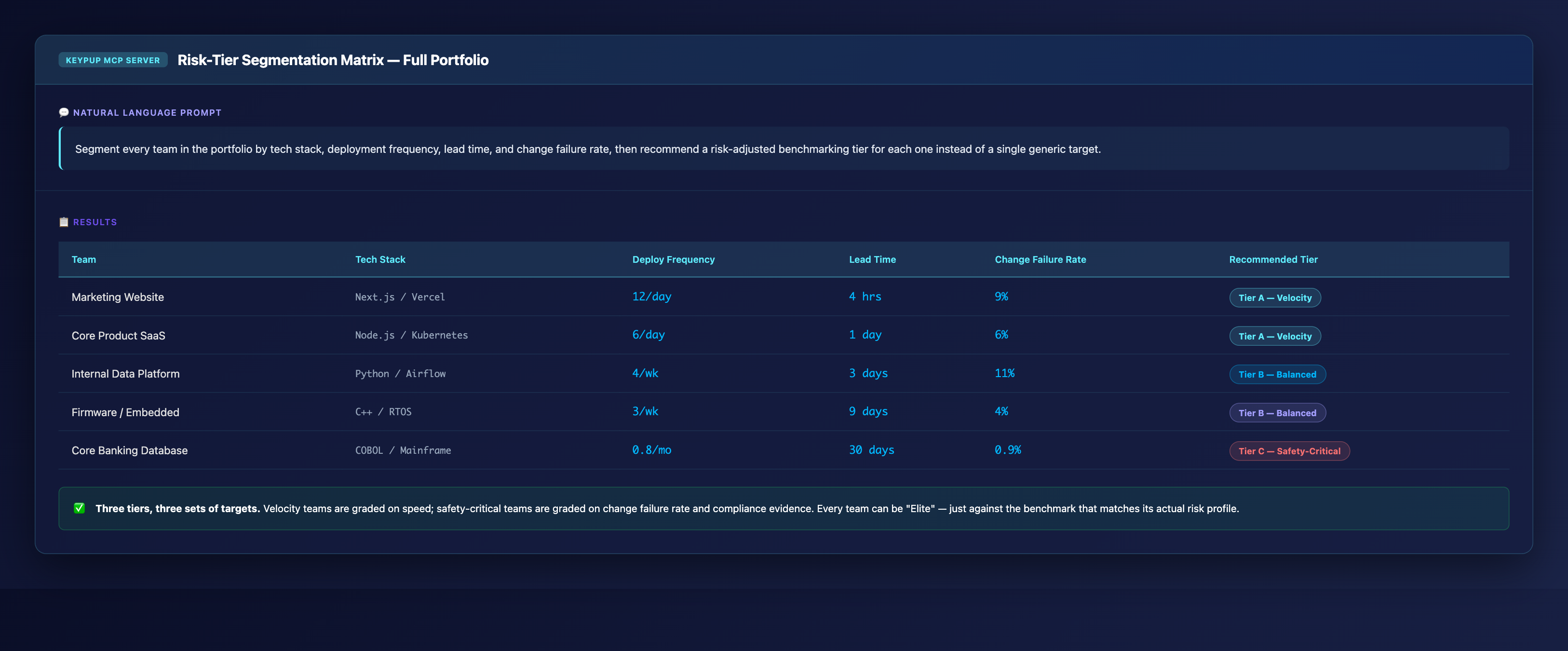
Once the spread and the shape are visible, the fix is to formalize it: assign every team to a benchmarking tier based on its actual technology stack and delivery profile, not a subjective label.
MCP Prompt:
Segment every team in the portfolio by tech stack, deployment
frequency, lead time, and change failure rate, then recommend a
risk-adjusted benchmarking tier for each one instead of a single
generic target.
Output: Risk-Tier Segmentation Matrix
Team
Tech Stack
Deploy Frequency
Lead Time
Change Failure Rate
Recommended Tier
Marketing Website
Next.js / Vercel
12/day
4 hrs
9%
Tier A — Velocity
Core Product SaaS
Node.js / Kubernetes
6/day
1 day
6%
Tier A — Velocity
Internal Data Platform
Python / Airflow
4/wk
3 days
11%
Tier B — Balanced
Firmware / Embedded
C++ / RTOS
3/wk
9 days
4%
Tier B — Balanced
Core Banking Database
COBOL / Mainframe
0.8/mo
30 days
0.9%
Tier C — Safety-Critical
Key Insight: Three tiers, three sets of targets. Velocity teams are graded on speed; safety-critical teams are graded on change failure rate and compliance evidence. Every team can be "Elite" — just against the benchmark that matches its actual risk profile.
5. Reporting to the Board Without Losing the Nuance
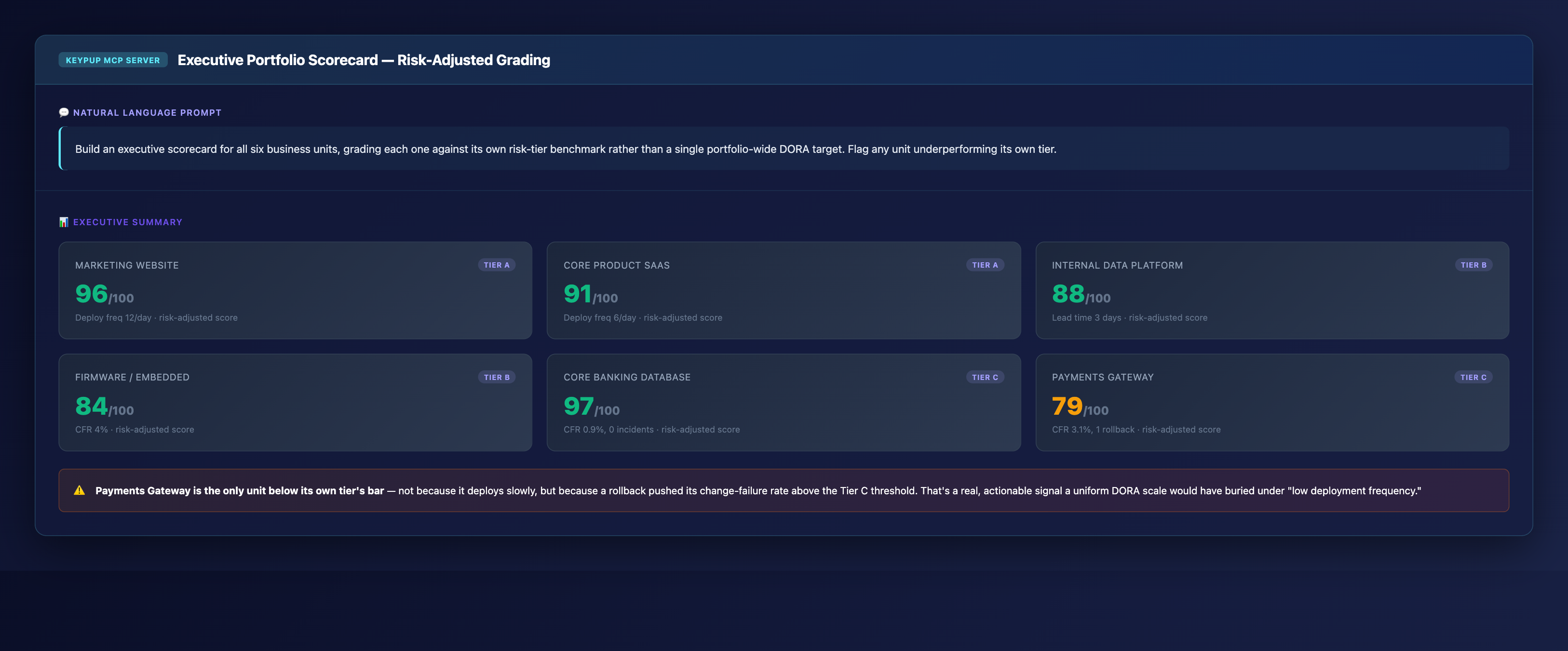
Executives still need a single view — they just need it to be risk-adjusted rather than flattened. Keypup MCP can generate a portfolio-wide scorecard that grades every unit against its own tier.
MCP Prompt:
Build an executive scorecard for all six business units, grading
each one against its own risk-tier benchmark rather than a single
portfolio-wide DORA target. Flag any unit underperforming its own
tier.
Output: Executive Portfolio Scorecard
Key Insight: Payments Gateway is the only unit below its own tier's bar — not because it deploys slowly, but because a rollback pushed its change-failure rate above the Tier C threshold. That's a real, actionable signal a uniform DORA scale would have buried under "low deployment frequency."
The Technical Implementation: How Keypup MCP Builds Risk-Adjusted Tiers
Data Sources Integration
Keypup MCP connects to the same systems your teams already use, regardless of how heterogeneous the portfolio is:
Version control (GitHub, GitLab, Bitbucket, Azure DevOps, and legacy mainframe change-control systems) for actual deployment and change data
Project management tools (JIRA, GitHub Projects, Azure DevOps) for incident and change-request context
CI/CD pipelines for deployment frequency and validation cycle length
Incident and compliance systems for change failure rate, rollback history, and audit evidence
Tier Assignment Logic
Rather than assuming every repository should be judged the same way, the MCP classifies teams using:
Deployment mechanics (continuous deployment vs. hardware validation vs. batch release windows)
Historical change failure rate and MTTR (a team that already fails safely doesn't need to be pushed toward "faster")
Blast radius of a bad deploy (a marketing typo vs. a ledger miscalculation)
Benchmark Generation, Not Benchmark Import
Each tier gets its own realistic target range for deployment frequency, lead time, and change failure rate — generated from the actual distribution of comparable teams, not imported wholesale from a generic industry report that never accounted for your specific mix of businesses.
Real-World Impact: Enterprise Case Studies
Case Study 1: Multi-Line Financial Services Company
Before Keypup MCP:
Single portfolio-wide DORA dashboard ranked the core banking team "Low performing" every quarter
Engineering leadership spent board time explaining away the same metric quarter after quarter
A push to "close the gap" led to a proposal to shorten change-advisory-board review — flagged and rejected by risk and compliance only after significant internal debate
After Keypup MCP:
Tier-based scorecard reclassified the core banking team into a Safety-Critical tier with its own target range
Board reporting time on DORA metrics dropped by half — no more quarter-over-quarter re-explaining of the same "red" metric
Zero proposals to loosen change-control since the introduction of risk-adjusted targets
"We weren't wrong to track deployment frequency. We were wrong to grade a regulated ledger system against the same bar as a marketing site. Keypup MCP gave us a way to keep the rigor and lose the false alarm."
— VP Engineering, Financial Services
Case Study 2: Industrial IoT & SaaS Hybrid Portfolio
Before Keypup MCP:
Firmware team consistently flagged as underperforming next to the company's cloud SaaS product
Firmware engineers reported low morale, citing "impossible" targets tied to hardware validation cycles they didn't control
No visibility into whether the firmware team's actual change failure rate was better or worse than the benchmark implied
After Keypup MCP:
Firmware moved to its own risk tier, benchmarked against comparable embedded-systems teams instead of the SaaS product
Change failure rate emerged as the firmware team's standout metric — previously invisible under a deployment-frequency-only view
Retention improved on the firmware team after leadership publicly adjusted how the team was graded
"The moment we stopped comparing hardware validation cycles to a SaaS deploy pipeline, the firmware team's real performance became visible for the first time. They weren't slow. They were being measured with the wrong ruler."
— Director of Engineering, Industrial IoT
Implementation: Getting Started with Keypup MCP
1. Connect Your Data Sources
Keypup MCP integrates with your existing tools regardless of how many different tech stacks your portfolio spans:
GitHub, GitLab, Bitbucket, Azure DevOps, or legacy version control for deployment and change history
JIRA, GitHub Projects, or Azure DevOps for incident and change-request context
Optional: compliance and audit systems for regulated teams
2. Define Your Risk Tiers
Work with engineering leadership, risk, and compliance to define:
Which teams are Velocity-tier, Balanced-tier, or Safety-Critical-tier (or your own naming convention)
What regulatory or blast-radius factors justify a different tier
How often tier assignments should be reviewed as teams and systems evolve
3. Start Querying in Natural Language
No SQL required. Just ask:
"What tier should this new repository be assigned to?"
"Show me every team underperforming its own risk-adjusted benchmark"
"Compare this team's DORA profile to its tier average"
"Build the quarterly board scorecard, risk-adjusted"
4. Automate Portfolio-Wide Reporting
Schedule recurring queries for:
Quarterly risk-adjusted board scorecards
Monthly per-tier trend tracking
Automatic re-tiering alerts when a team's profile shifts significantly
Ad-hoc comparisons whenever a new team or acquisition joins the portfolio
The Bottom Line: One Portfolio, Multiple Fair Benchmarks
The standardization fallacy isn't a data problem — it's a modeling problem. Enterprise engineering leaders overseeing heterogeneous portfolios need to:
✅ See the real spread across cloud-native, legacy, firmware, and regulated systems ✅ Prove why a uniform benchmark misrepresents safety-critical teams ✅ Assign risk-adjusted tiers based on actual constraints, not subjective labels ✅ Report to the board with nuance intact, not flattened into a single misleading number ✅ Protect operational safety by never incentivizing a team to out-race its own risk profile
Keypup MCP makes this possible without asking teams to change how they work — it simply asks the right question of data you already have: not "how fast is this team?" but "how fast should this team be, given what it actually does?"
Get Started
Ready to replace your uniform DORA dashboard with risk-adjusted, tier-based benchmarks?
Start Free Trial — Connect your engineering stack in minutes and see your portfolio's real risk-tier spread today.
Request Demo — See how enterprise teams use Keypup MCP to benchmark heterogeneous engineering portfolios fairly.
View MCP Documentation — Technical details for engineering teams implementing Keypup MCP.
Keywords: DORA metrics heterogeneous portfolio, risk-adjusted engineering benchmarks, DORA metrics legacy systems, engineering metrics regulated industries, deployment frequency core banking, engineering portfolio benchmarking, DORA metrics fintech compliance, tiered engineering KPIs, enterprise engineering standardization, engineering metrics for legacy and mainframe teams
Ready to Transform Your Analytics?
Join teams already using AI to make data-driven decisions faster than
ever.
Velocity looks fine, until your best engineers quit. Learn what engineering leaders on Reddit say about after-hours commits, weekend work and burnout at enterprise scale, and how Keypup MCP uses commit, review and merge timestamps to measure how much work happens outside working hours, where it concentrates, who is overloaded without naming anyone, and what it costs in skipped reviews.
Your median cycle time looks healthy, yet every release still ends in merge conflicts, rebases and big-bang reviews. Learn what engineering leaders on Reddit say about long-lived branches and the trunk-based vs GitFlow debate at enterprise scale, and how Keypup MCP uses pull request dates, target branches, commits, reviews and mergeability to measure branch lifetime, find where branches live longest and land aging work before it drifts into conflict.
Compare the 6 best engineering metrics tools for multi-team benchmarking in 2026 — Keypup, LinearB, Swarmia, Jellyfish, Faros and Appfire Flow — on cross-team benchmarking, org-level rollups, DORA Metrics, Git-to-ticketing linking, custom KPIs, AI capabilities and data security. See how to compare teams on equal terms and find where your delivery process is broken.